ATHLETES
GOLIVE
2.0
Redesigning a multi-user sports streaming and management platform from the ground up — through heuristic research, persona development, and a full V2 design system.
One platform.
Many roles to serve.
AthletesGoLive is a live sports streaming and management platform connecting schools, travel teams, athletes, coaches, fans, and scouts across youth and amateur sports. When I joined as Director of UX, the existing app had grown organically without a unified design language — a fragmented experience that frustrated each of its distinctly different user types.
The mandate was clear: audit the current product with rigor, build a research foundation, and design a V2 experience that would serve a complex multi-persona audience without compromising on performance or clarity for any of them.
Director of UX.
I led all UX strategy and execution end-to-end — from establishing a research and evaluation cadence to designing a V2 system architecture that could scale across user types and platform contexts. I operated as the sole UX practitioner and was embedded directly with product and engineering leadership.
The Core Problem
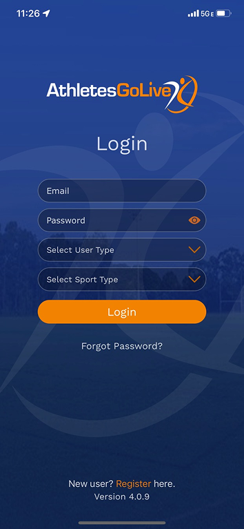
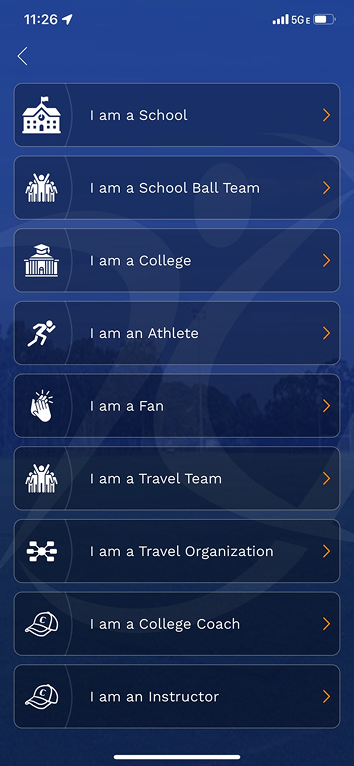
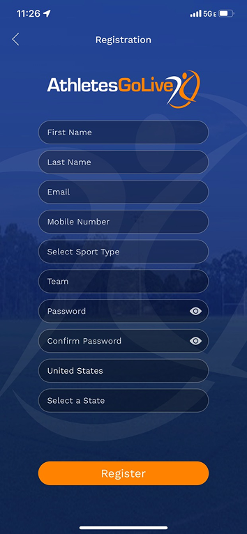
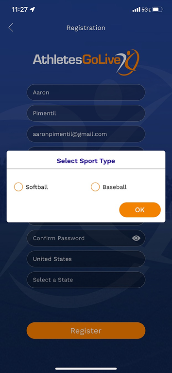
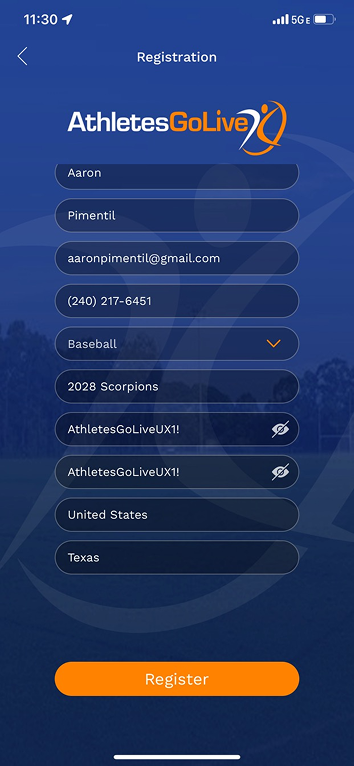
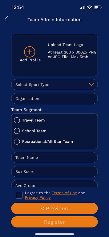
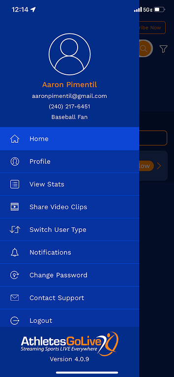
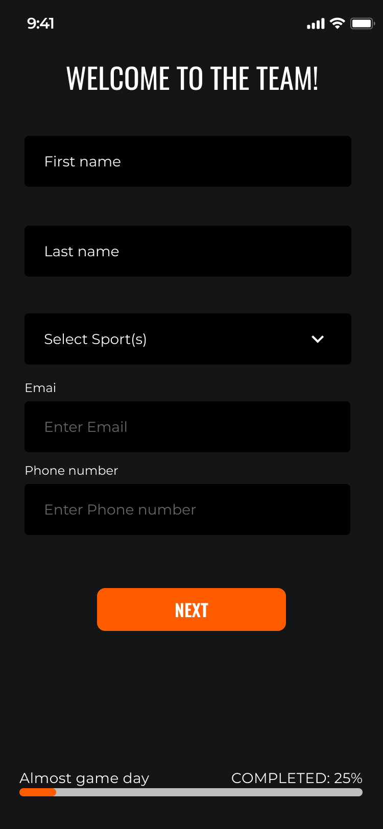
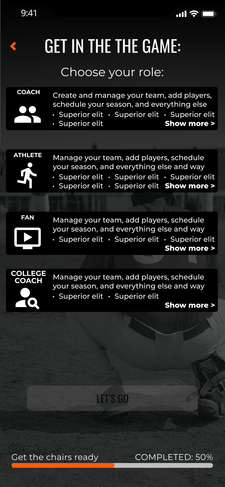
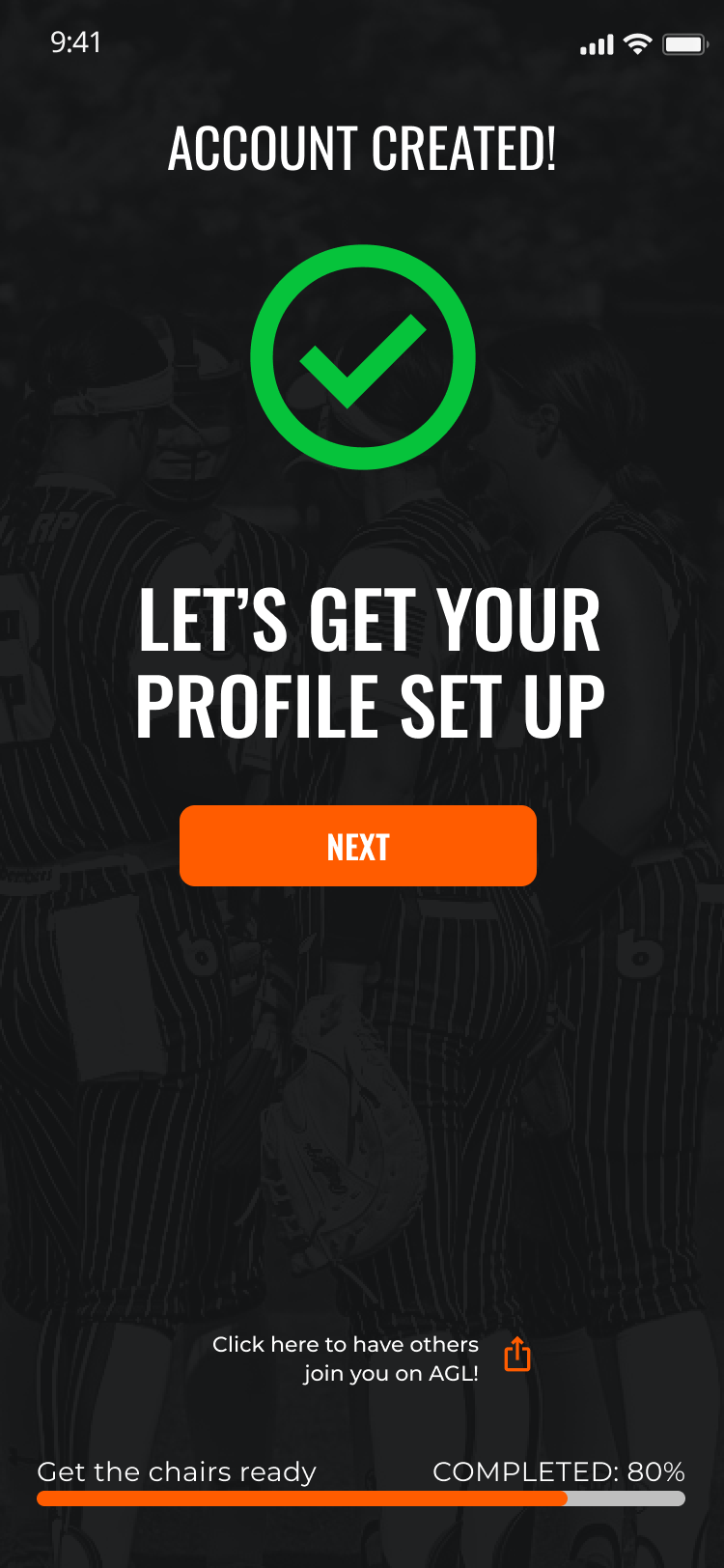
- Seven user types (Fan, Athlete Pro, Athlete Elite, Team, Organization, College Coach, Instructor) forced through one registration flow with no role-appropriate onboarding
- No visual hierarchy or brand consistency across screens — each feature looked like it was built in a different era
- Critical features buried or inaccessible without prior system knowledge
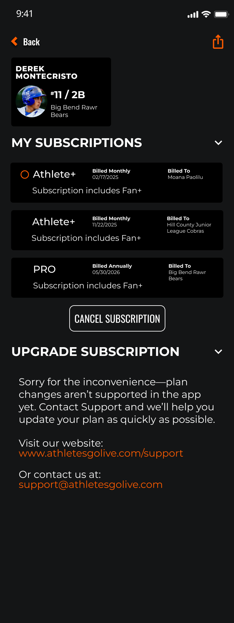
- Subscription upsell architecture was a single blocking modal with no context or tier comparison
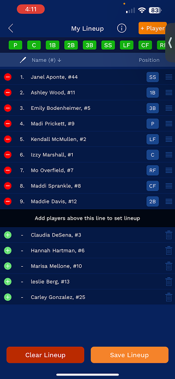
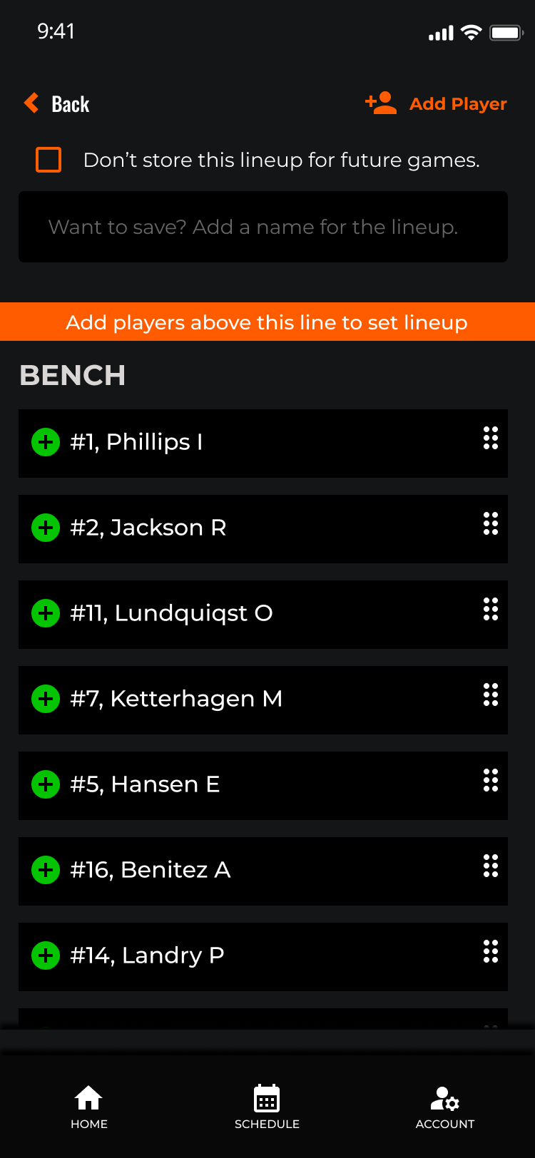
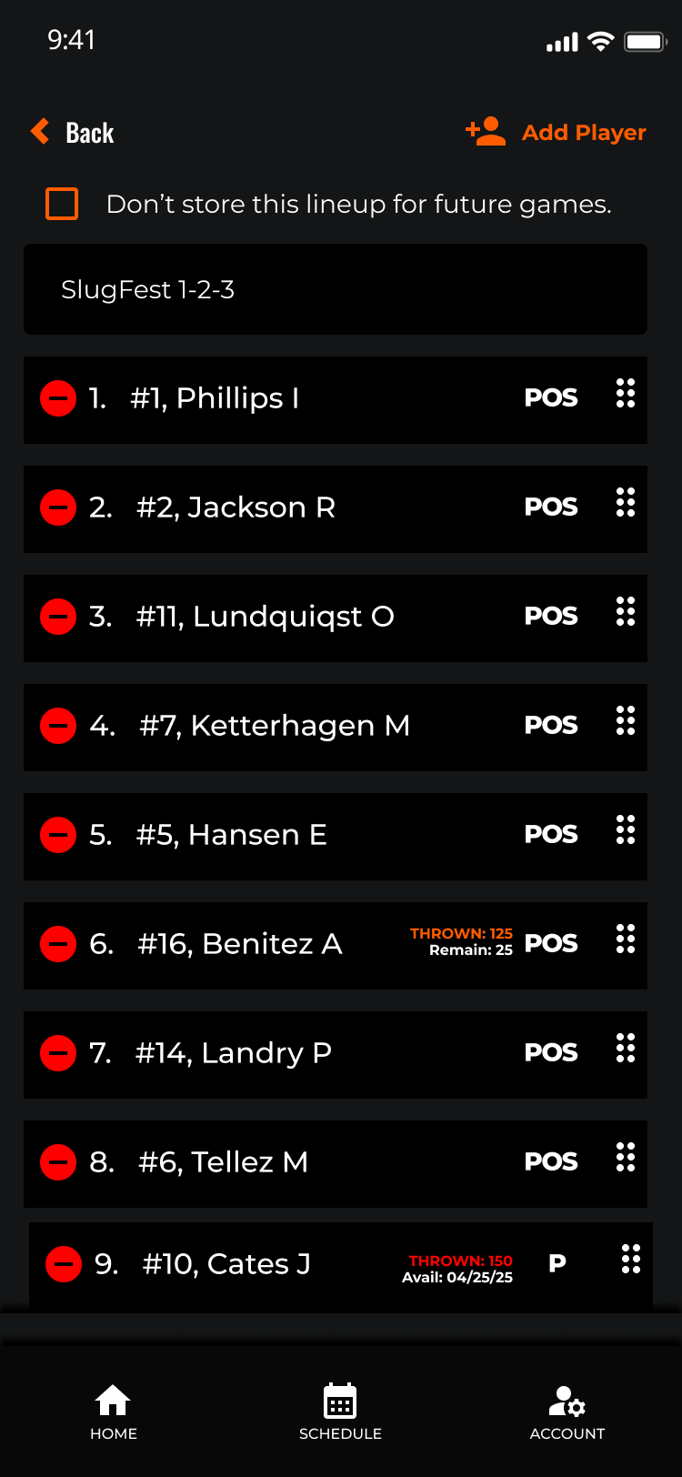
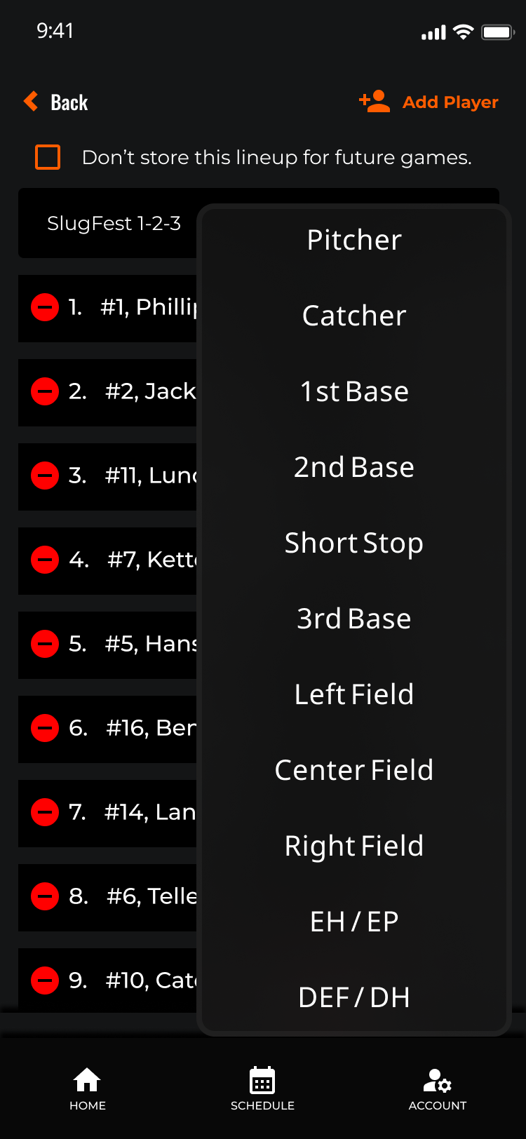
- Team management and scoring workflows required expert-level familiarity to execute
- No design system in place — every new feature introduced new inconsistencies
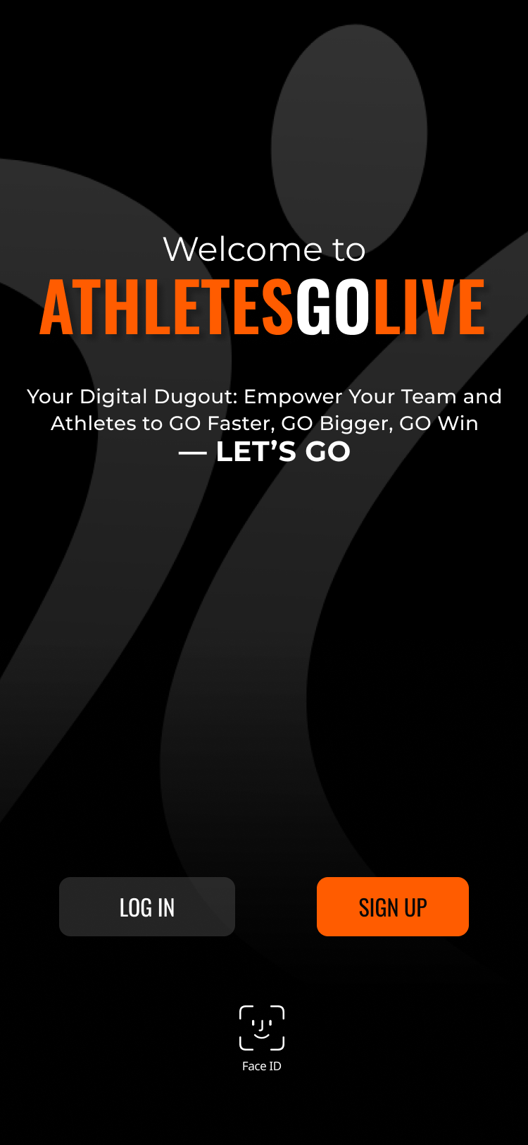
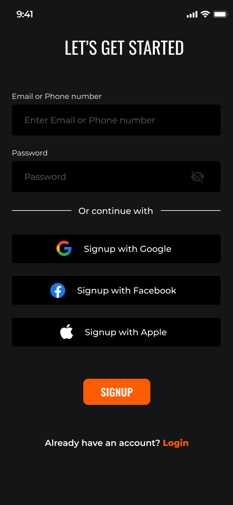
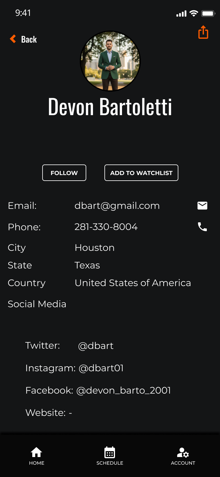
The product
as it existed.
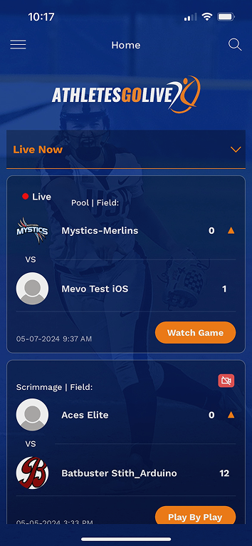
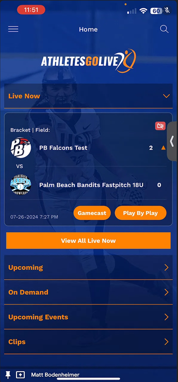
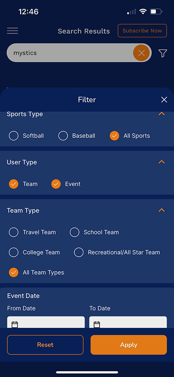
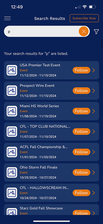
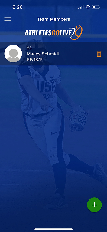
Before redesigning anything, I documented the full V1 state of the AthletesGoLive mobile app across all major user flows. These screens represent the baseline — the foundation for every heuristic violation, persona insight, and design decision that followed.

Start with the
evidence.
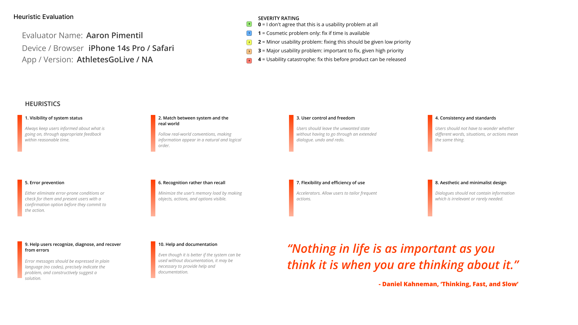
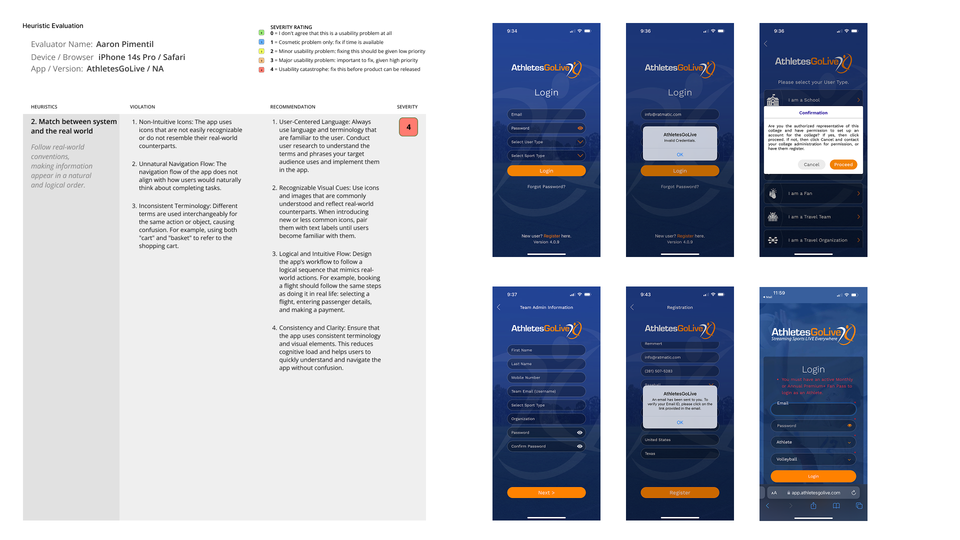
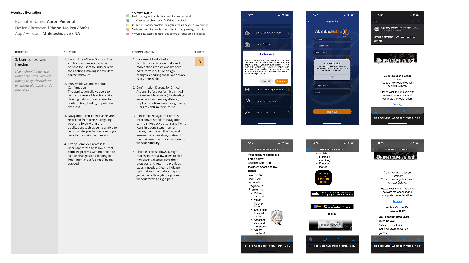
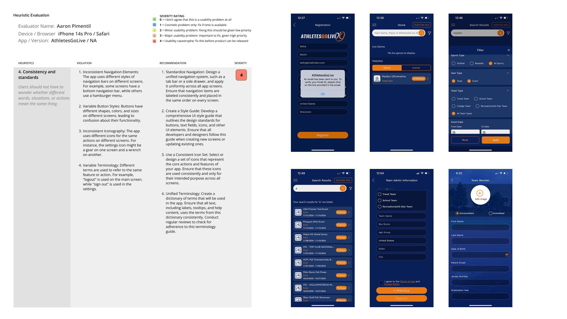
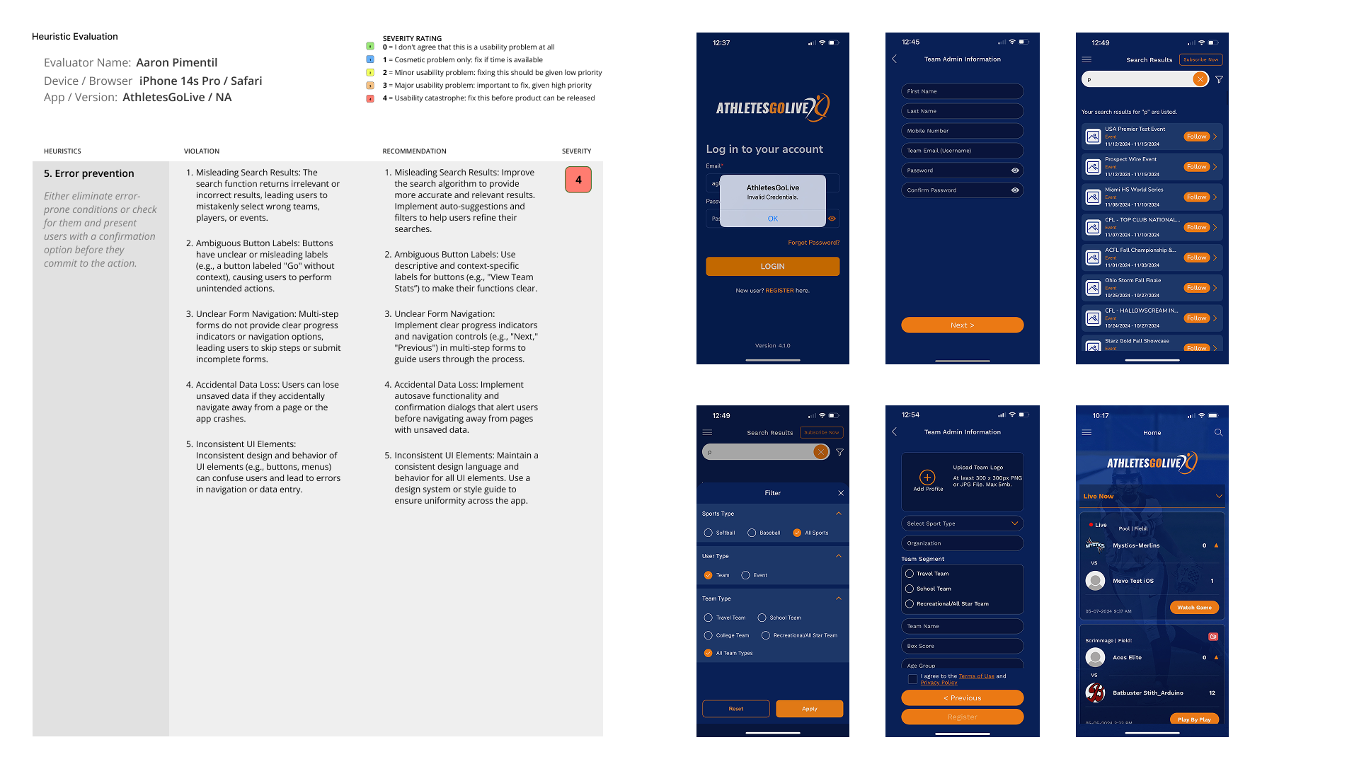
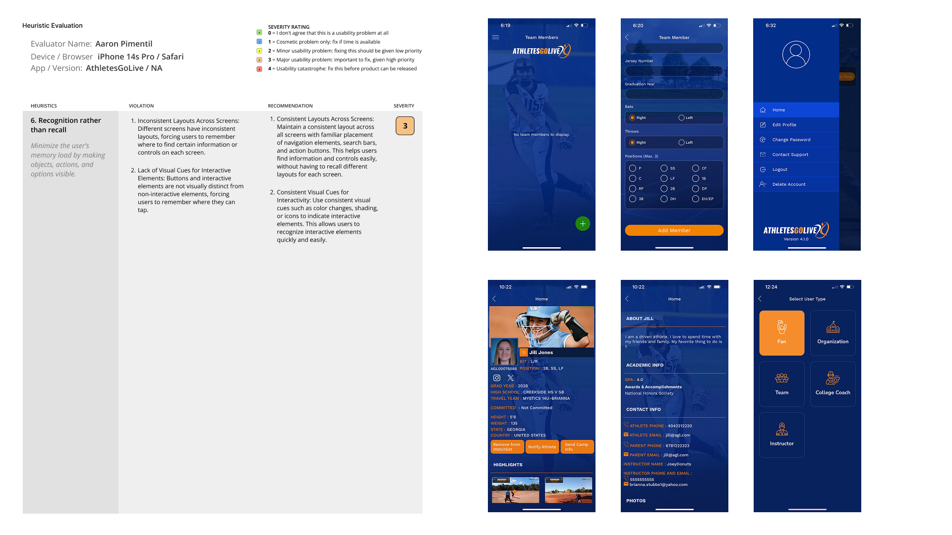
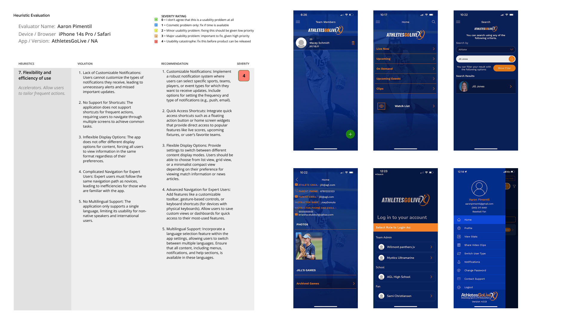
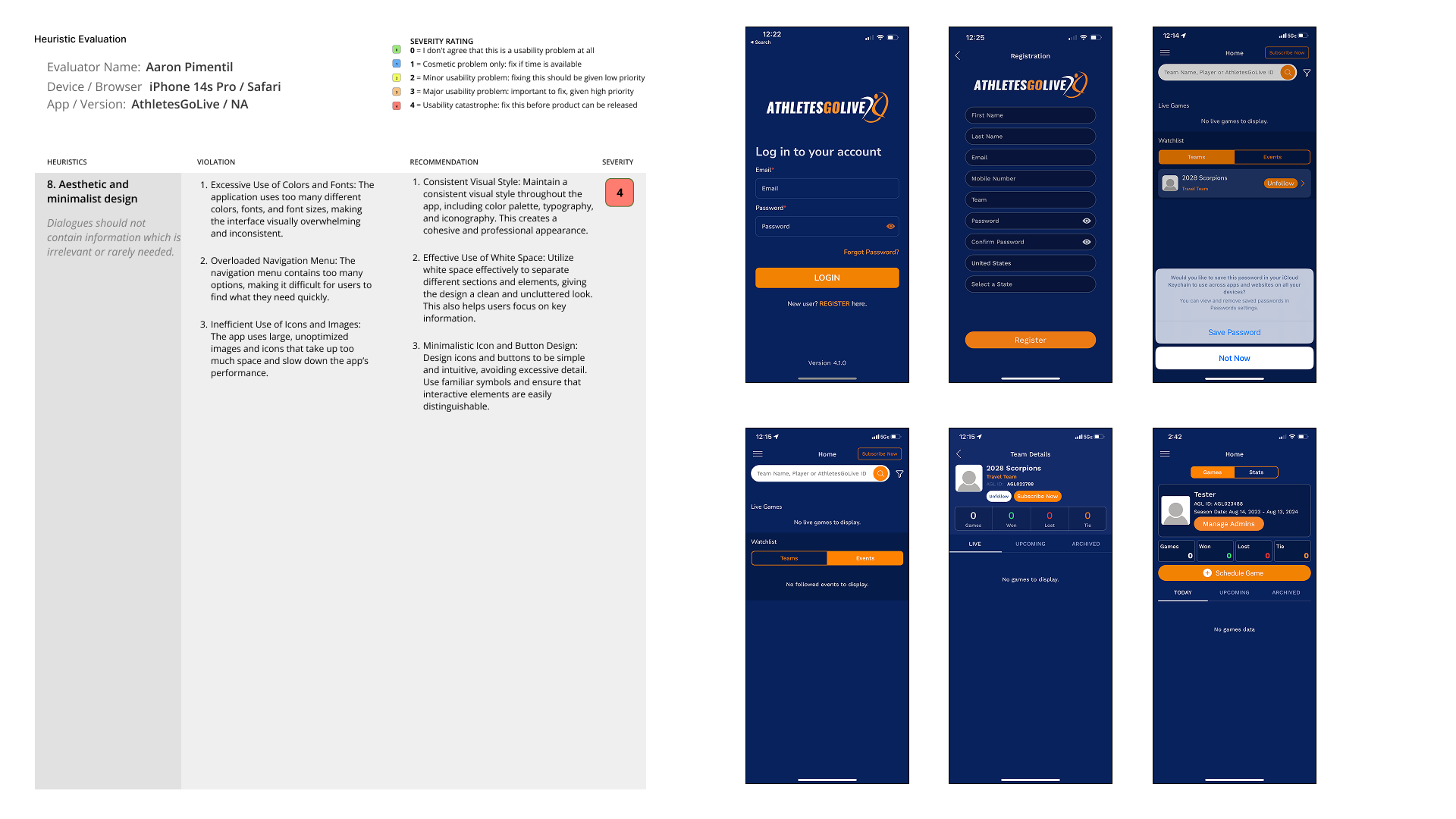
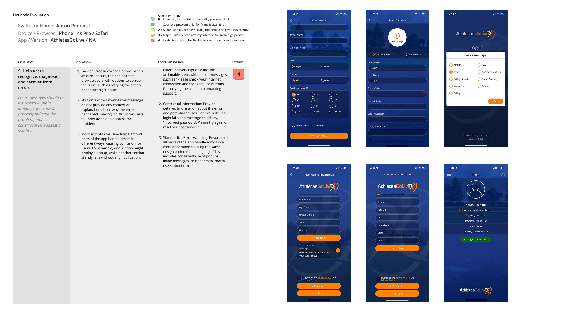
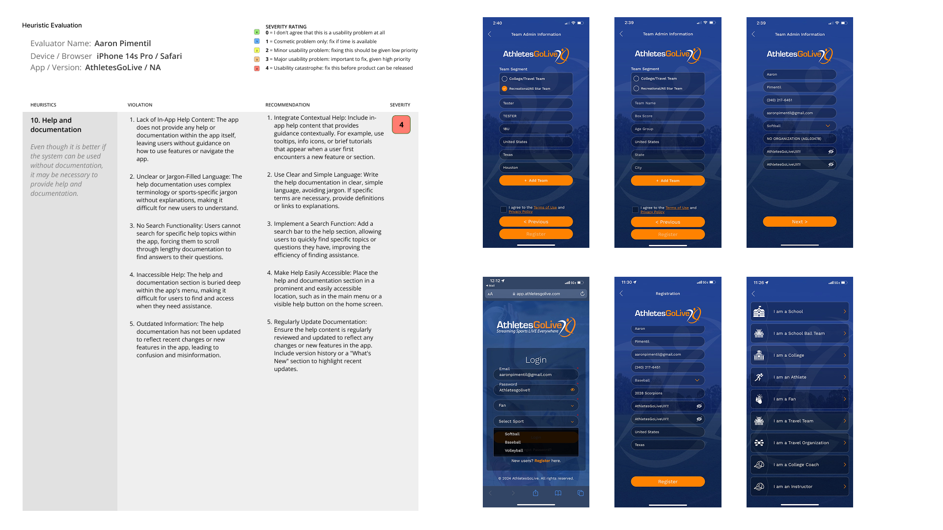
Before designing a single new screen, I established a structured research cadence using Nielsen's 10 Usability Heuristics as the evaluation framework. The goal was to move from subjective impressions to documented, severity-rated evidence — giving engineering and product leadership a shared, defensible language for prioritizing UX fixes.
Heuristic Evaluation Setup
I defined the evaluation parameters: device (iPhone 14s Pro / Safari), app version, severity rating scale (0–4), and heuristic framework. Every finding was categorized as Functionality, Efficiency, or Accessibility — making prioritization decisions clear for both product and engineering teams.

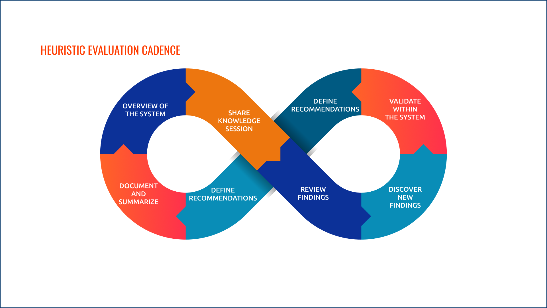
Iterative Evaluation Cadence
The evaluation followed a continuous improvement loop: Overview the system → Share Knowledge Session → Define Recommendations → Validate Within the System → Discover New Findings → Review Findings → Define Recommendations → Document and Summarize. This ensured findings informed each subsequent pass rather than being treated as a one-time audit.
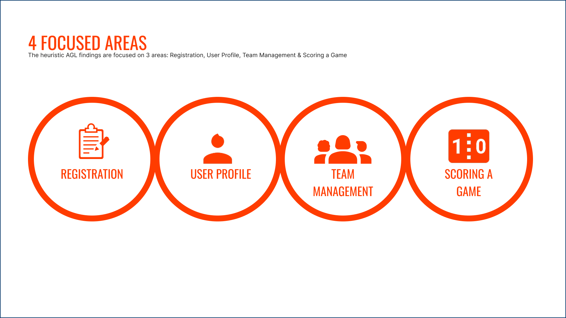
4 Focused Areas
The AGL heuristic findings were concentrated across four high-impact areas of the application: Registration, User Profile, Team Management, and Scoring a Game. These were the flows with the highest frequency of use and the most critical severity ratings.

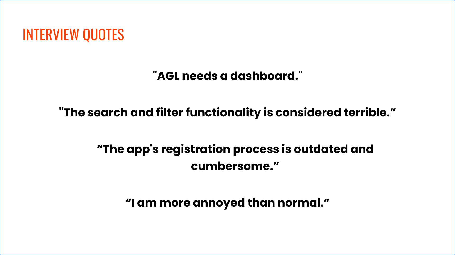
Every violation
documented.
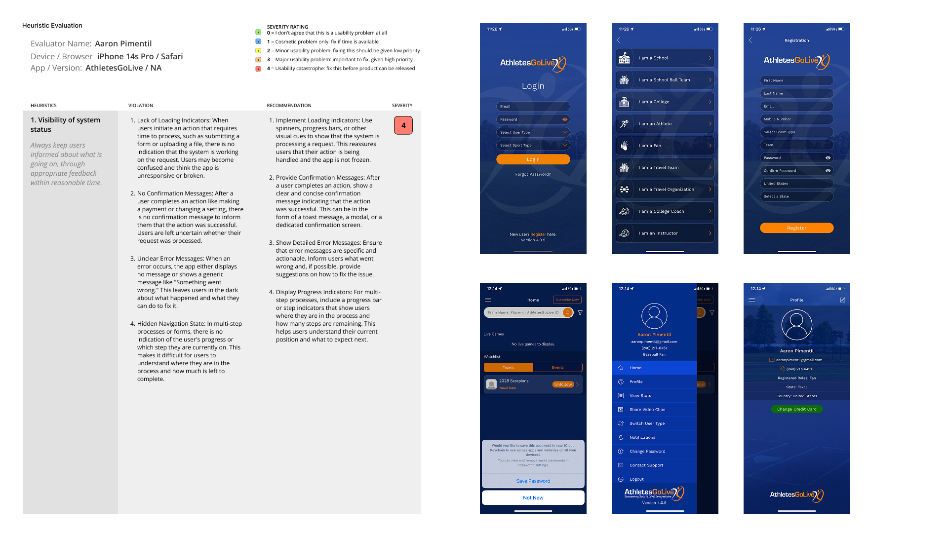
Each heuristic was evaluated against the live AGL app, with specific violations identified, annotated against real app screens, and paired with severity ratings. The most critical violations — rated Severity 4 — were flagged as immediate barriers to usability.

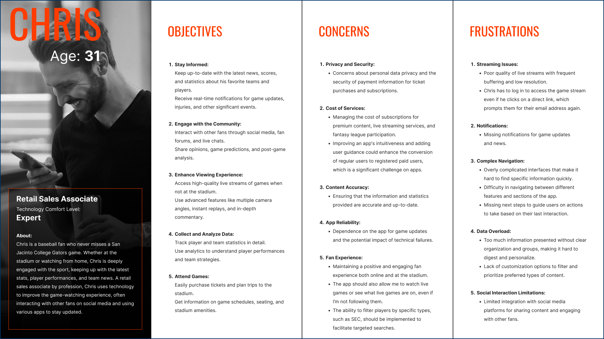
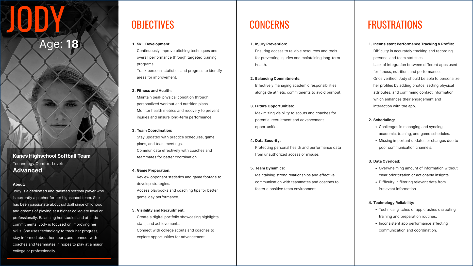
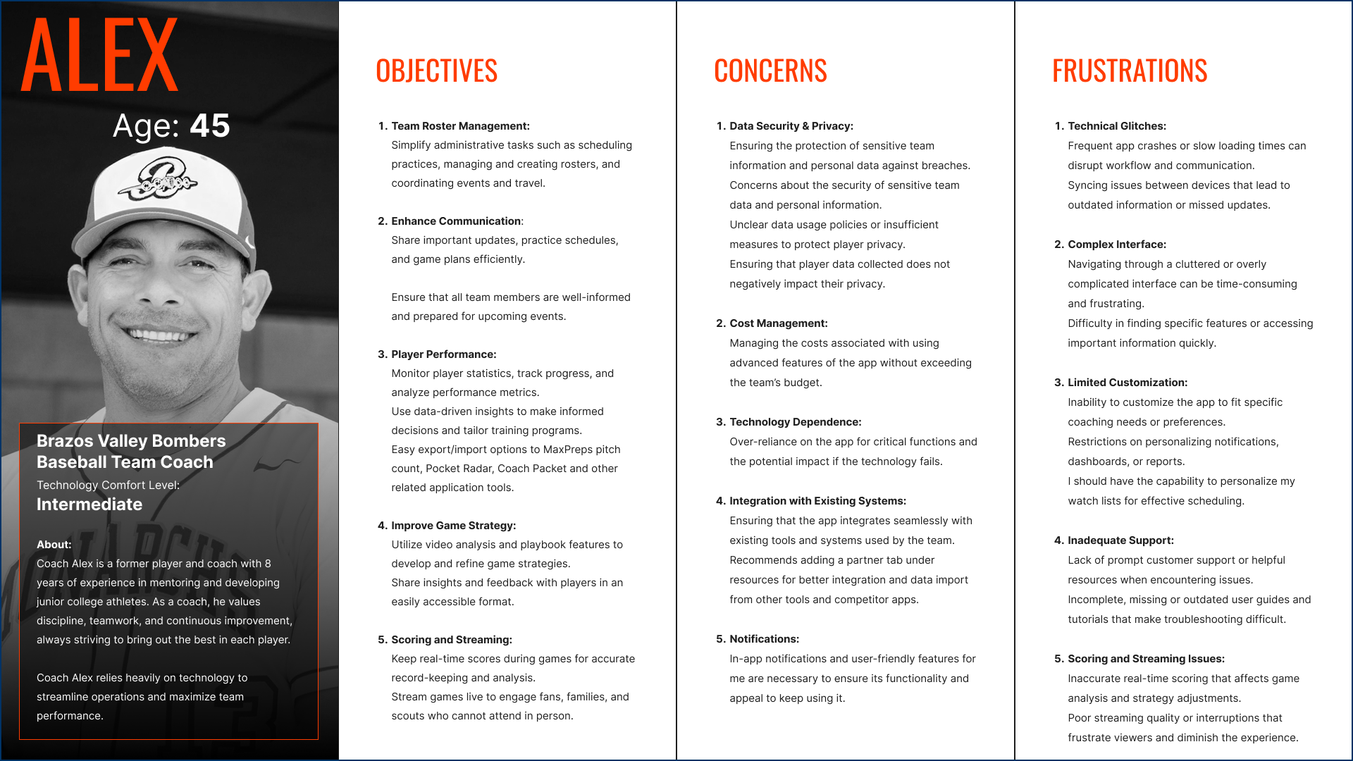
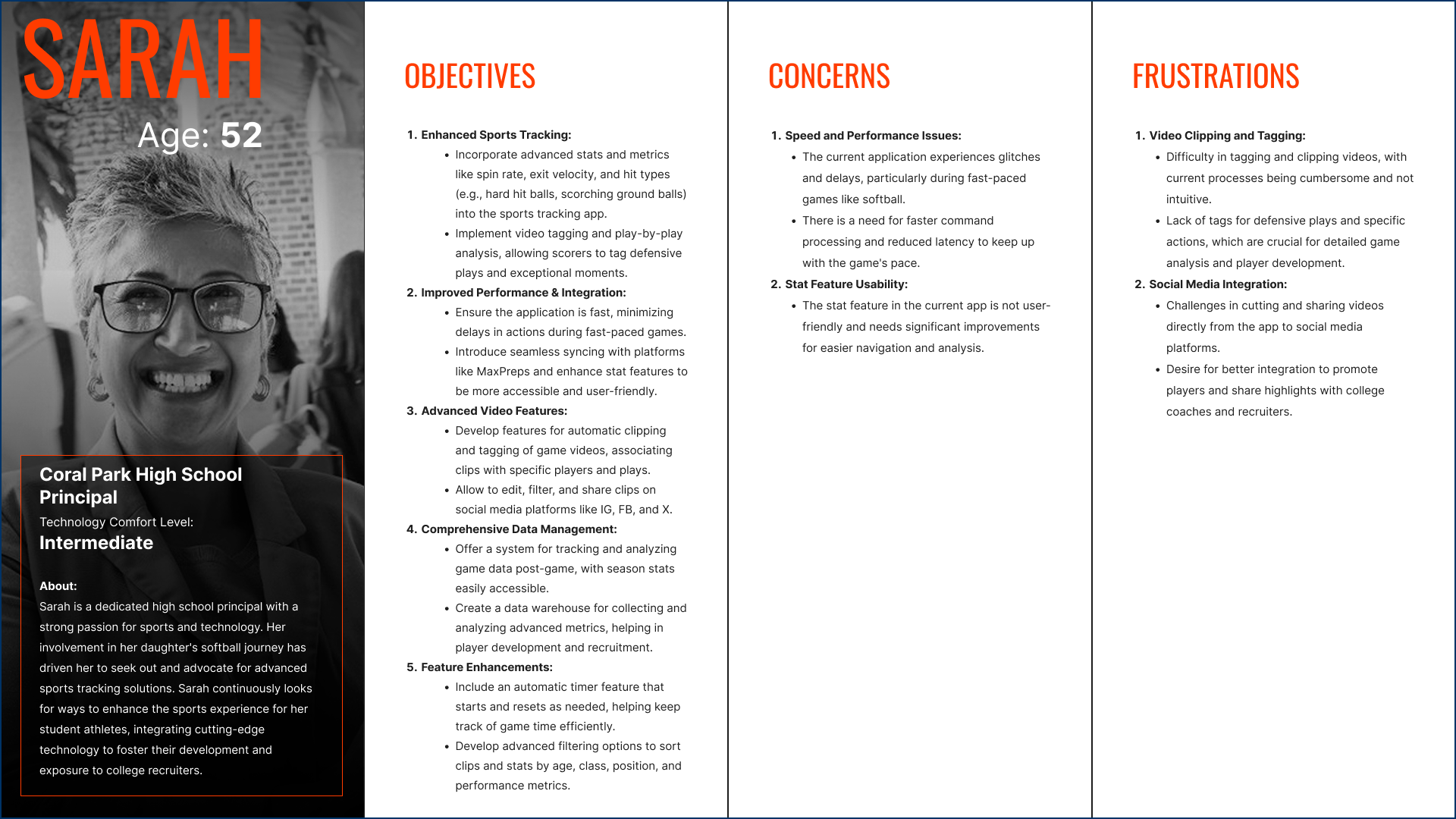
Four personas.
One platform.
The AGL user base spans seven user types (Fan, Athlete Pro, Athlete Elite, Team, Organization, College Coach, and Instructor), but the research distilled these into four primary personas that represented the broadest spectrum of goals, frustrations, and context of use. Building fewer, richer personas ensured design decisions stayed focused rather than diluted across edge cases.

The redesign.
Built for every user.
With a fully documented research foundation, I moved into V2 design — a ground-up redesign of the AthletesGoLive platform. Every V2 decision traces directly to a heuristic finding, a persona goal, or a severity-rated violation from the evaluation phase.
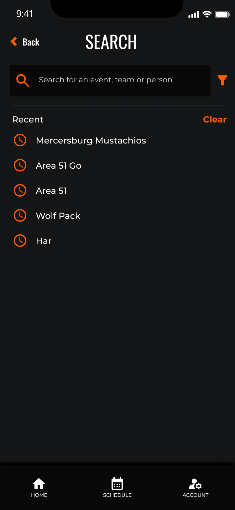
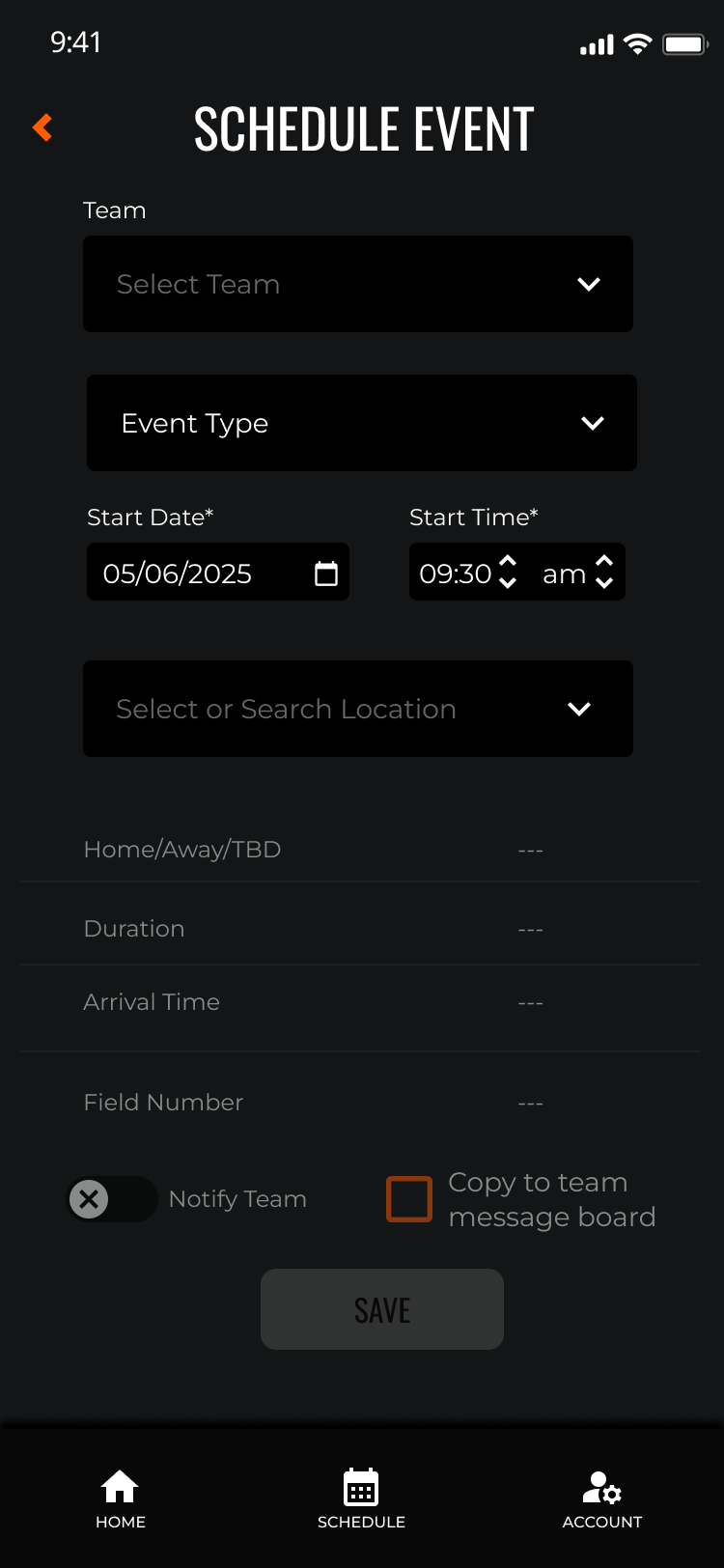
Redesigned to introduce role-aware flows, progressive disclosure across multi-step forms, inline validation, and proper system status feedback at every step.
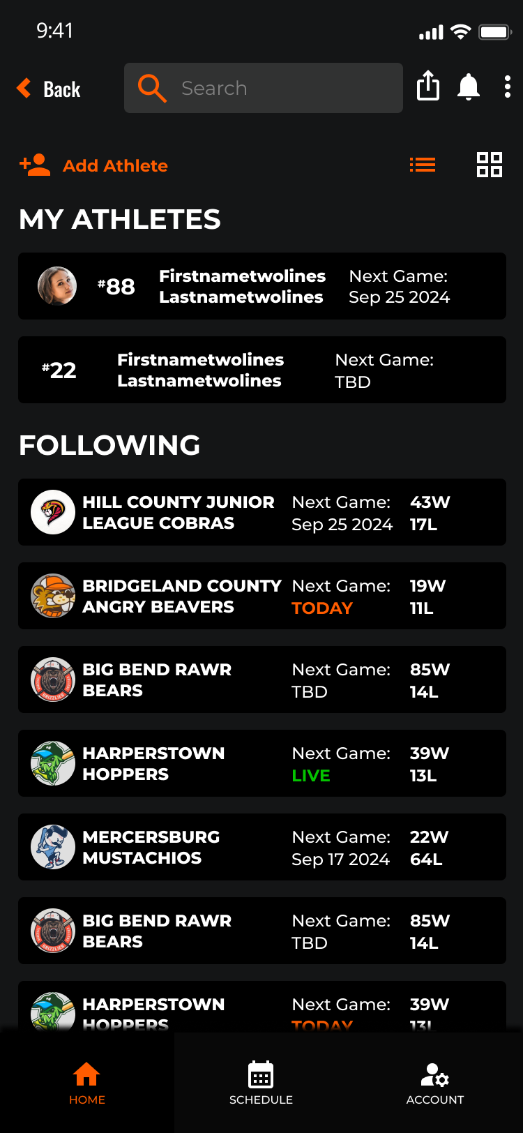
A restructured home experience with clear content hierarchy, contextual navigation, and subscription architecture that communicates value before asking for commitment.
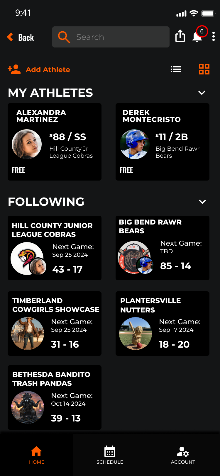
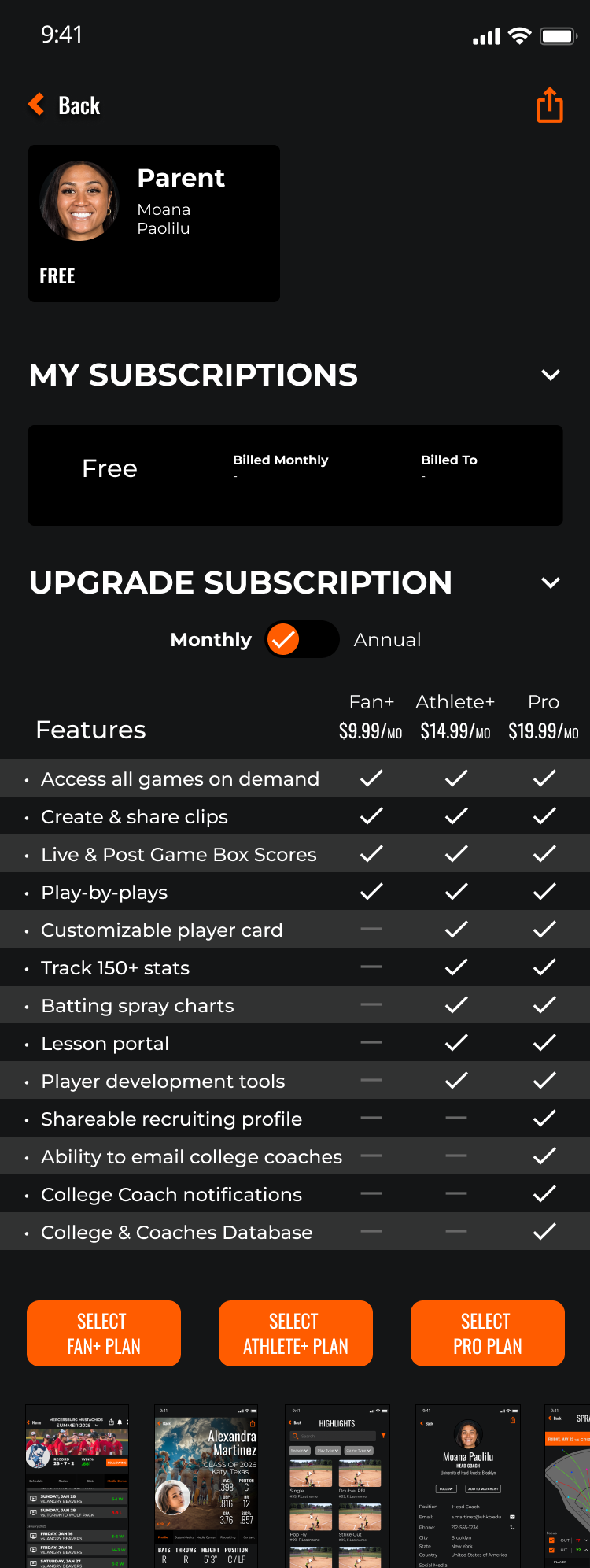
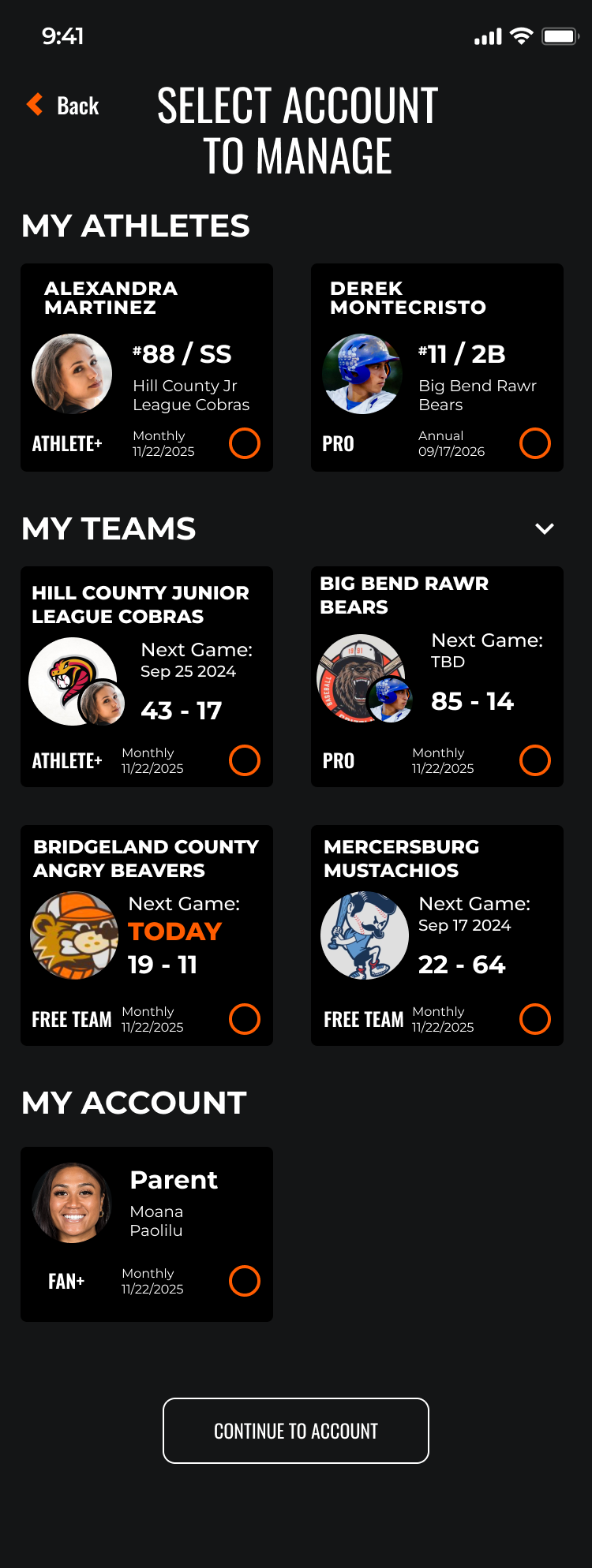
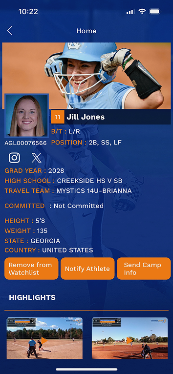
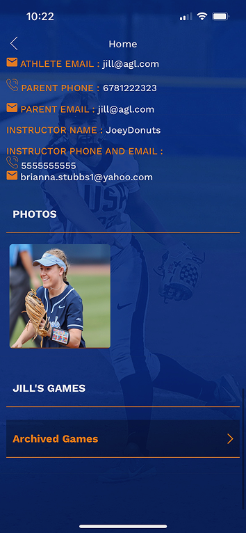
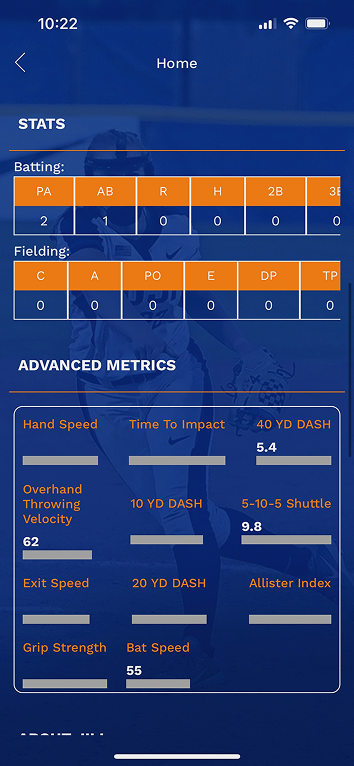
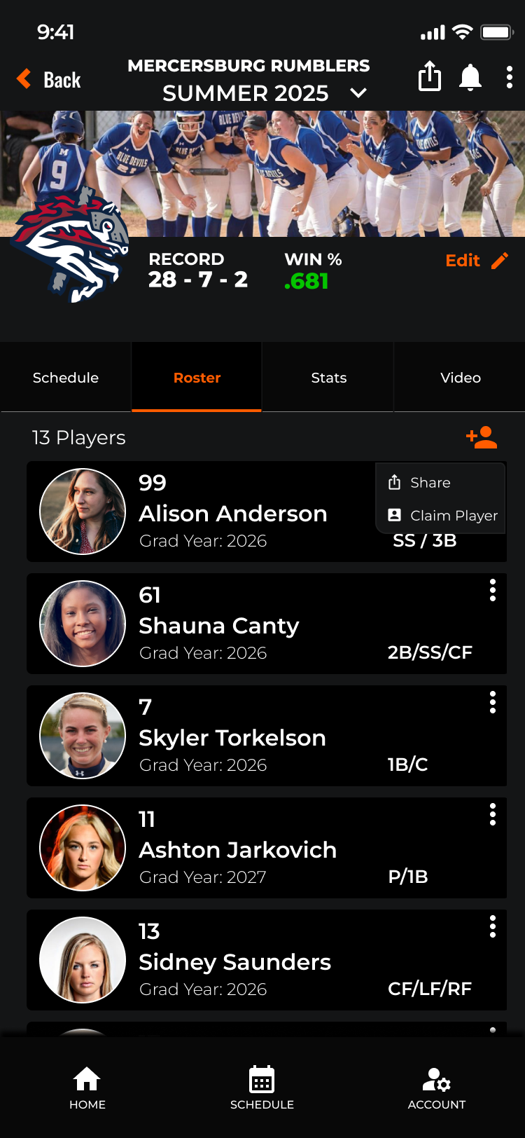
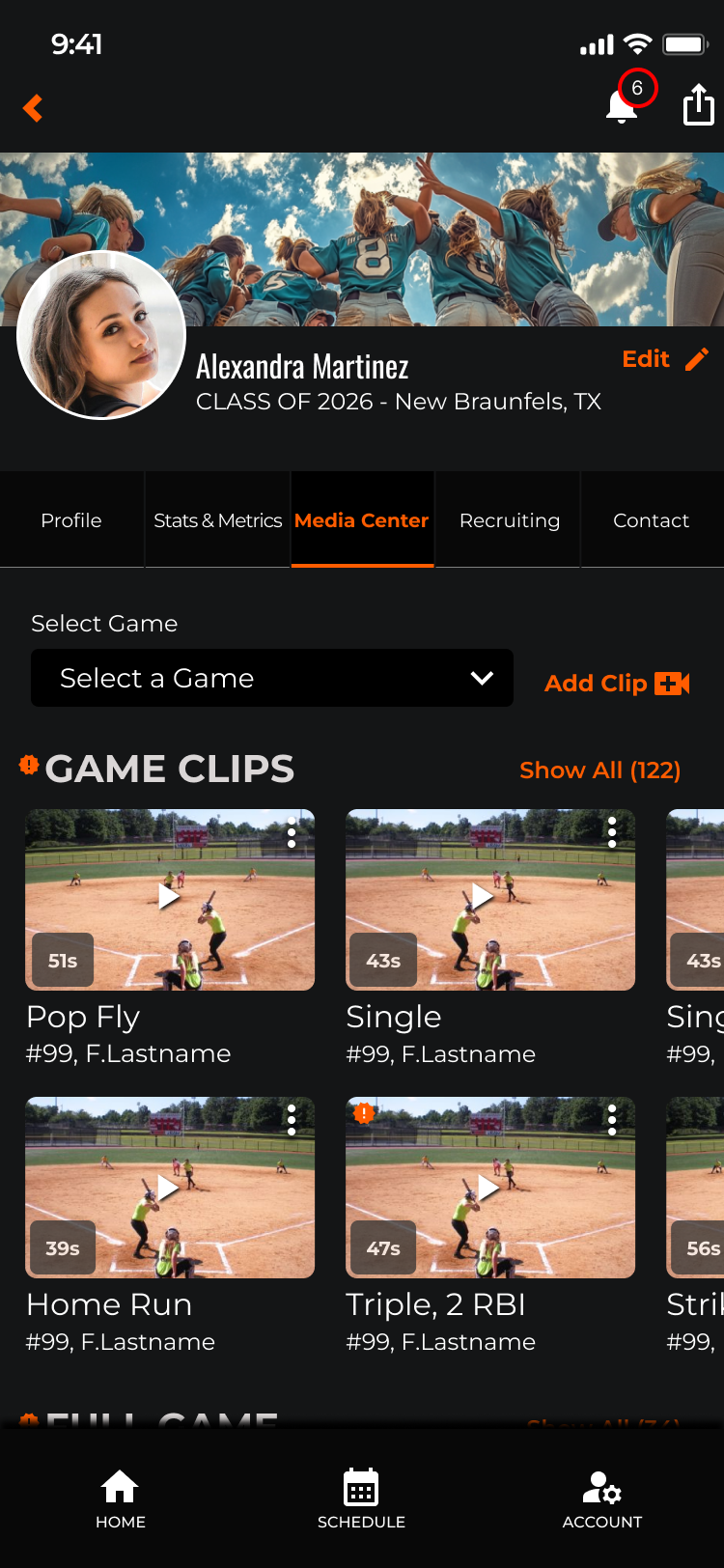
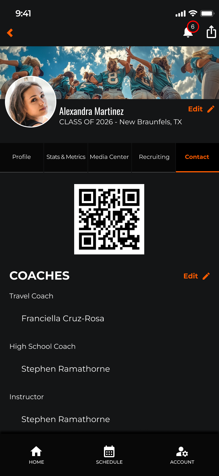
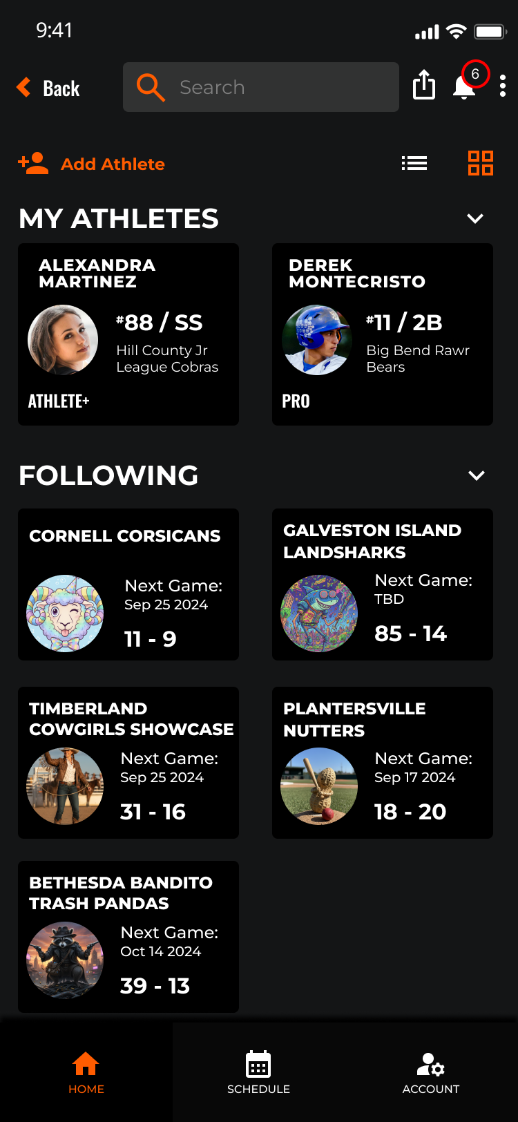
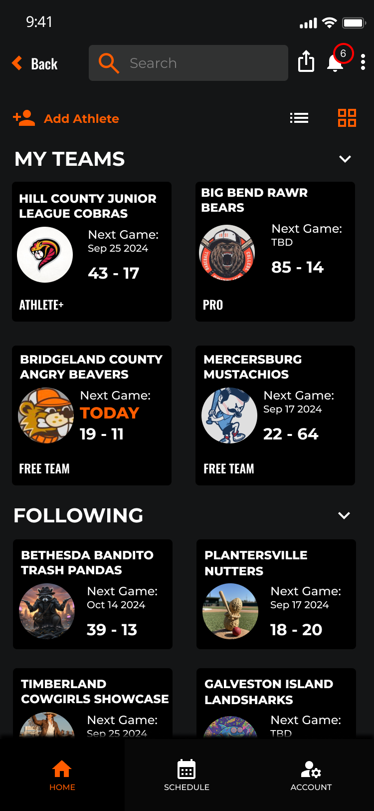
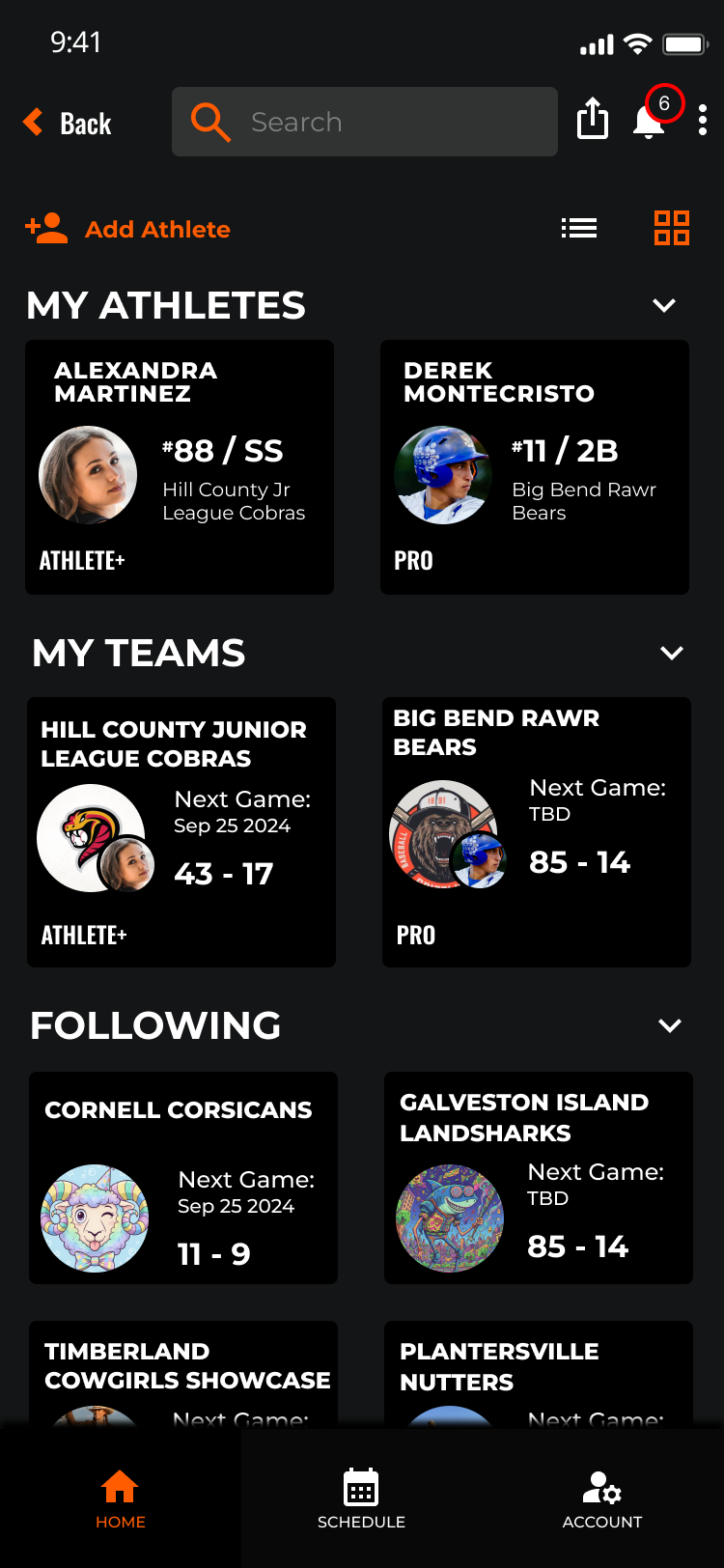
Every user type gets a purpose-built profile experience. Team, Fan, and Athlete profiles each surface role-appropriate content, actions, and data — no more one-size-fits-all layouts that leave critical information buried.
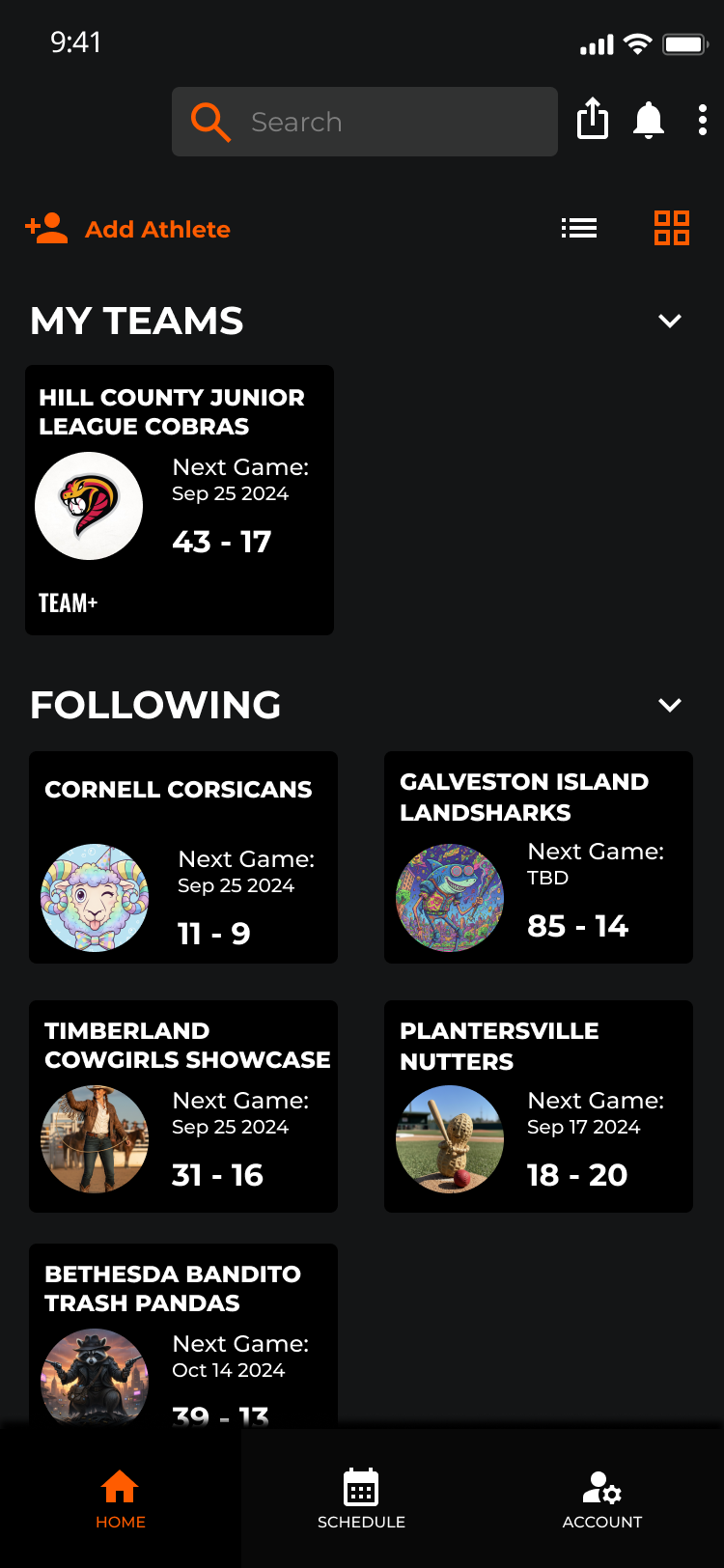
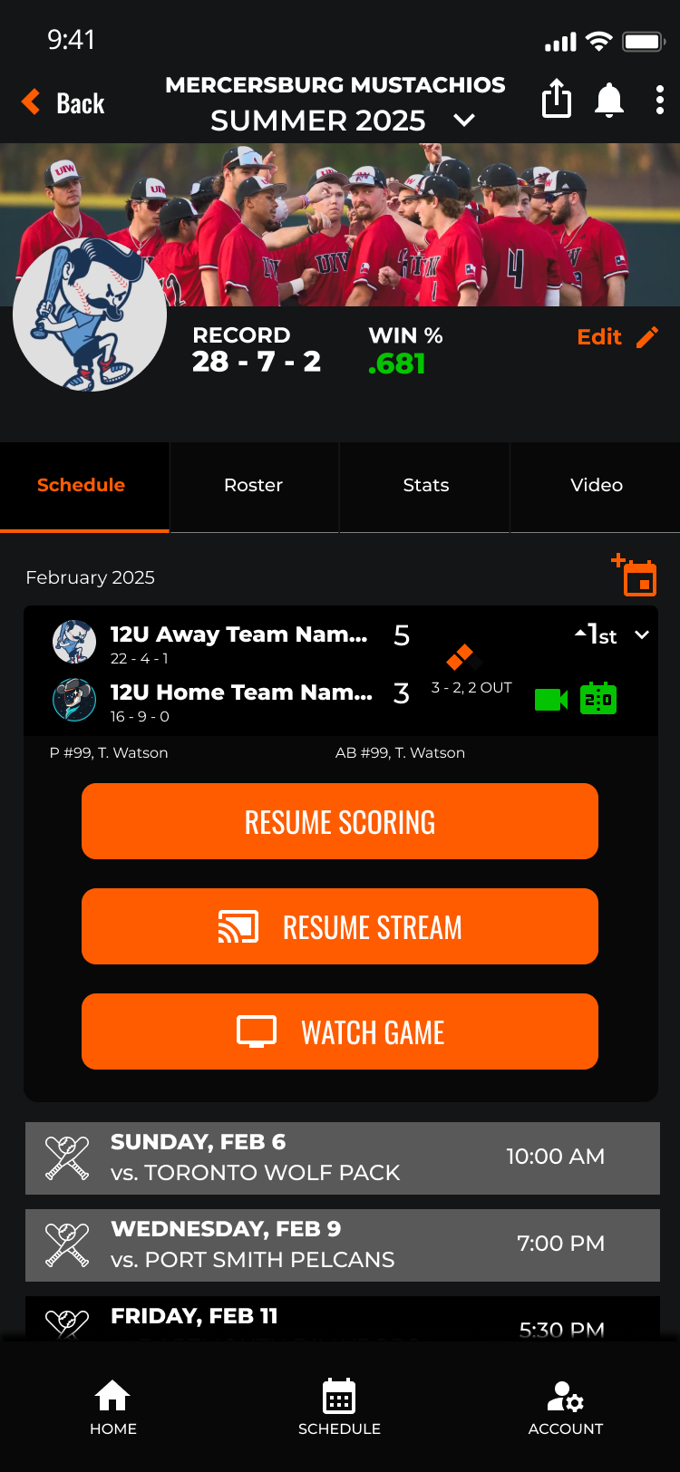

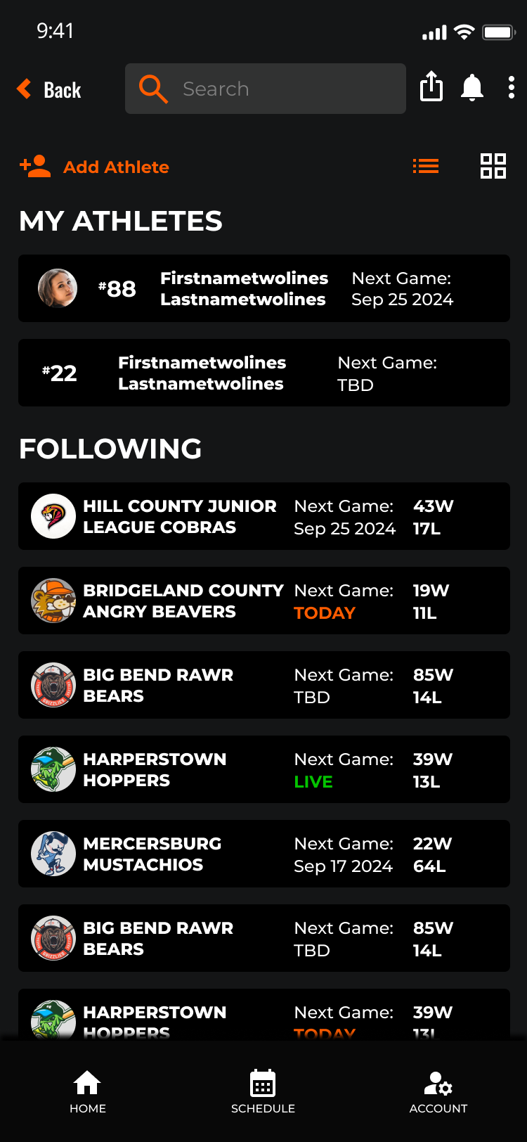
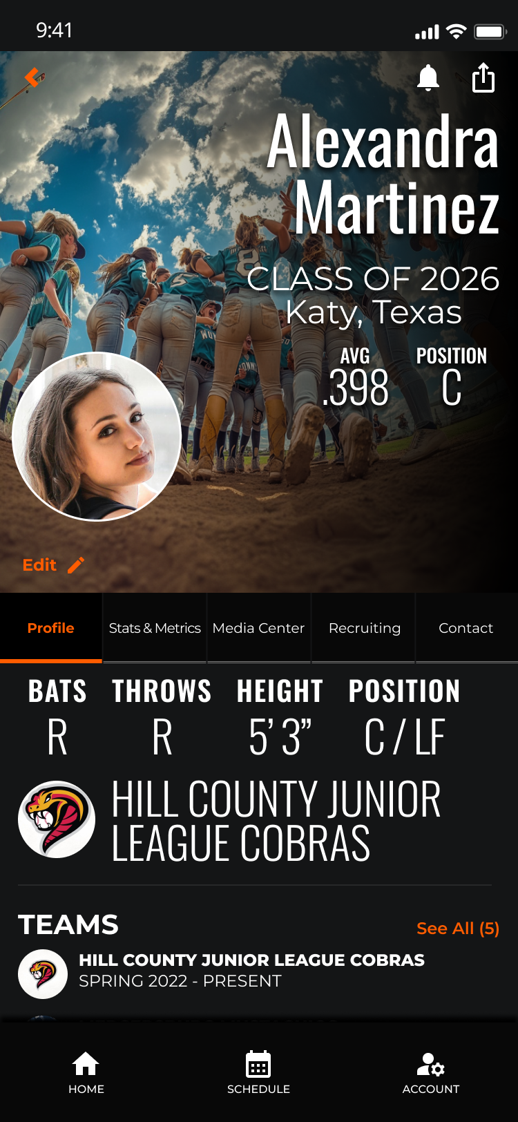
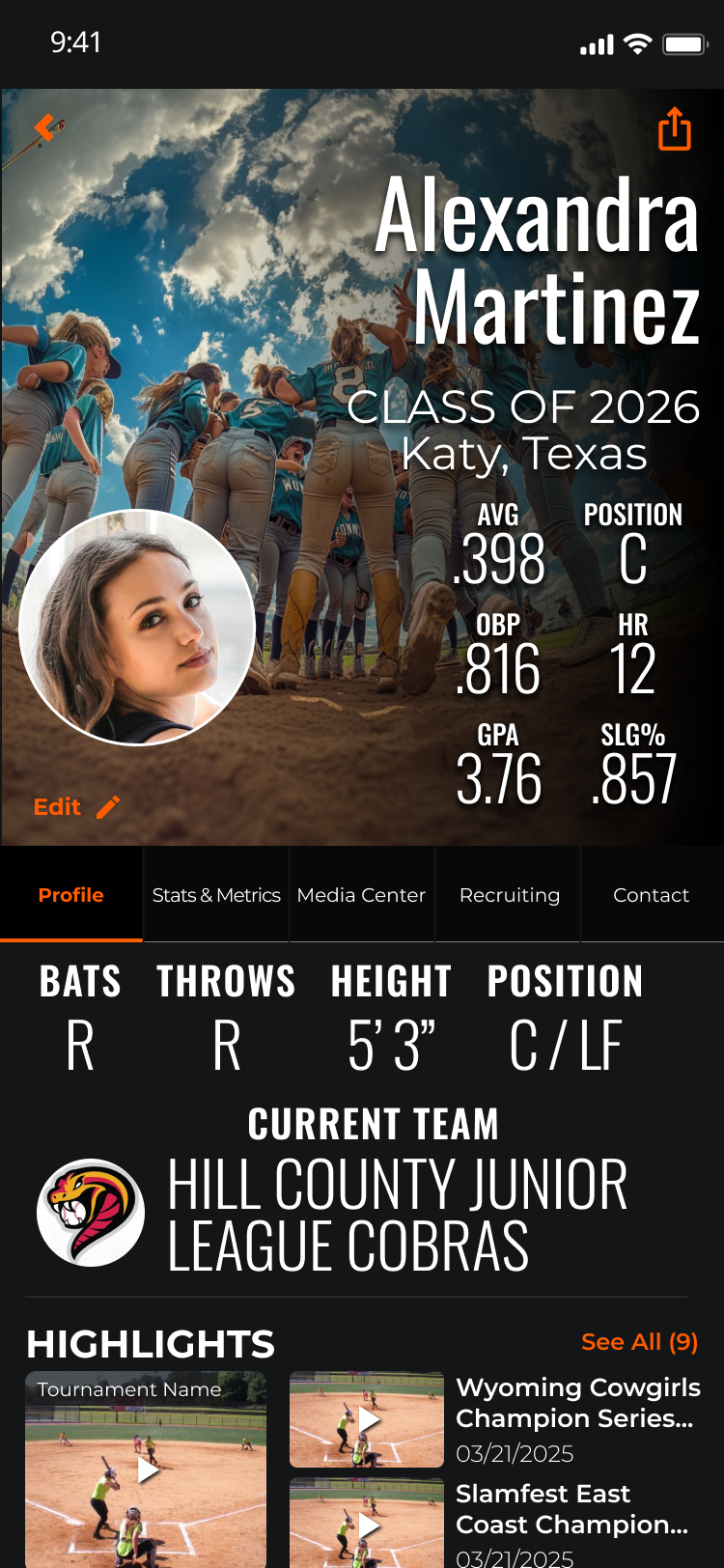
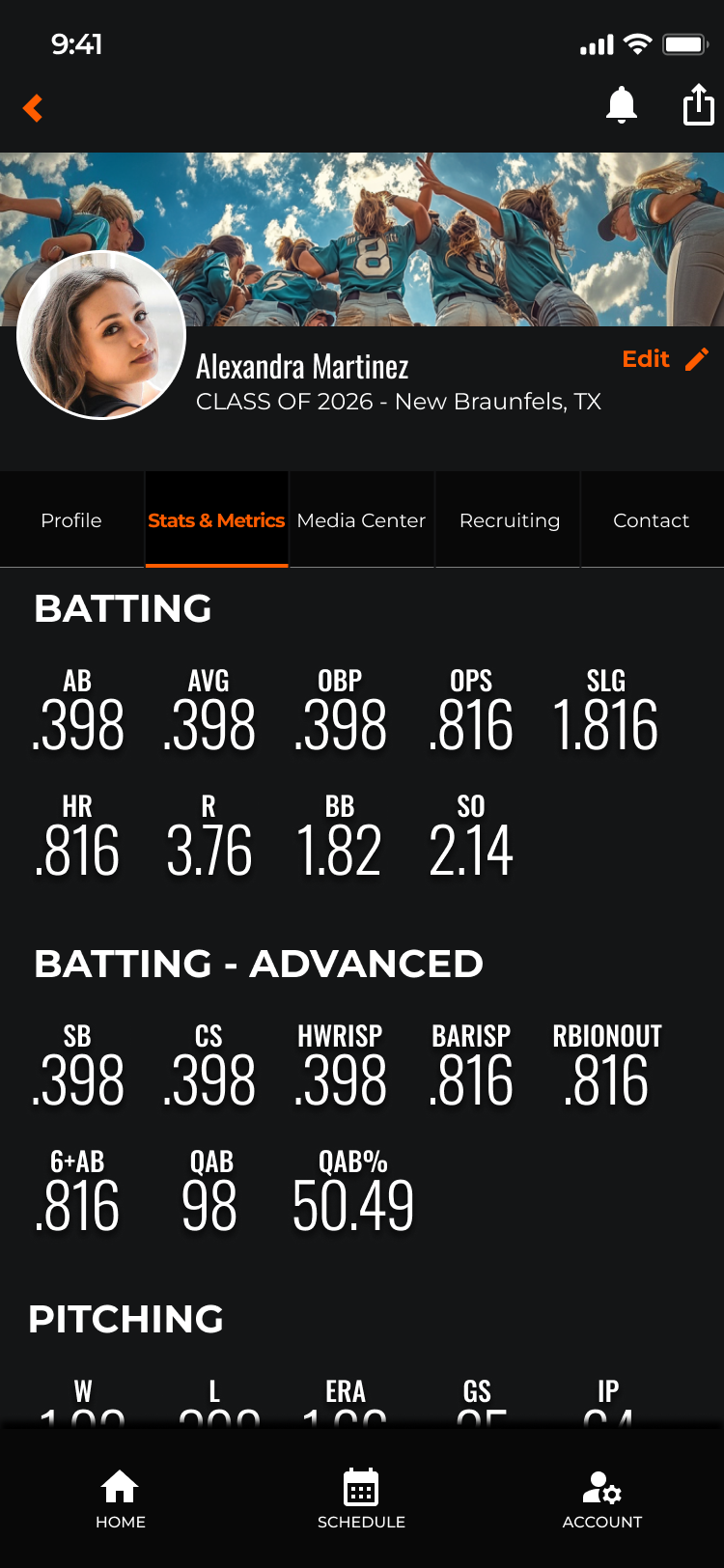
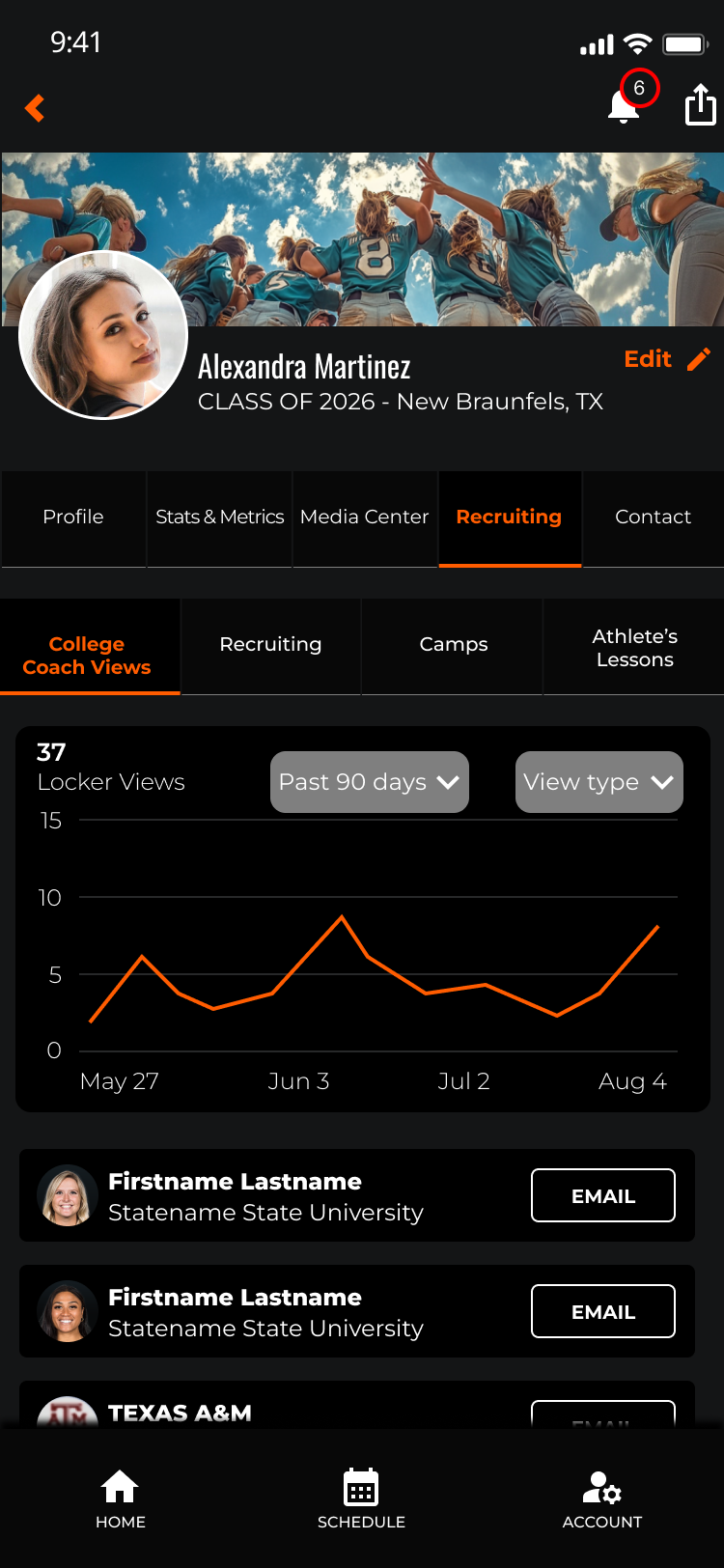
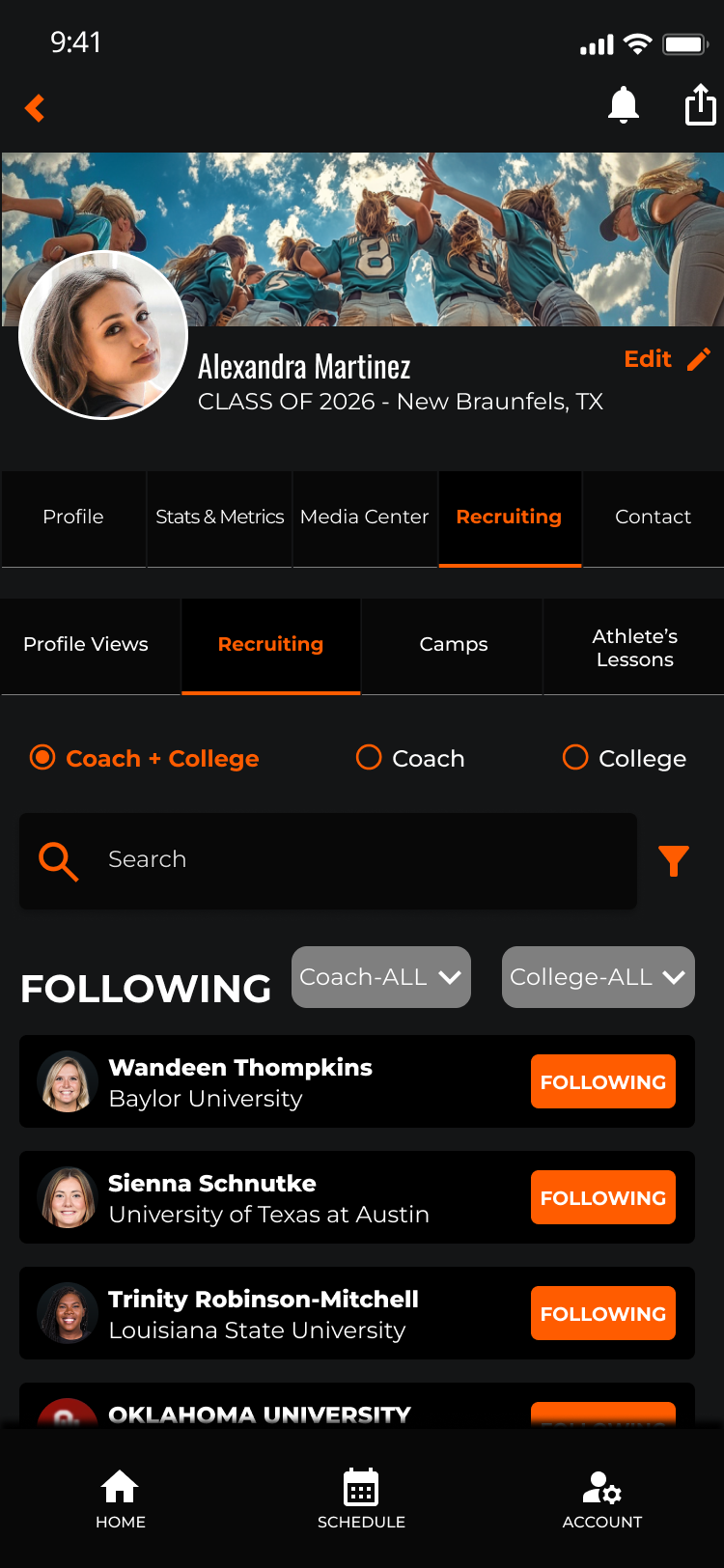
Role-specific dashboards replace the single generic home screen. Fan, Team, and Athlete users each land in a context-aware hub that surfaces what matters most to them immediately.
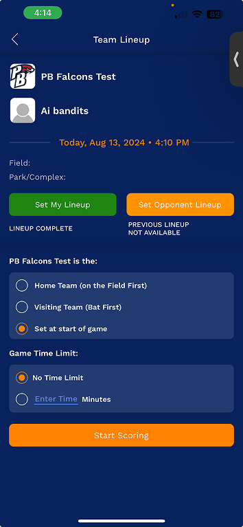
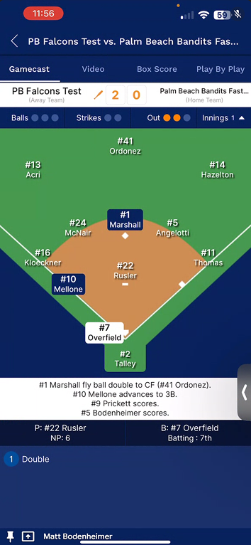
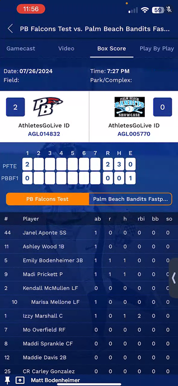
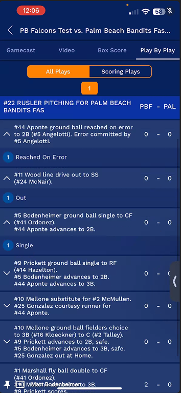
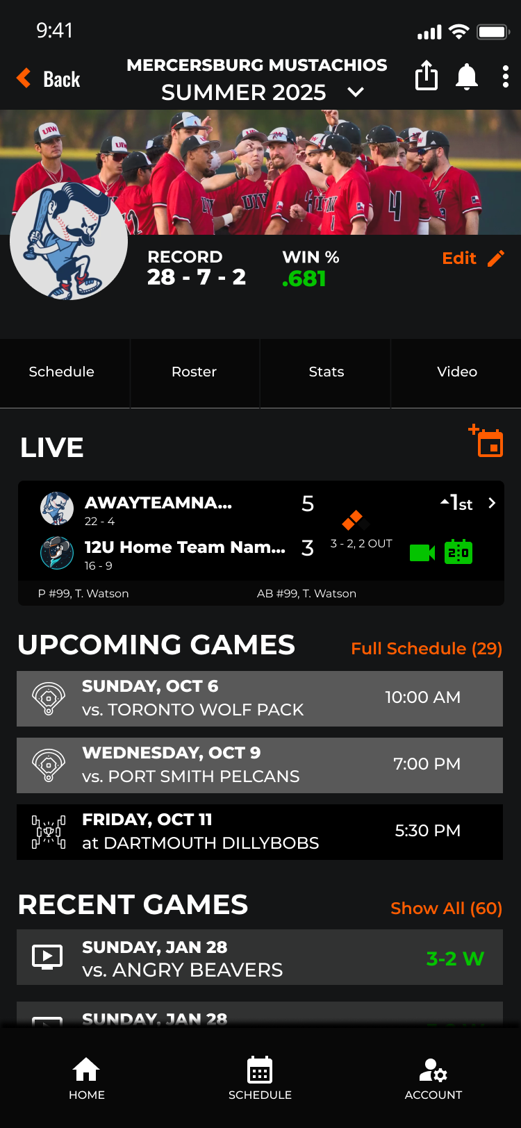
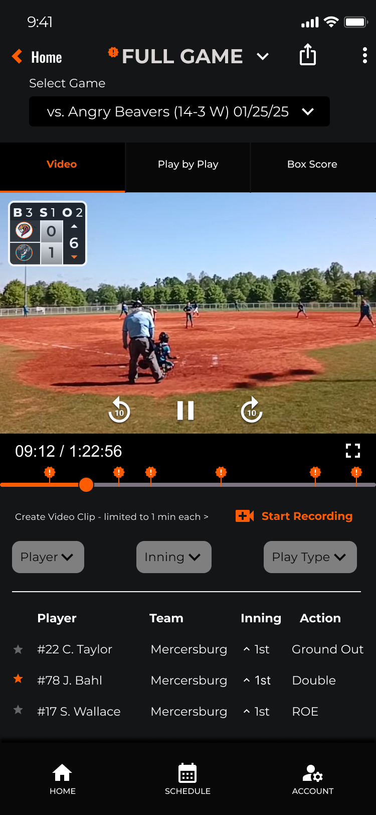
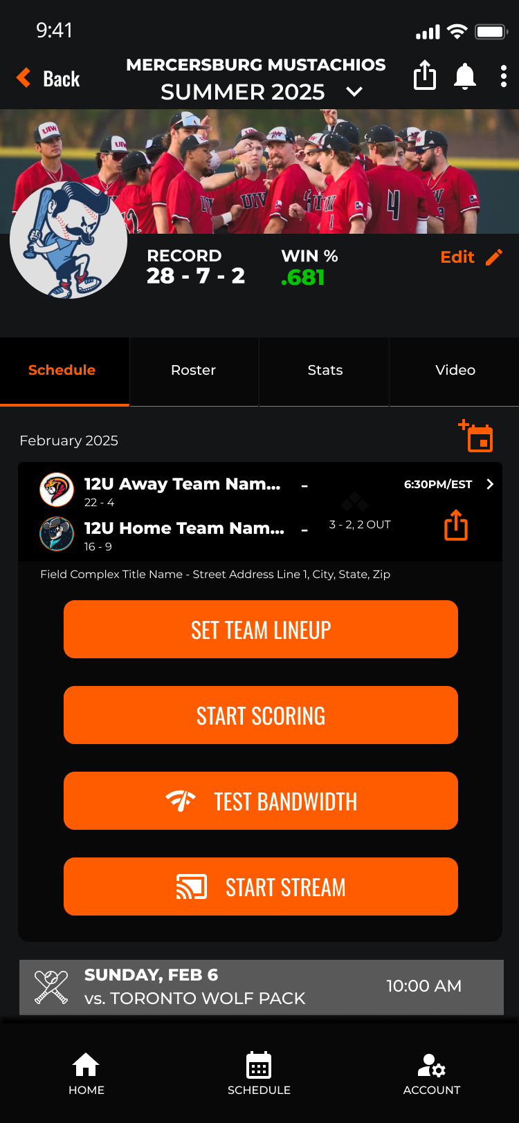
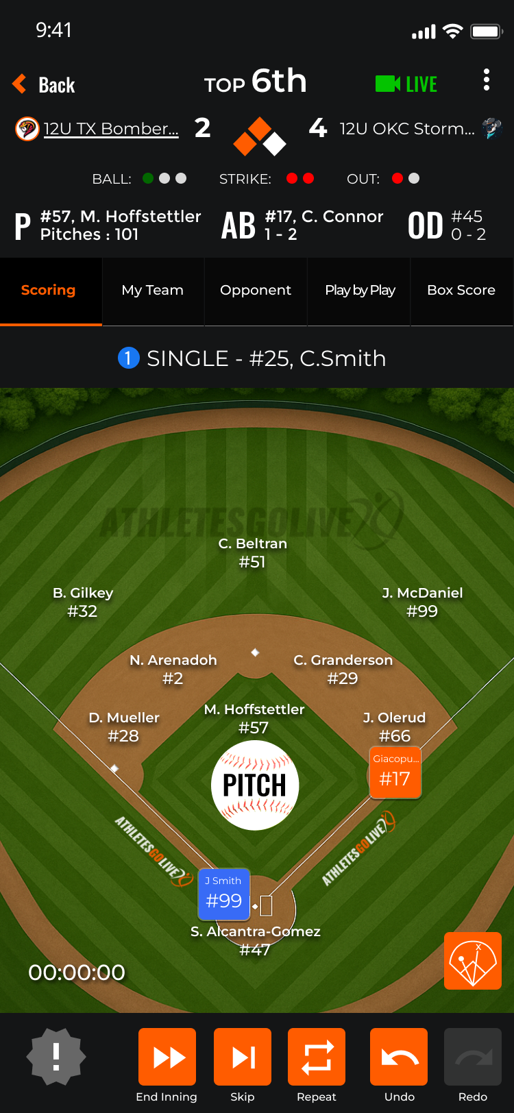
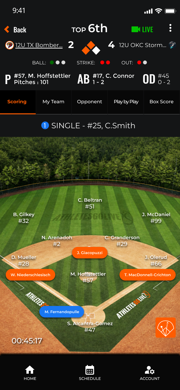
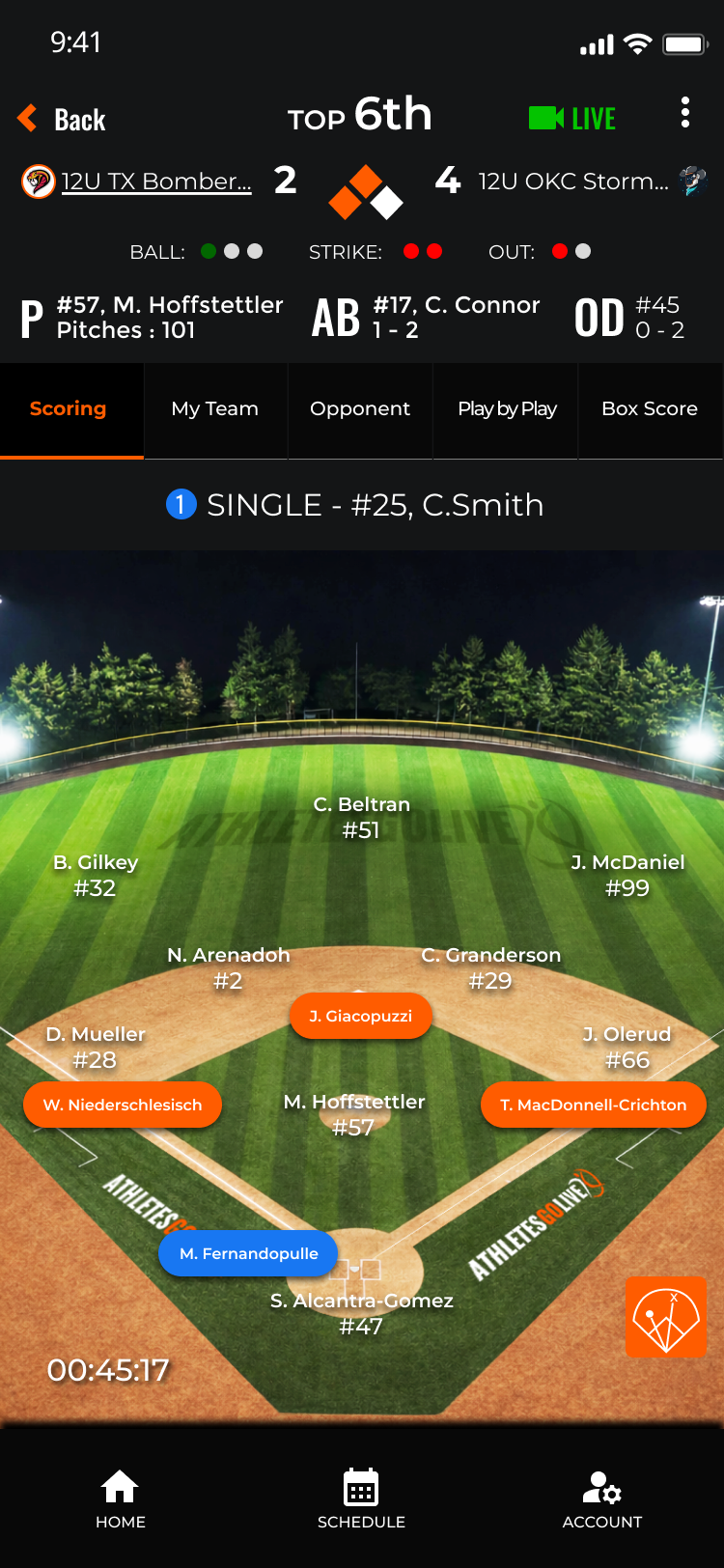
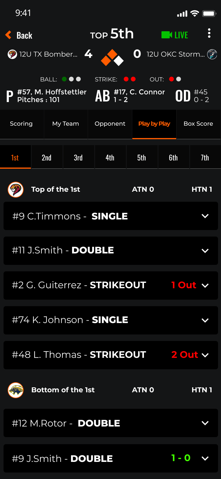
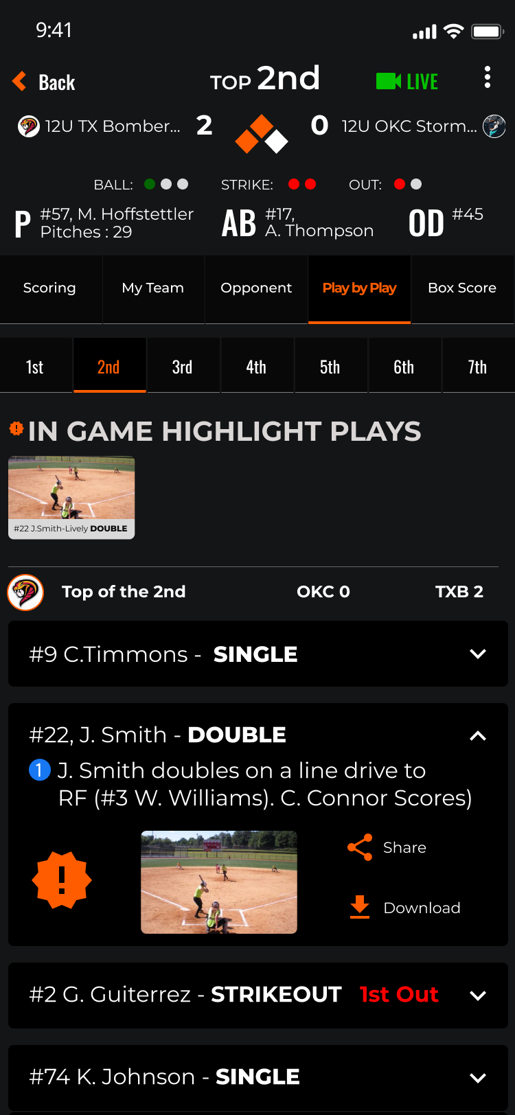
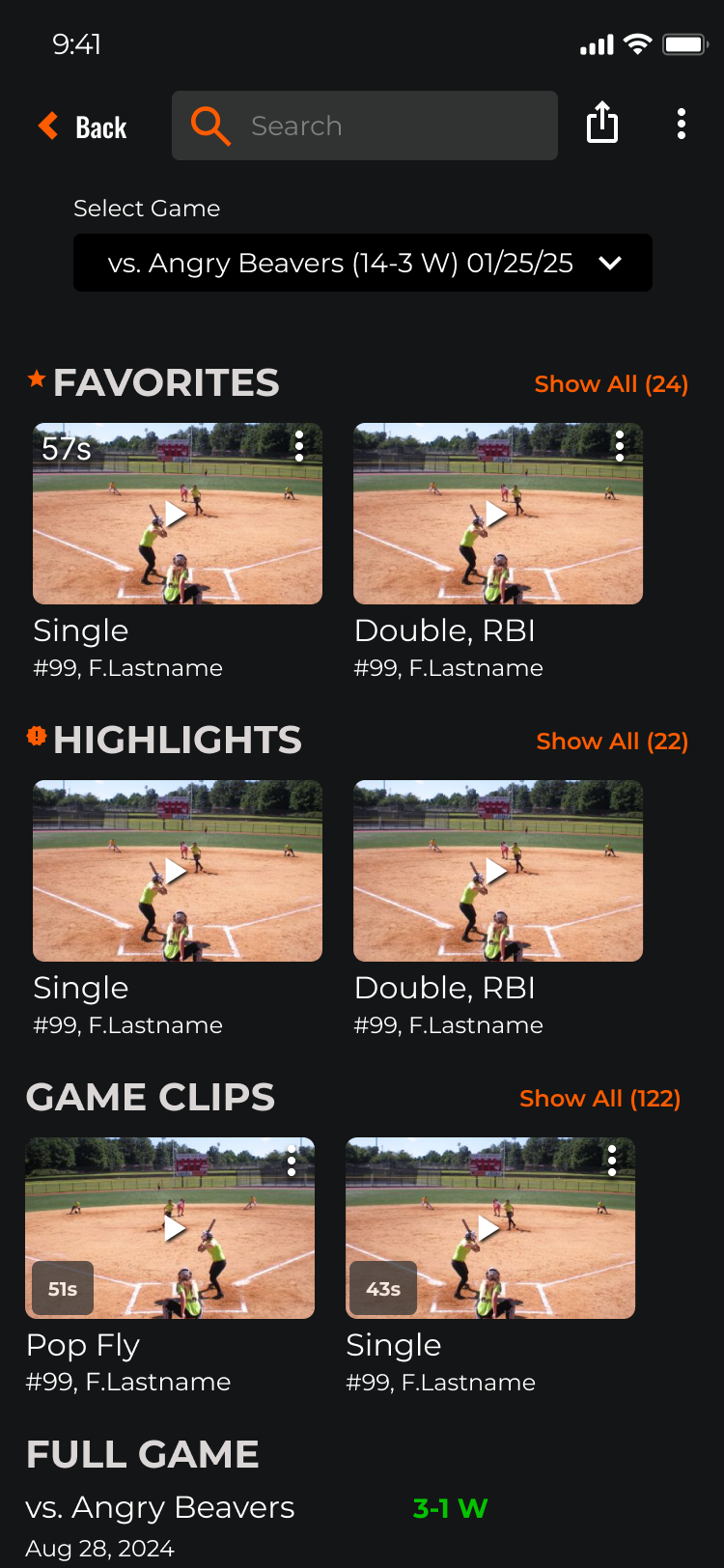
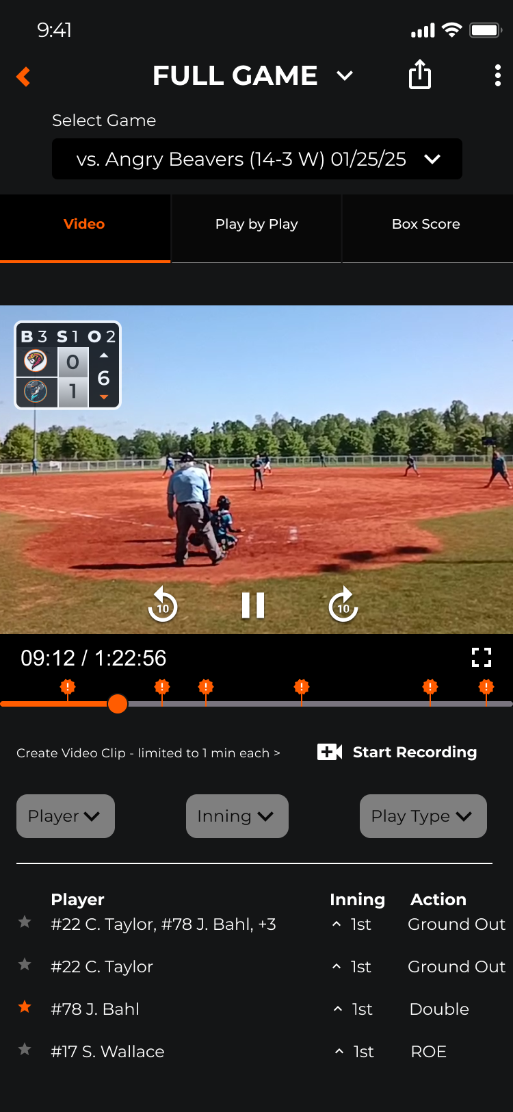
The live game experience is the core value proposition of AthletesGoLive. V2 redesigns every touchpoint — from pre-game setup through live scoring, in-game viewing, and post-game box score review.
Research-driven.
Platform-ready.
AthletesGoLive V2 was built on a documented research foundation that didn’t exist before this engagement. Every heuristic violation was catalogued and assigned a severity rating. Every persona had a named, researched identity. Every V2 design decision traced back to evidence.
For a platform serving seven distinct user types (Fan, Athlete Pro, Athlete Elite, Team, Organization, College Coach, and Instructor) across streaming, live scoring, recruiting, and team administration, this foundation wasn’t optional — it was the only path to a product that could serve all of them without sacrificing any of them.
What Was Delivered
- Full heuristic evaluation of V1 across 10 Nielsen heuristics with severity ratings (0–4)
- 4 primary personas developed from multi-participant user research
- HE findings organized into Functionality, Efficiency, and Accessibility categories
- V2 design system covering all major flows: registration, home, profiles, team management, and live scoring
- Subscription tier architecture with contextual gating replacing the single blocking modal
- Implementation-ready specs and prototypes for iOS, Android, and web
- Design system documentation to support ongoing development consistency