NOVOS
Alarm
Center &
Well Plan
NOVOS is the industry's only reflexive drilling system. I joined midstream to design two parallel features from scratch: a multi-state alarm notification center to combat alert fatigue on the rig floor, and a directional well plan import interface housing nine columns of precision survey data. Both tracks delivered complete developer-ready spec sheets.
NOVOS is the oil and gas industry's only reflexive drilling system — an autonomous platform that automates repetitive drilling activities so drillers can stay focused on process consistency and safety, while operators benefit from optimized drilling programs. The system runs on dedicated hardware mounted at the rig floor, handling real-time sensor data, guiding drillers through step-by-step procedures, and surfacing alarms that demand immediate human judgment.
This contract placed me inside the NOVOS product team midstream — joining an active sprint cadence with an established design language, a growing component library, and SMEs who needed design velocity, not a slow ramp. Every component I designed had to inherit from and extend the existing system without breaking visual consistency.
Both tracks were grounded in documented field research — rig visits, video-recorded driller sessions, and SME interviews that surfaced exactly why the existing approaches weren't working.
Drillers were being desensitized. False alarms from broken sensors, maintenance events, and context-unaware triggers fired constantly — so operators learned to dismiss them reflexively. The risk: at the most vulnerable moments, like making a connection, alarm noise was loudest and drillers had trained themselves to ignore it entirely.
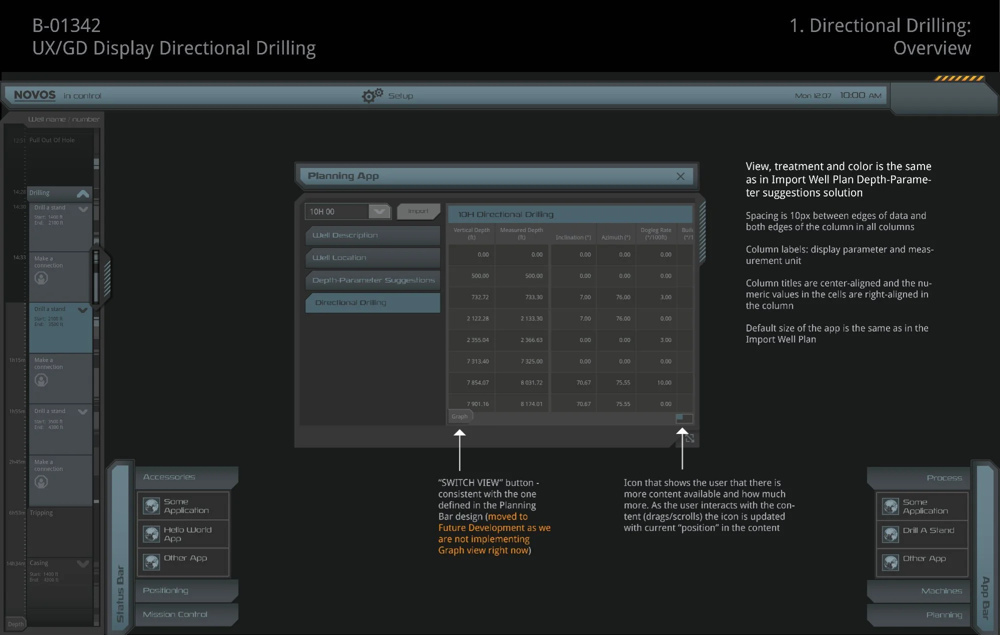
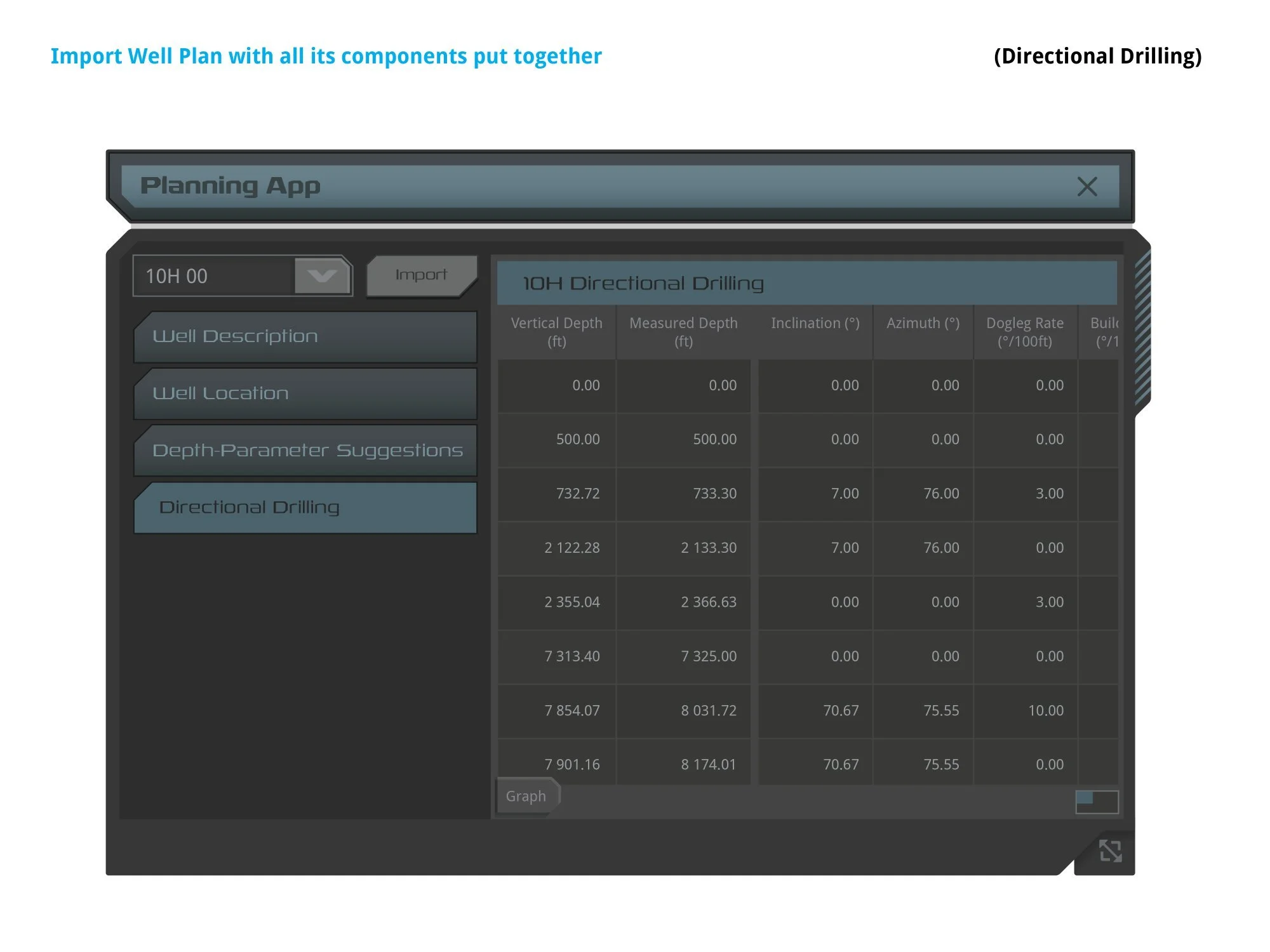
The directional well plan table presented nine columns of precision survey data — Vertical Depth, Measured Depth, Inclination, Azimuth, Dogleg Rate, Build Rate, Turn Rate, and north/east positional offsets. Engineers needed to import, validate, and switch between well plans in a constrained modal without losing their place in the data.
- Finding 01False alarms desensitize. A repeating alarm from a faulty sensor teaches drillers to ignore it — including the real event when it finally occurs.
- Finding 02Consequence-triggered, not cause-triggered. One root event fires multiple alarms. The driller receives noise, not diagnosis.
- Finding 03No contextual awareness. Alarms fire during normal operations — pumps off during a connection — making routine suppression a habit.
- Finding 04Undifferentiated priority. All unacknowledged active alarms look identical. Critical warnings compete visually with trivial status notices.
- Finding 05Well plan data is complex. Nine columns, ten-plus survey rows, horizontal overflow, and sub-column grouping — all within a fixed modal constrained to rig-floor hardware dimensions.
I worked directly with SMEs who provided real-world operational scenarios, which formed the basis for every design decision. Rather than building from scratch, I audited the existing NOVOS component library — cataloging text styles, color tokens, button shapes, SVG assets, and animation patterns — so every new component I designed could be assembled from familiar parts and feel native to the system.
For the alarm center, the SME documentation outlined five things every alarm needed to communicate: that an alarm occurred, its severity, its cause, the corrective action, and the consequences of not acting. This became the design brief.
Early concepts were presented as interactive prototypes to SMEs before backlog items reached development — showing multi-state behavior in motion kept the team aligned even when implementation was two or three sprints out. For the well plan, SMEs provided actual survey data files so I could work with real column widths, real numeric precision, and real overflow conditions rather than synthetic content.
Both tracks went through two guideline document versions refined through engineering review, producing complete SVG asset specs, BorderImage scaling rules, pixel-exact position coordinates, and font tokens — the same format used by every other component in the NOVOS system.
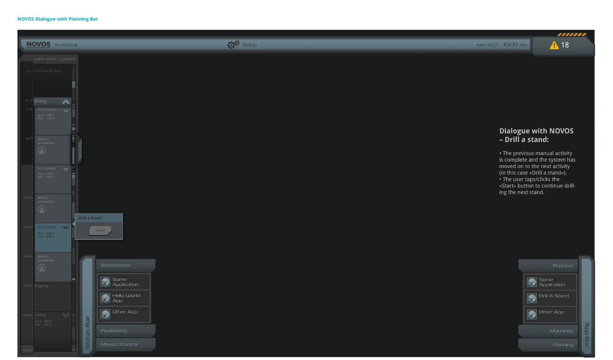
The NOVOS Dialogue with Planning Bar — the system in full operational context. The Planning Bar (left) tracks drilling activities with timestamps and depth ranges; the NOVOS Dialog (center) guides drillers through step-by-step manual procedures. Eighteen active alarms in the nav bar establish the urgency of the alarm center design challenge.
The solution introduced a persistent Alarm Center Button in the NOVOS top navigation bar. The button communicated alarm status at a glance through two distinct visual states: a Warning state (amber triangle icon with count badge) indicating active unacknowledged alarms, and a Normalized state (green check icon) showing all alarms acknowledged. The hazard stripe pattern and count badge gave drillers at-a-glance awareness without leaving their active task.
Tapping the button opened the NOVOS Alarm List — a right-side panel that slid over the workspace without interrupting the current workflow. Each row displayed the alarm title, timestamp, and a plain-language description. A left-edge priority indicator strip used color to differentiate severity tiers, directly solving the "all alarms look identical" problem. The design explicitly avoided mass-acknowledge patterns that had trained drillers to dismiss everything at once.
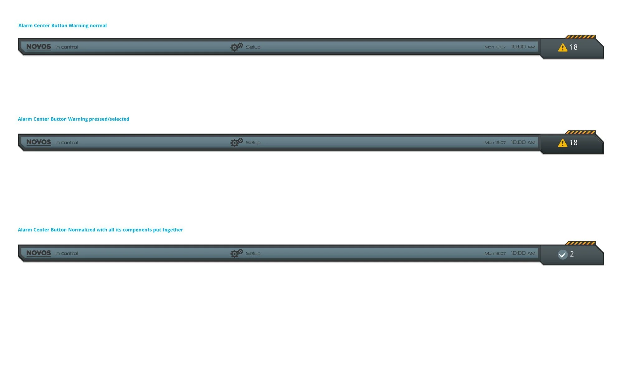
Three persistent button states — Warning Normal (amber triangle, count 18), Warning Pressed (panel open), and Normalized (green check, count 2). The hazard stripe pattern reinforced elevated alert status without text. The count badge provided immediate situational awareness at any scroll position.
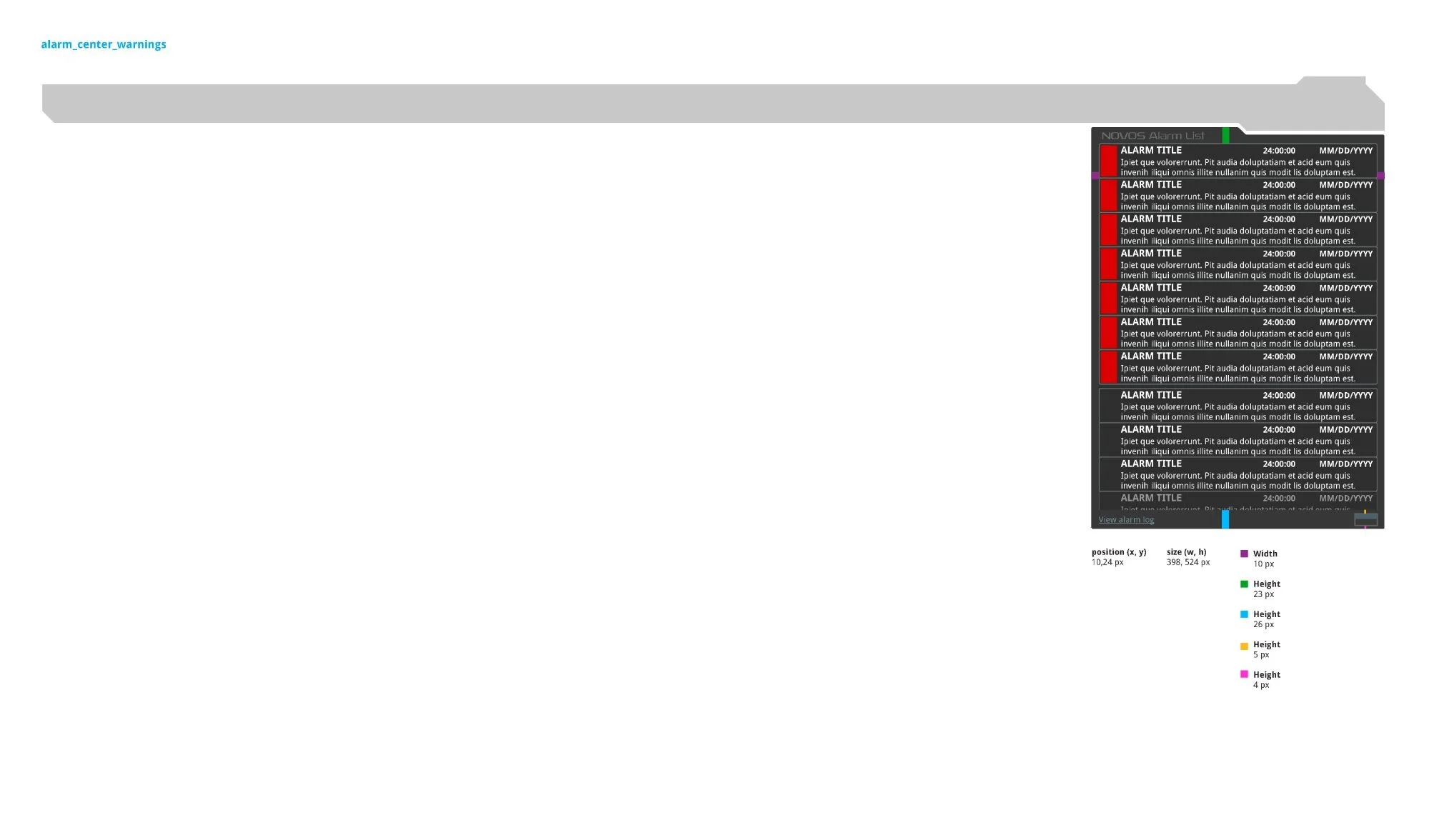
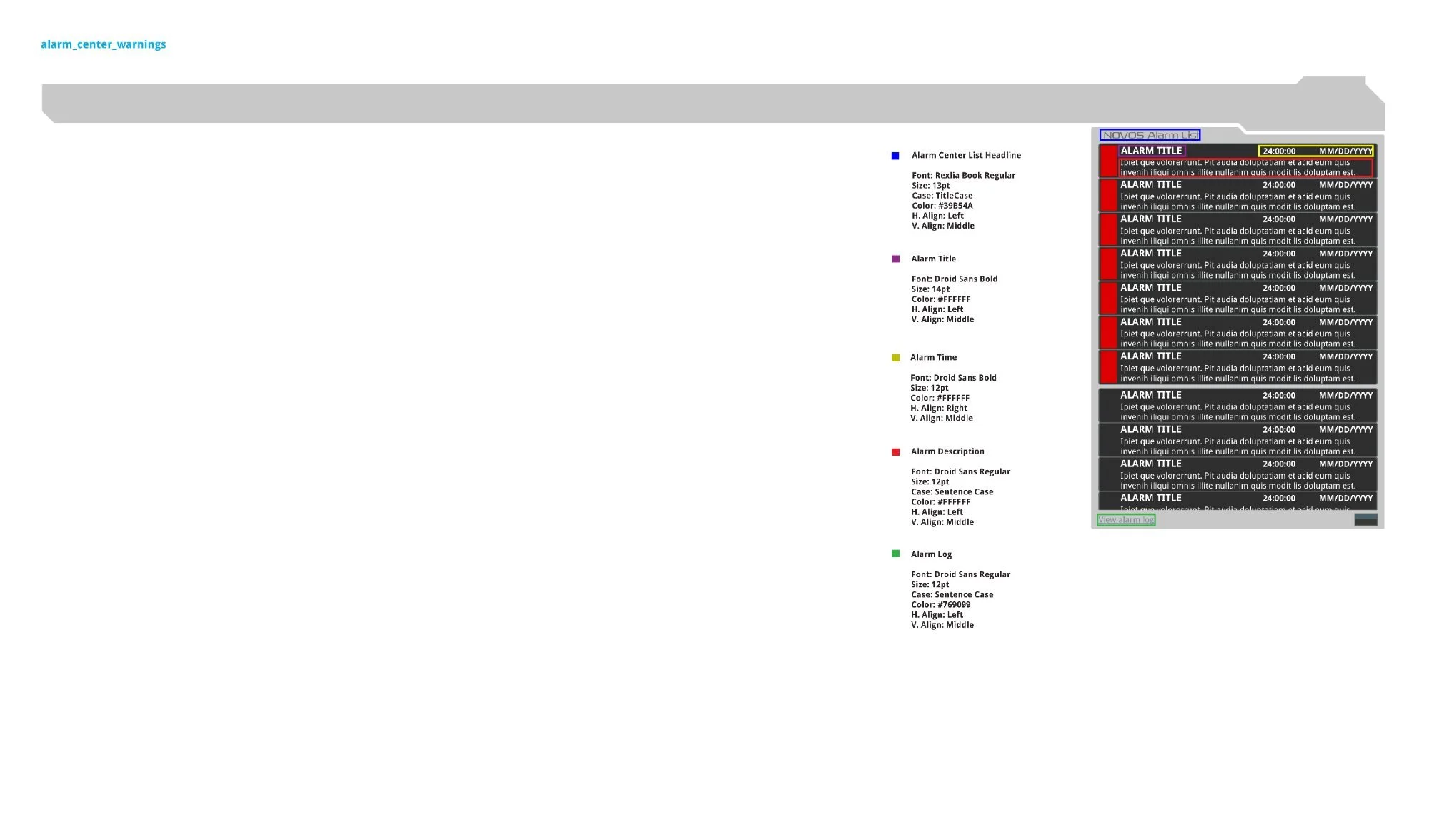
Left: Panel spacing — position (10, 24px), size (398 × 524px), color-coded callouts for header height (23px), content zone (26px), separator (5px), footer strip (4px). Right: Typography system — Rexlia Book Regular for the headline (#39B54A), Droid Sans Bold for alarm titles (14pt) and timestamps (12pt, right-aligned), Droid Sans Regular for descriptions and the "View Alarm Log" link (#769099).
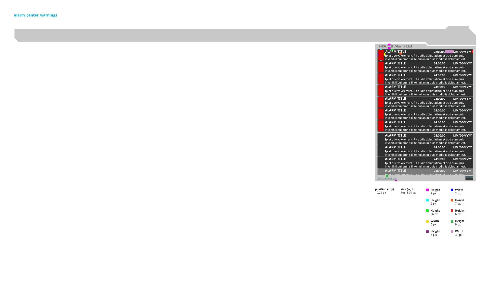
Second dimension pass — row-level measurements: 7px top padding, 26px content zone, 6px side margins, 35px priority indicator width, 9px bottom spacing. Each measurement specified independently so developers could implement without ambiguity in either the QML or CSS layer.
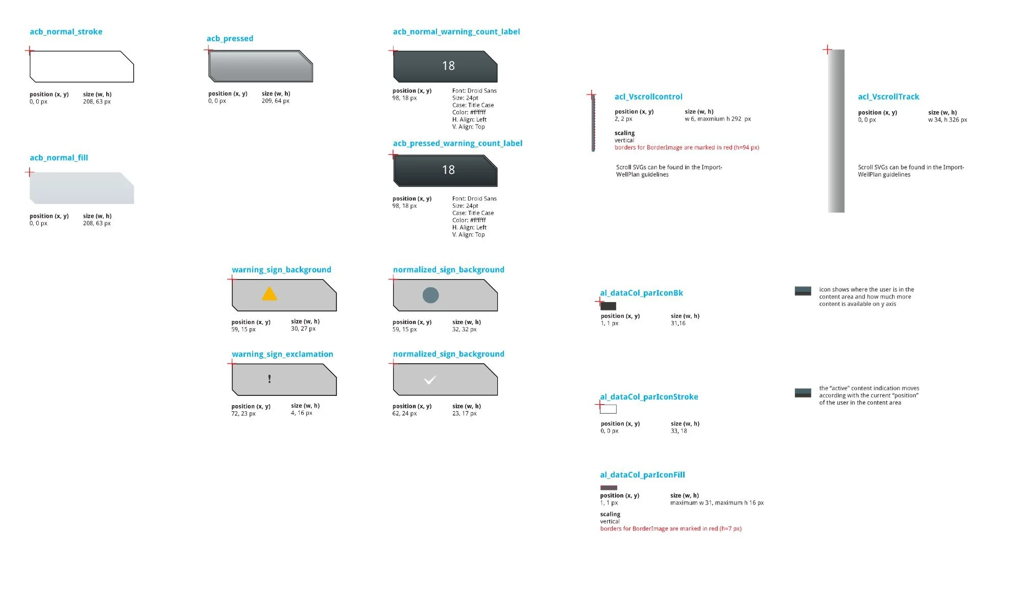
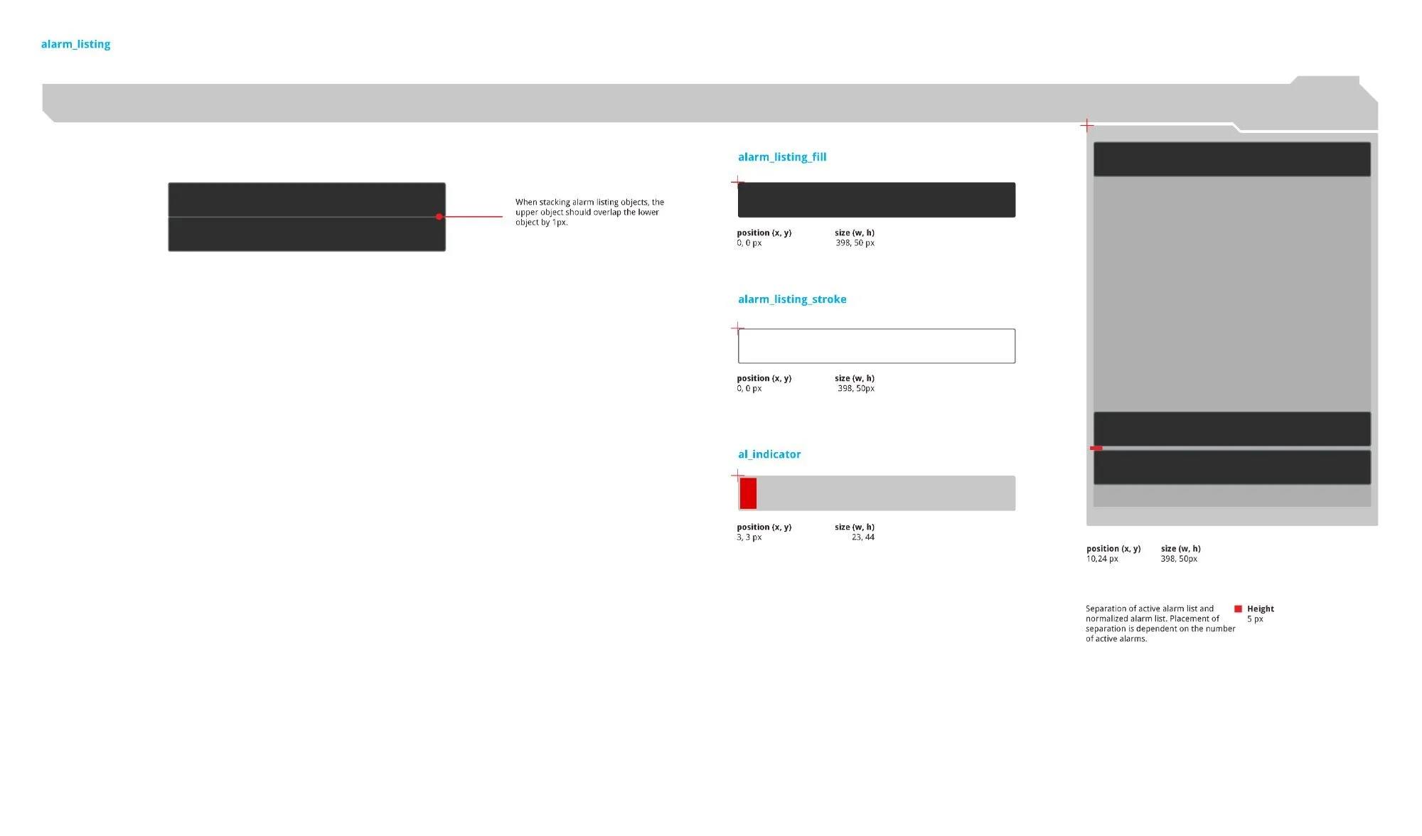
Left: Button SVG breakdown — acb_normal_stroke (208 × 63px), fill, acb_pressed (209 × 64px), warning_sign_background (30 × 27px), warning_sign_exclamation (4 × 16px), normalized check, vertical scroll control (w6, max h292px). Right: alarm_listing — fill and stroke (both 398 × 50px) plus the al_indicator priority strip (23 × 44px at position 3, 3). Stacking rule: upper object overlaps lower by 1px.
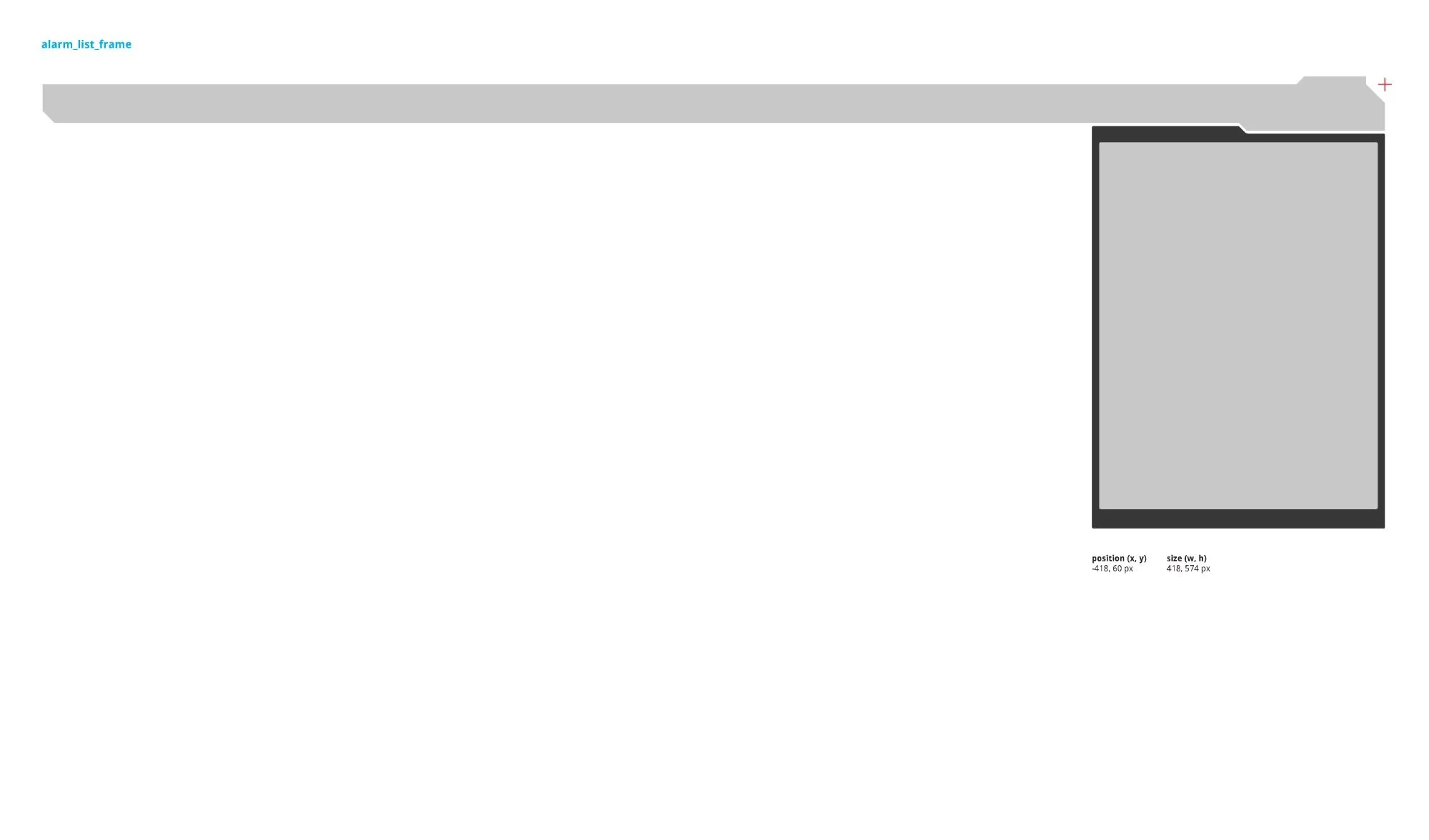
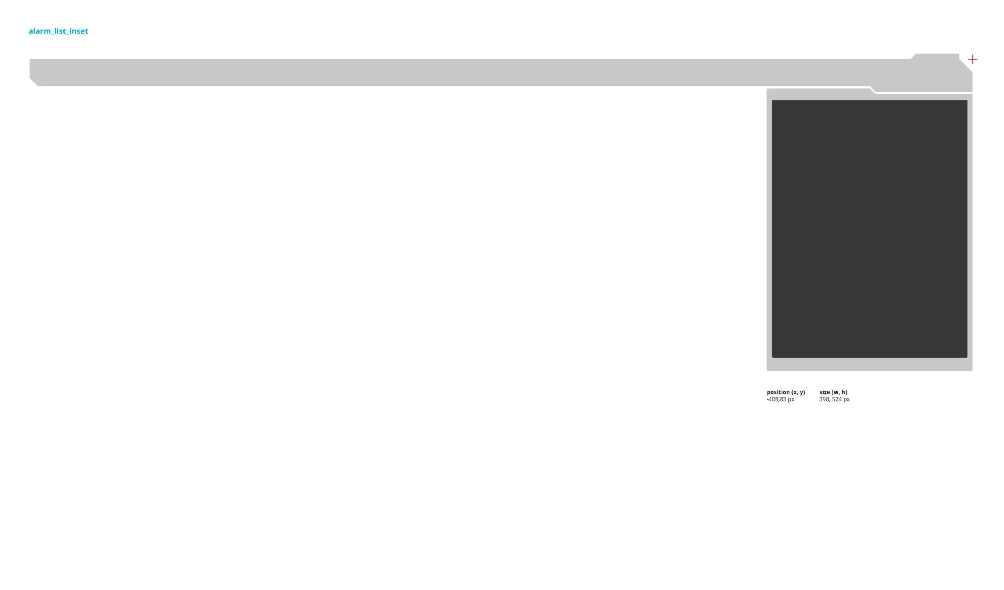
Two nested SVG layers: alarm_list_frame (outer shell, 418 × 574px) positioned off-canvas at x –418 in resting state and sliding to 0 on trigger, and alarm_list_inset (inner dark content area, 398 × 524px). Two-layer construction allows the frame and content to animate and scale independently.
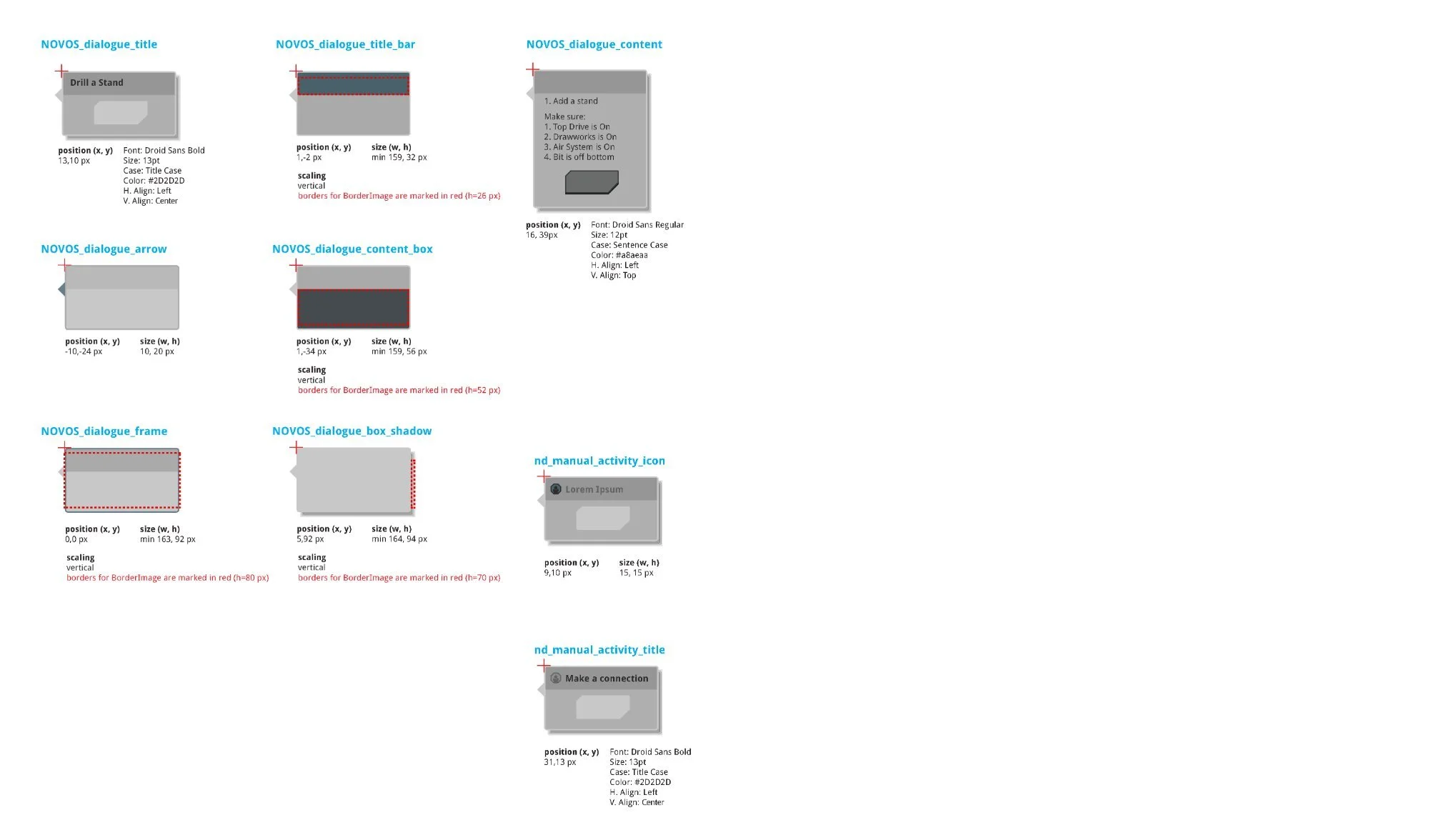
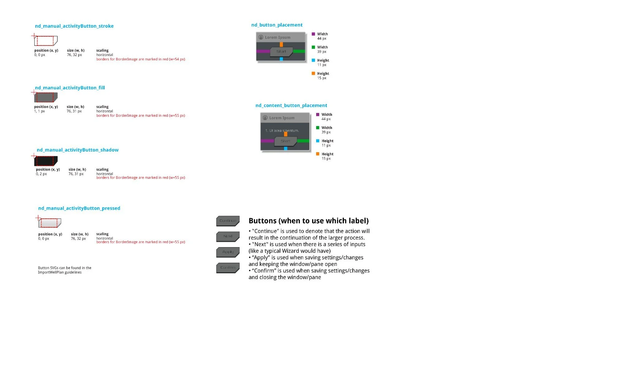
NOVOS Dialogue specs — title bar (min 159 × 32px), content box (min 159 × 56px), frame (min 163 × 92px), box shadow (min 164 × 94px). Activity button defined four states: normal, pressed, and "Starting" (dimmed, text color shifted). Label conventions: "Continue" for process continuation, "Next" for wizard sequences, "Apply" to save without closing, "Confirm" to save and close.
The Planning App modal housed a tabbed navigation sidebar alongside a data-dense table displaying directional drilling survey data — up to nine columns including Vertical Depth, Measured Depth, Inclination, Azimuth, Dogleg Rate, Build Rate, Turn Rate, and north/east positional offsets — across ten or more survey rows, all within a fixed modal at a minimum width of 790px.
The left sidebar used three interaction states — normal (gradient), pressed, and selected (flat fill #49616B) — to communicate the active section. The Import button communicated the full workflow through four states: dimmed (no selection), normal (ready), importing (in-progress), and an imported confirmation that persisted for 6 seconds before resetting.
B-01342 — Directional Drilling in full NOVOS operational context. Design notes annotate column spacing (10px from edge), center-justified column labels, right-aligned cell data, and the parIcon position indicator (lower right) showing the user's viewport position within the full data set.
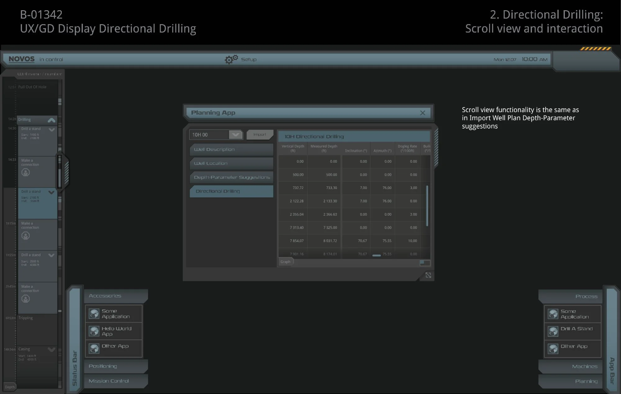
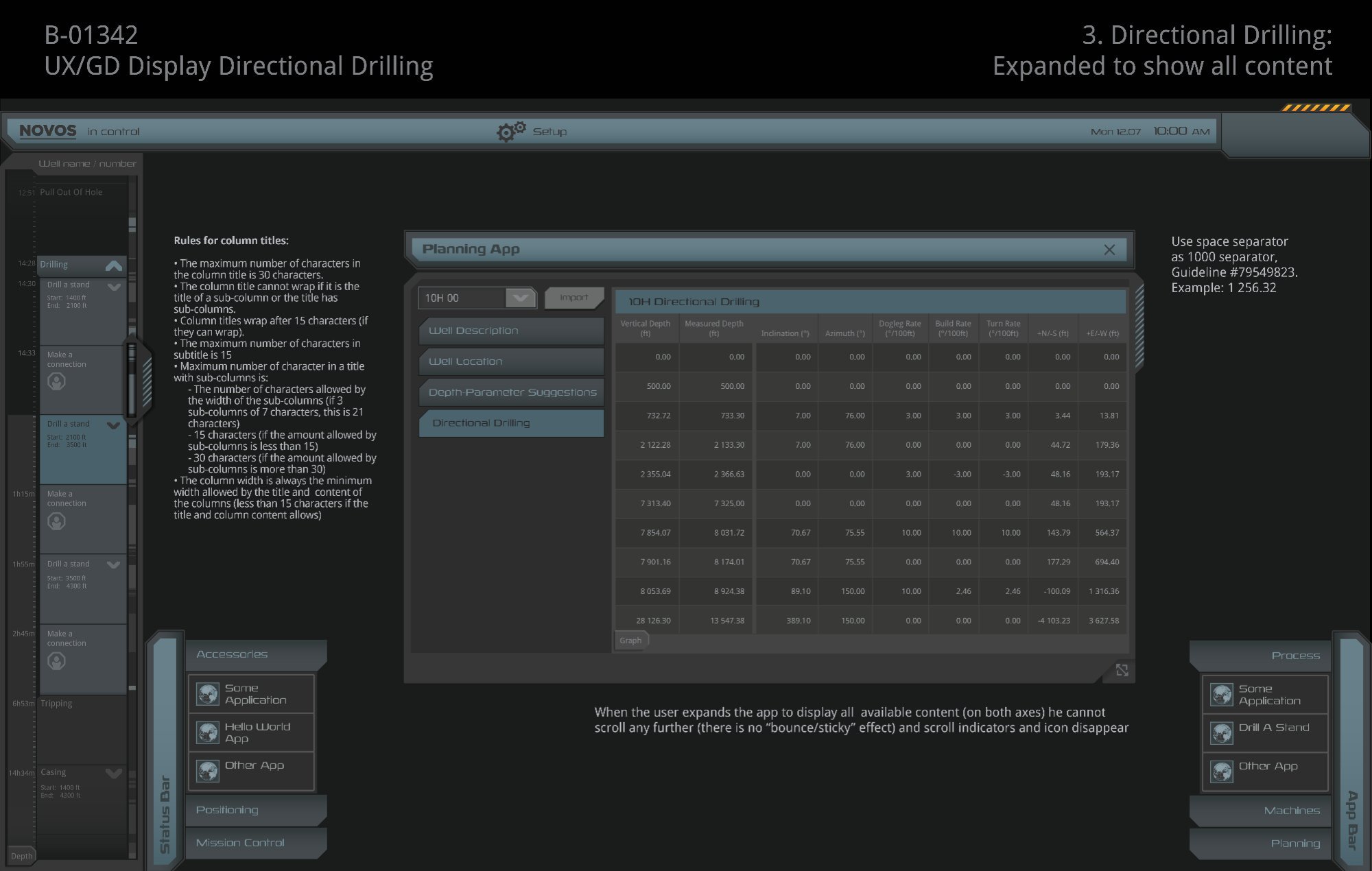
Left: Scroll view — vertical scroll control appears when data rows exceed the visible area; indicators and parIcon disappear when fully expanded (no bounce/sticky effect). Right: Expanded to full content with column width rules — max 30 characters per title, wrapping after 15 characters, minimum width driven by widest title or data value. Numeric values use space as the 1000 separator.
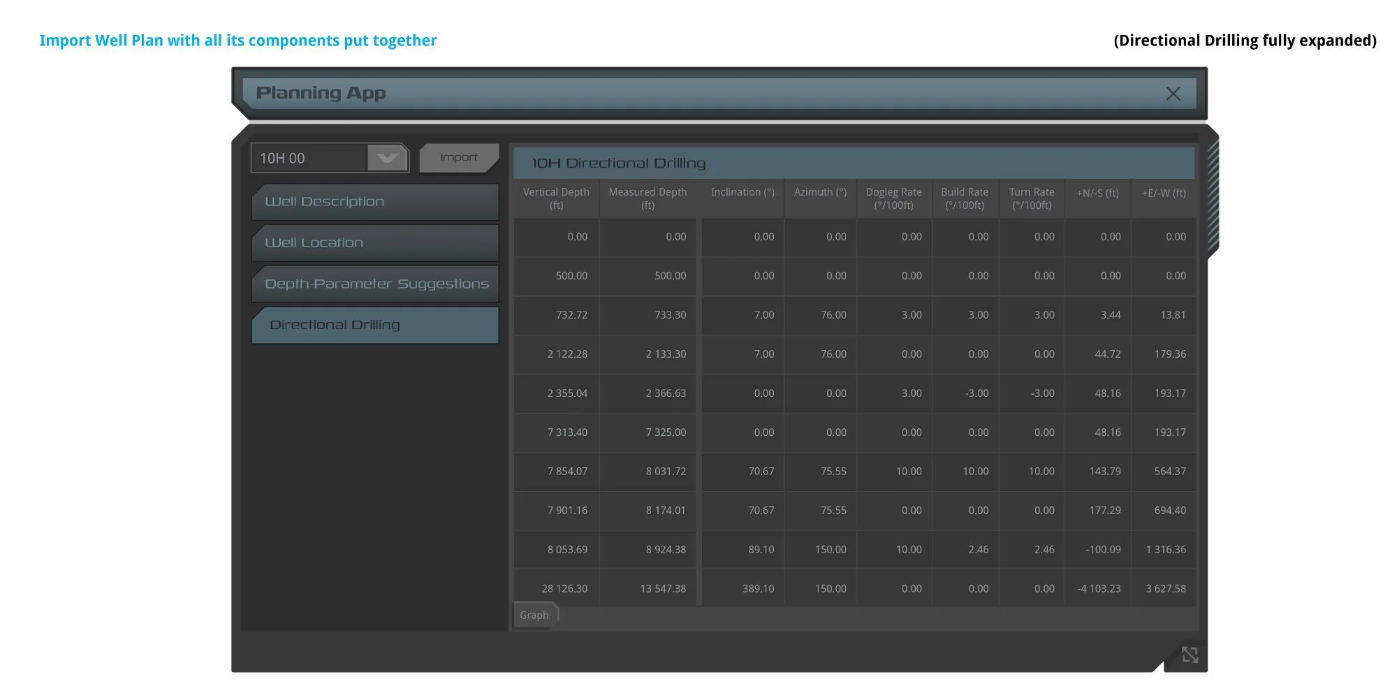
Left: Default view — "Directional Drilling" selected, 7 columns visible, horizontal scroll active. Right: Fully expanded — all nine columns including Build Rate, Turn Rate, +N/-S, and +E/-W; scroll indicators disappear once all content is visible.
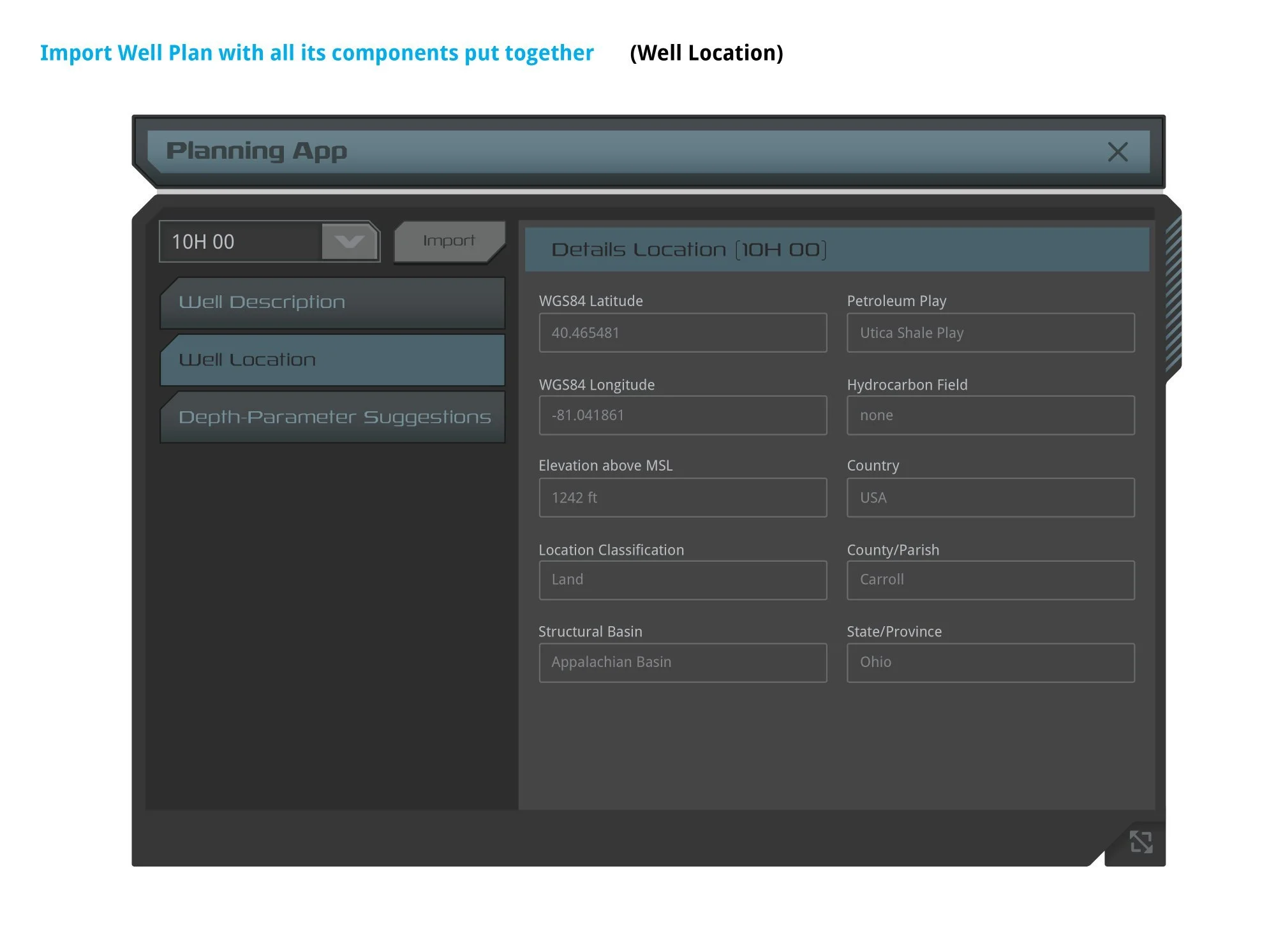
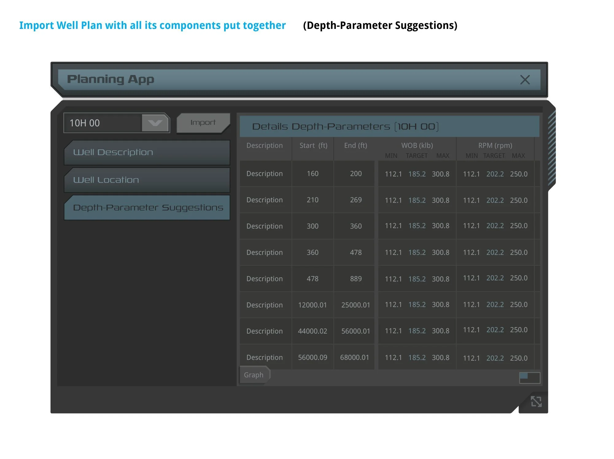
The sidebar nav controlled four discrete content sections. Well Location (left) displayed GPS coordinates, elevation, and geographic identifiers. Depth-Parameter Suggestions (right) introduced complex column hierarchy — WOB and RPM each split into MIN / TARGET / MAX sub-columns, demonstrating the sub-column grouping rules documented in the column width spec.
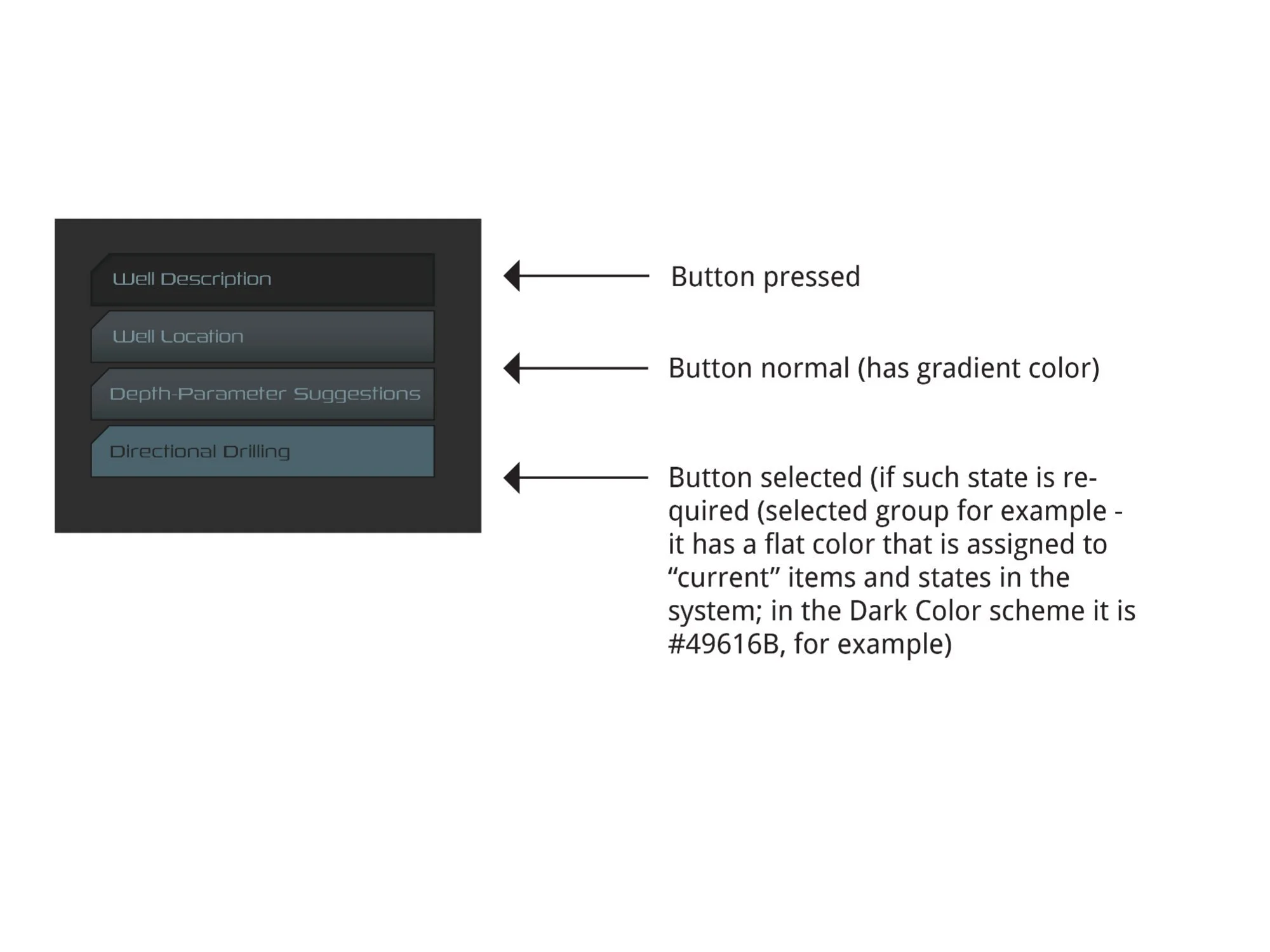
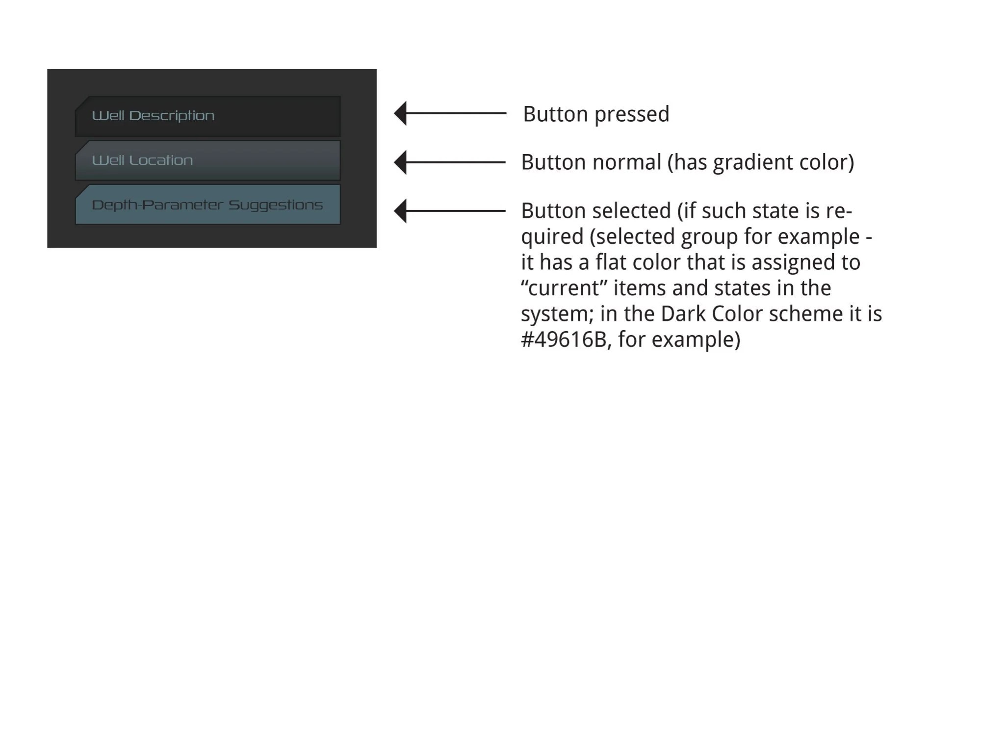
Sidebar nav button states across both guideline versions. Three states: pressed (flat dark), normal (gradient fill), and selected (flat fill #49616B — the "current" item color throughout the NOVOS Dark Color scheme). Font: Rexlia Book, 13pt normal / 14pt pressed, Title Case, #769099 normal / #282828 active.
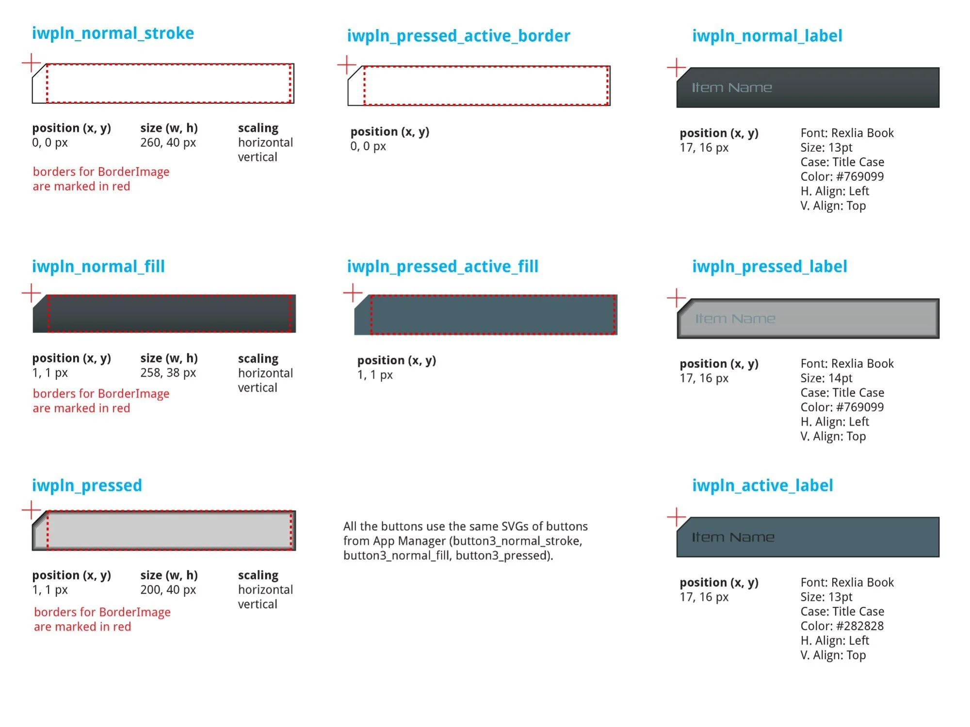
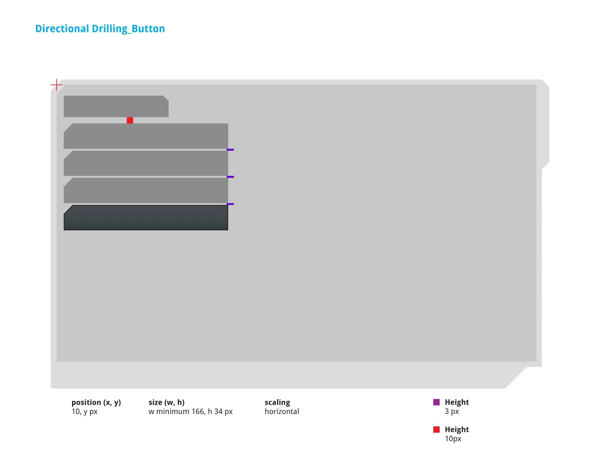
Left: Nav button label SVG specs — iwpln_normal_stroke (260 × 40px), iwpln_normal_fill (258 × 38px), iwpln_pressed (200 × 40px), and active border/fill pair. Right: Sidebar button SVG stacking — position (10, y px), minimum size (w 166, h 34px). Uses App Manager SVGs: button3_normal_stroke, button3_normal_fill, button3_pressed.
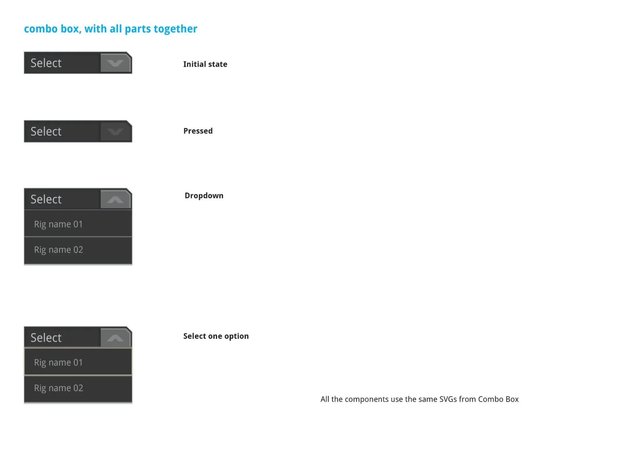
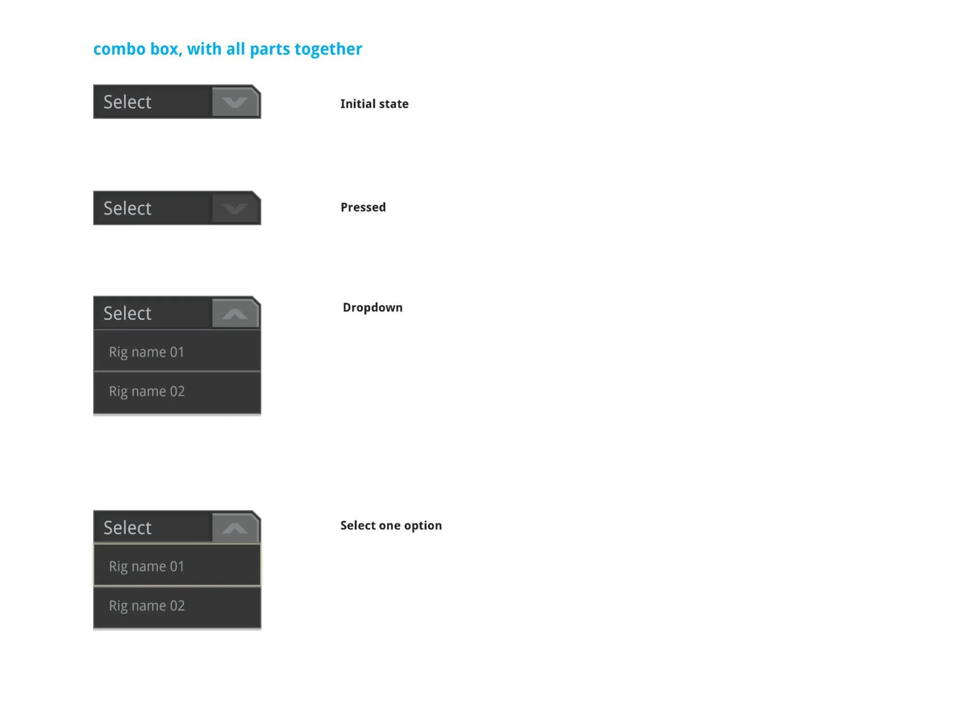
Combo box documented across both guideline versions — four states: Initial ("Select" placeholder, down chevron), Pressed, Dropdown open (up chevron, option list), and Select one option. The arrow tab flips ∨ to ∧ on open. All components share SVG assets from Combo Box.
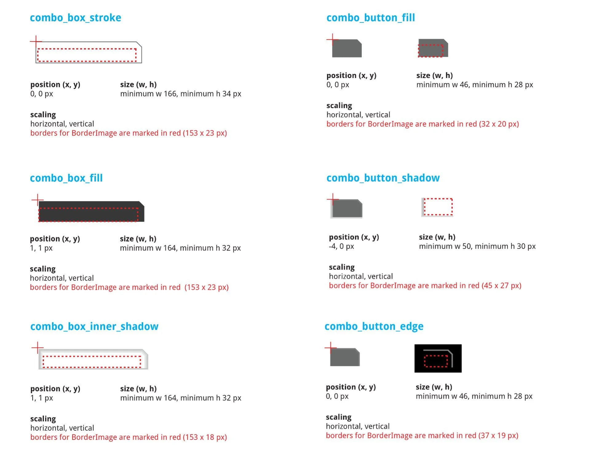
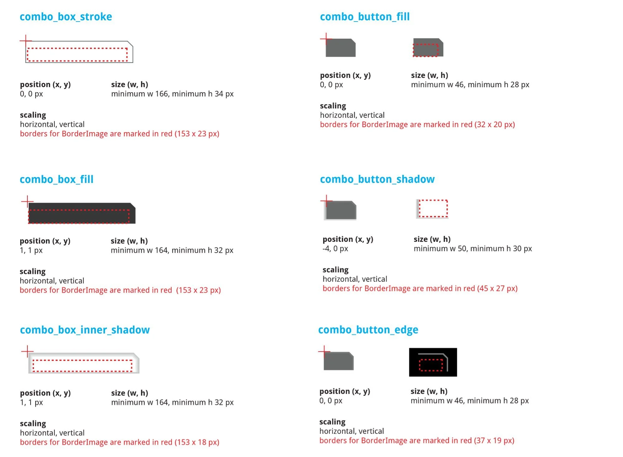
Combo box SVG breakdown — combo_box_stroke (min w166 × h34px), combo_box_fill (min w164 × h32px), combo_box_inner_shadow (min w164 × h32px), combo_button_fill (min w46 × h28px), combo_button_shadow (min w50 × h30px, position –4, 0), combo_button_edge (min w46 × h28px). All scale horizontally and vertically.
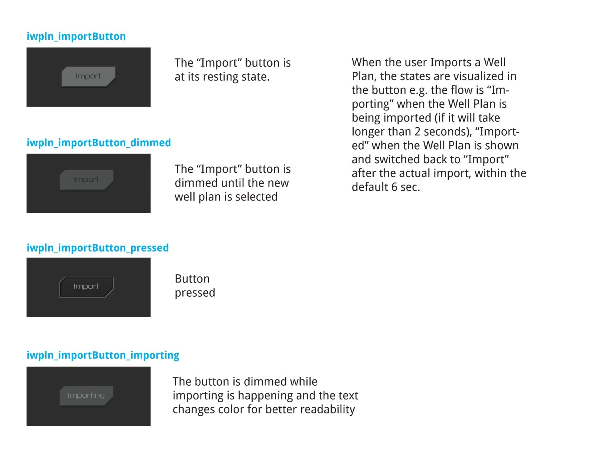
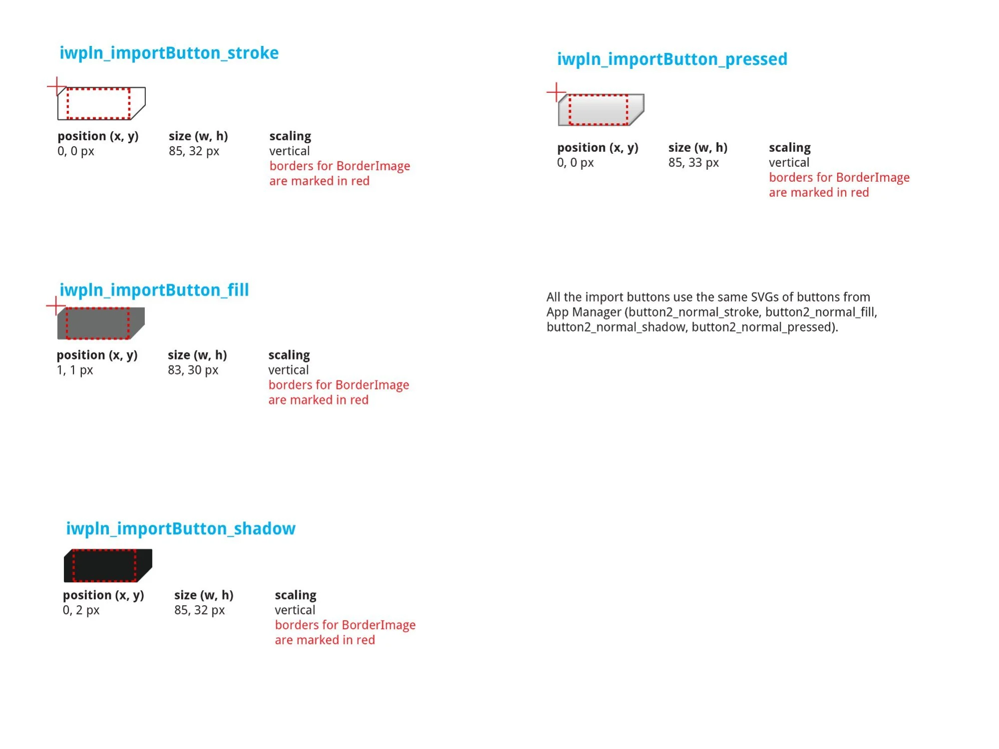
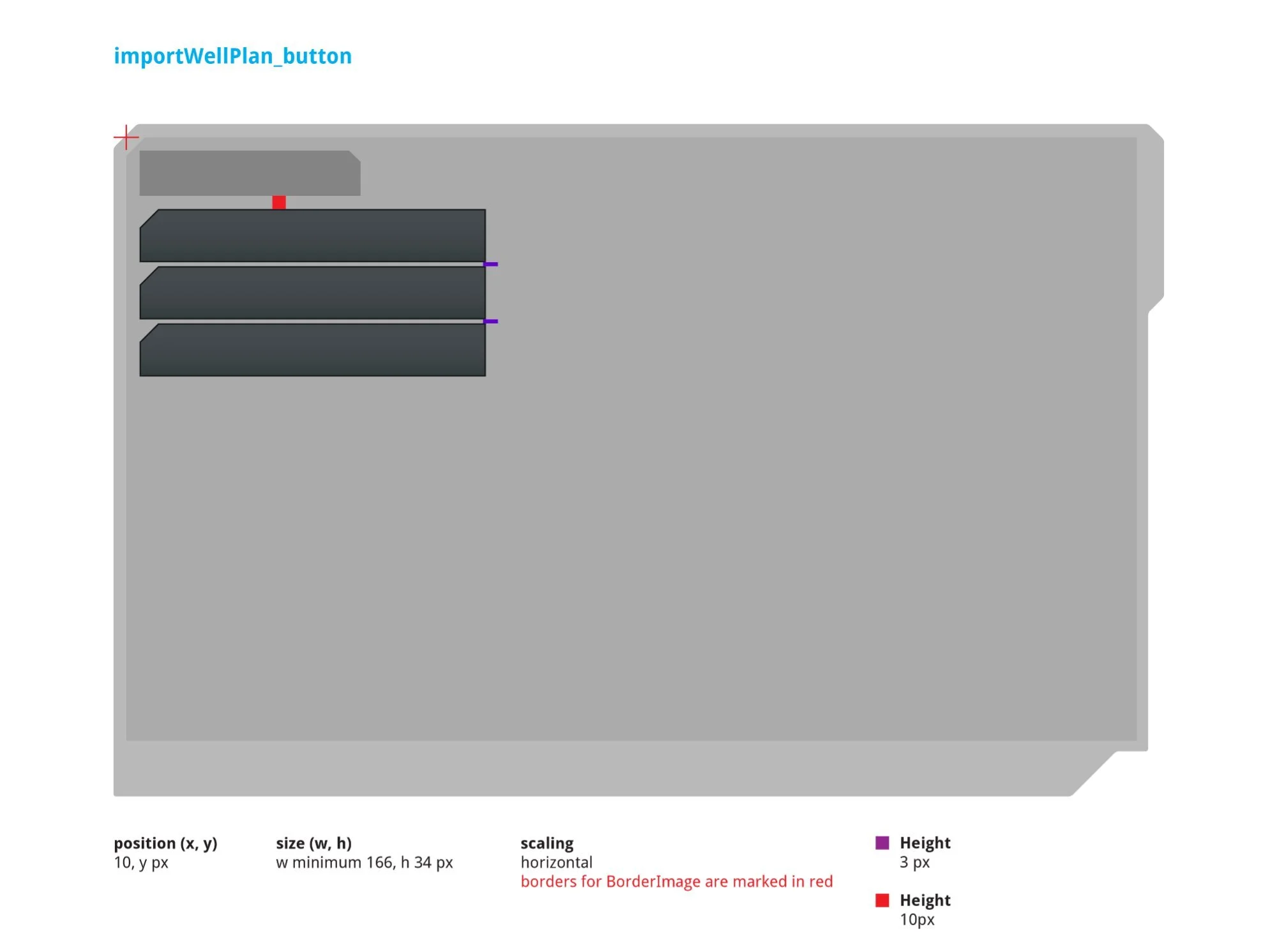
Left: Four-state flow — normal (resting), dimmed (no well plan selected), pressed (visual depression), and importing ("Importing" label, dimmed while in progress >2s, then "Imported" confirmation for 6 seconds before resetting). Right: SVG breakdown — stroke (85 × 32px), fill (83 × 30px), shadow (85 × 32px), pressed (85 × 33px). Uses App Manager SVGs: button2_normal_stroke, fill, shadow, pressed.
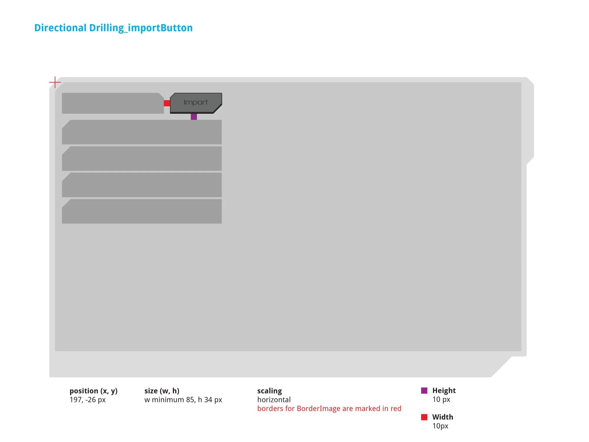
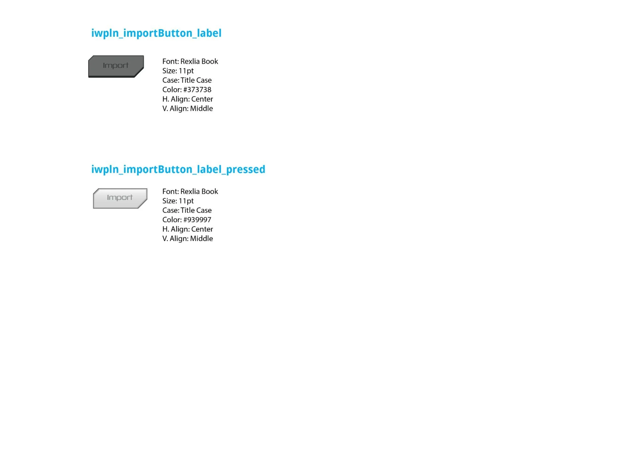
Left: Import button in context — positioned at (197, –26px), min size (w 85, h 34px). Right: Label typography — Rexlia Book, 11pt, Title Case; normal state color #373738 (near-black on the chevron surface), pressed state color #939997 (lighter for readability when dimmed).
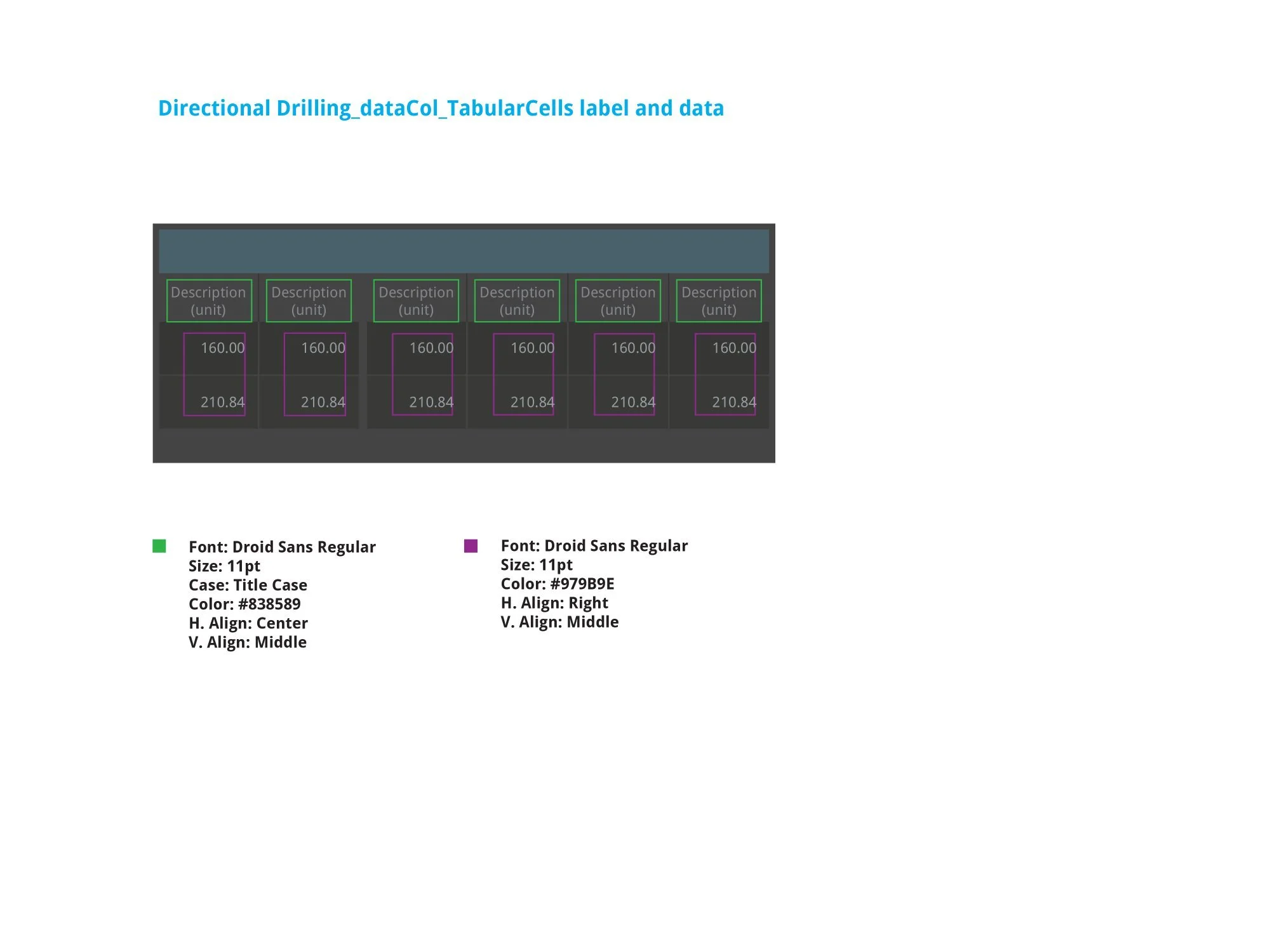
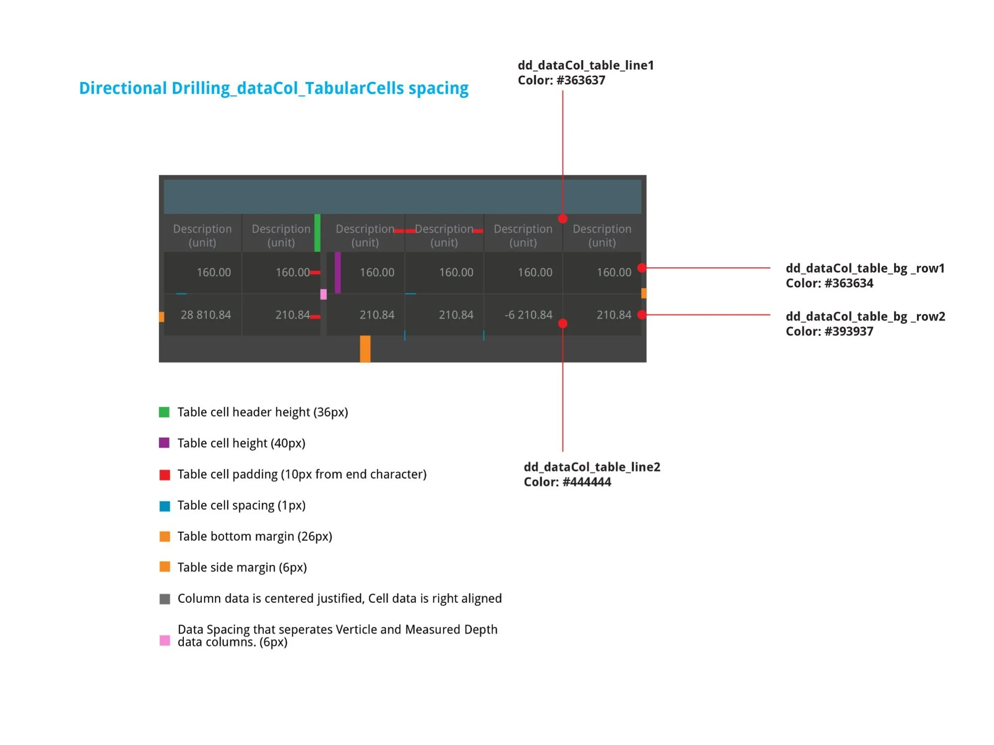
Left: Typography — column headers Droid Sans Regular, 11pt, Title Case, #838589, center-aligned; cell data Droid Sans Regular, 11pt, #979B9E, right-aligned. Right: Spacing — 36px column header height, 40px data row height, 10px end-character padding, 1px cell spacing, 26px bottom margin, 6px side margin. Alternating row backgrounds: #363634 / #393937. A 6px gap separates the Vertical/Measured Depth pair.
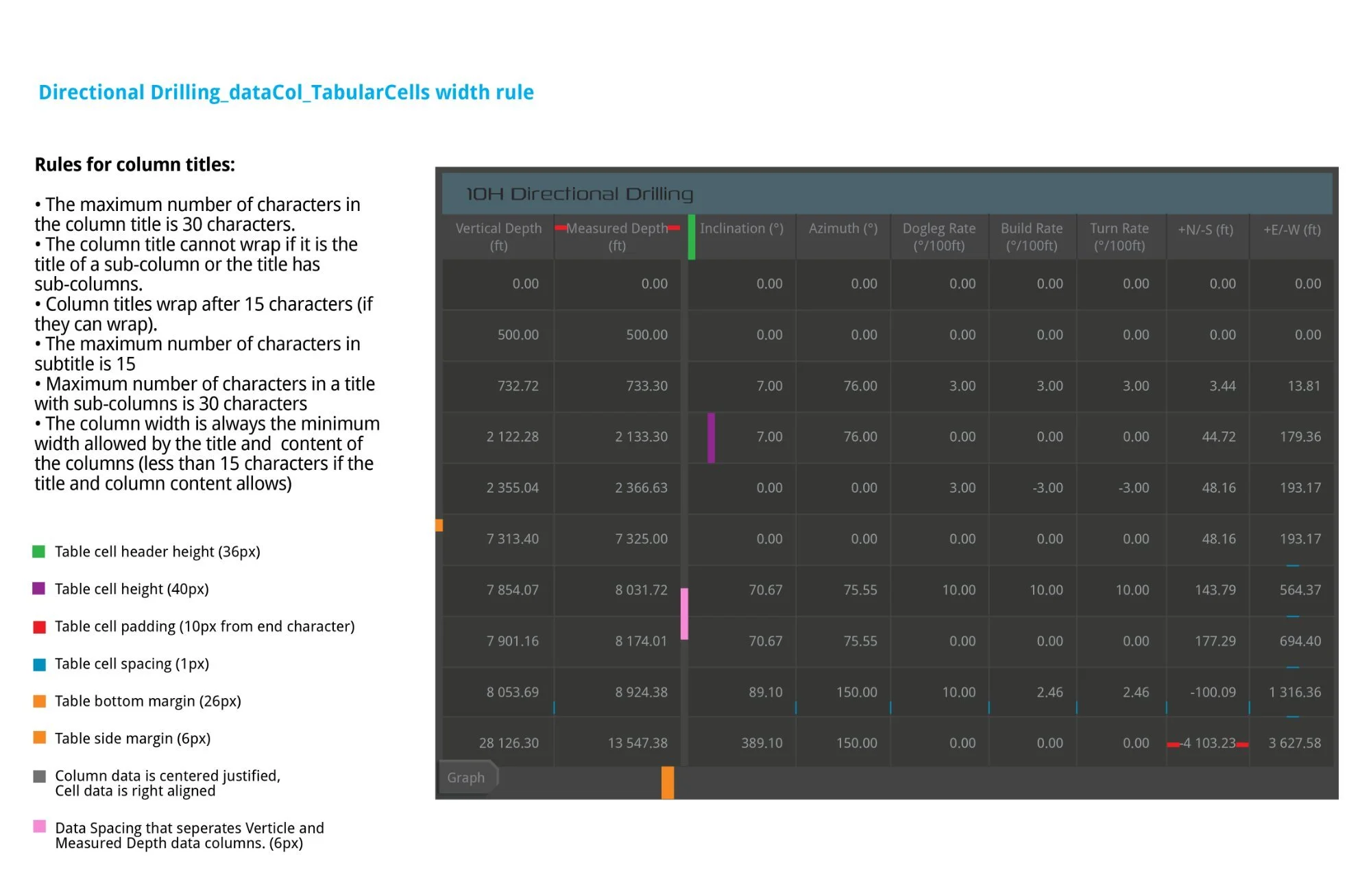
Column width rules on the full annotated 9-column table. Rules: max 30 characters per title; sub-column titles cannot wrap; wrap after 15 characters if possible; column width always the minimum allowed by the widest title or value. Color-coded annotations mark header height (36px), cell height (40px), padding (10px), spacing (1px), margins, and the 6px Vertical/Measured Depth separator.
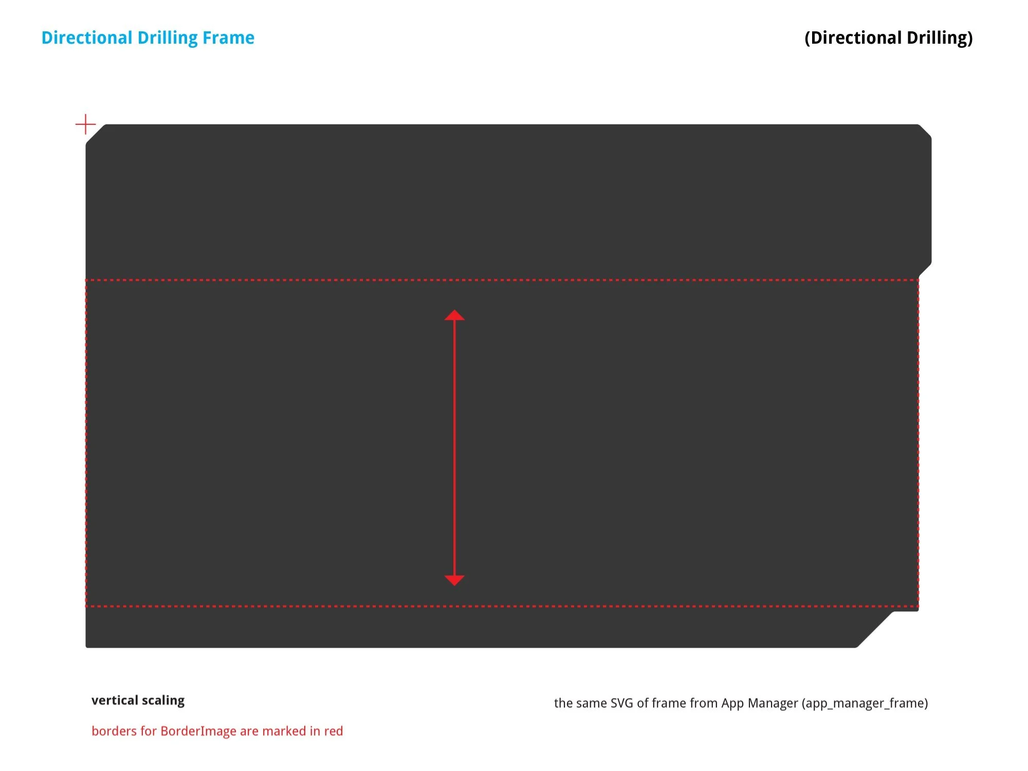
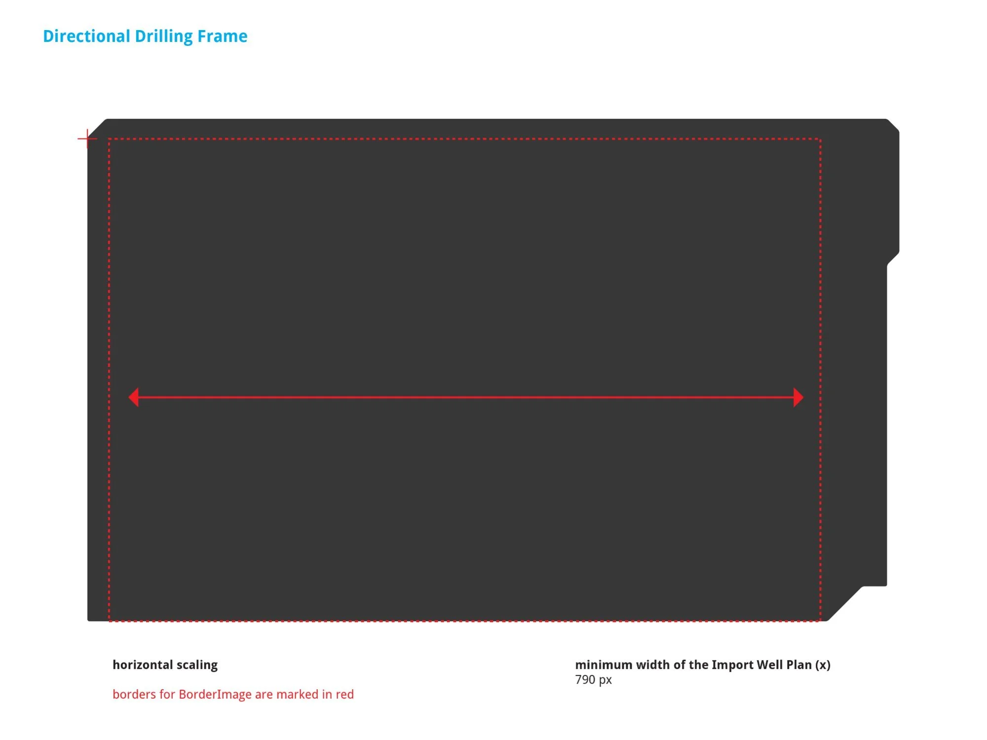
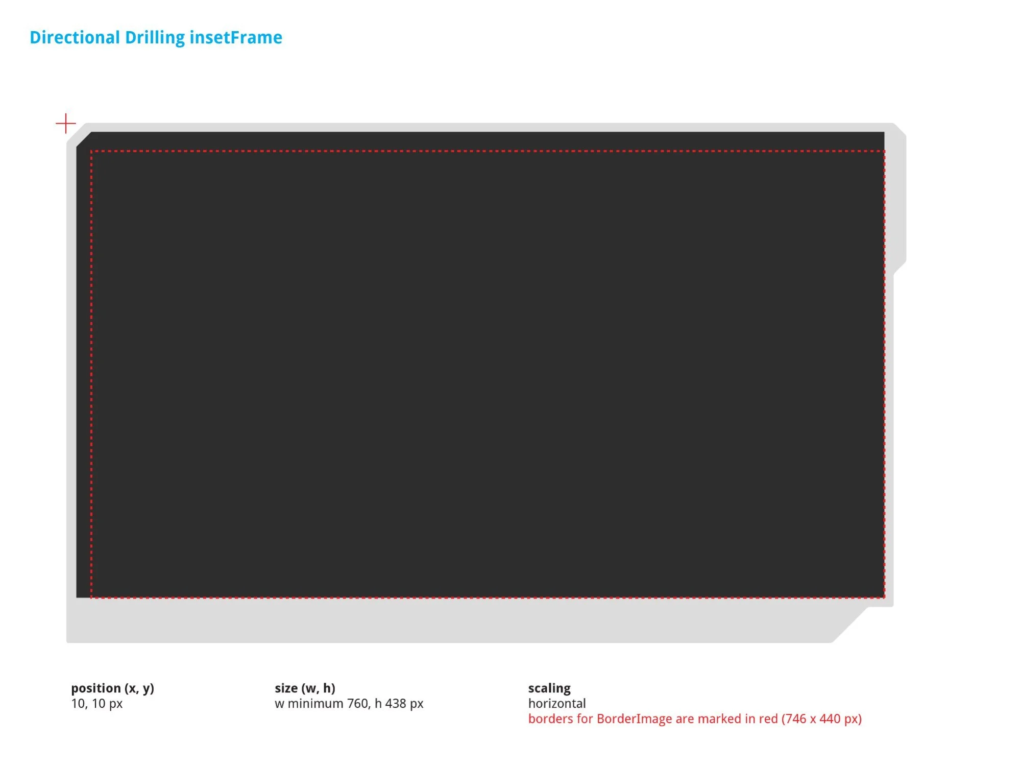
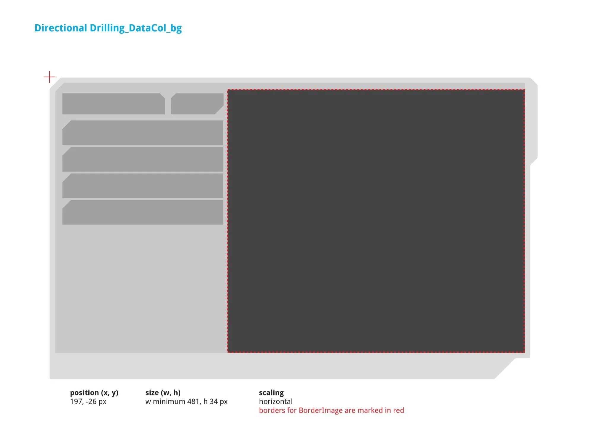
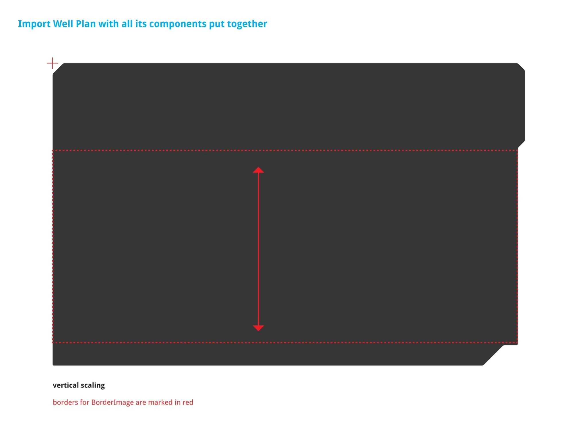
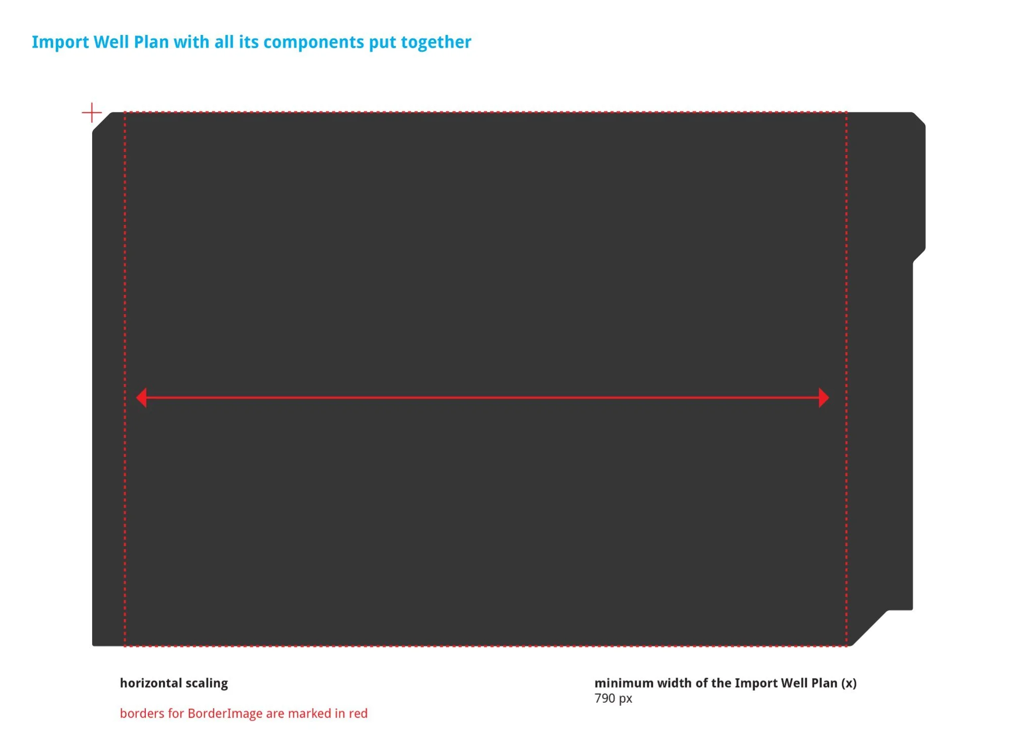
From left: Outer frame vertical scaling (same SVG as app_manager_frame) · Outer frame horizontal scaling with 790px minimum width constraint · insetFrame (min w 760, h 438px at position 10, 10px) · DataCol_bg (position 197, –26px, min w 481, h 34px). The 790px minimum width is enforced at both frame and insetFrame level to match rig-floor hardware.
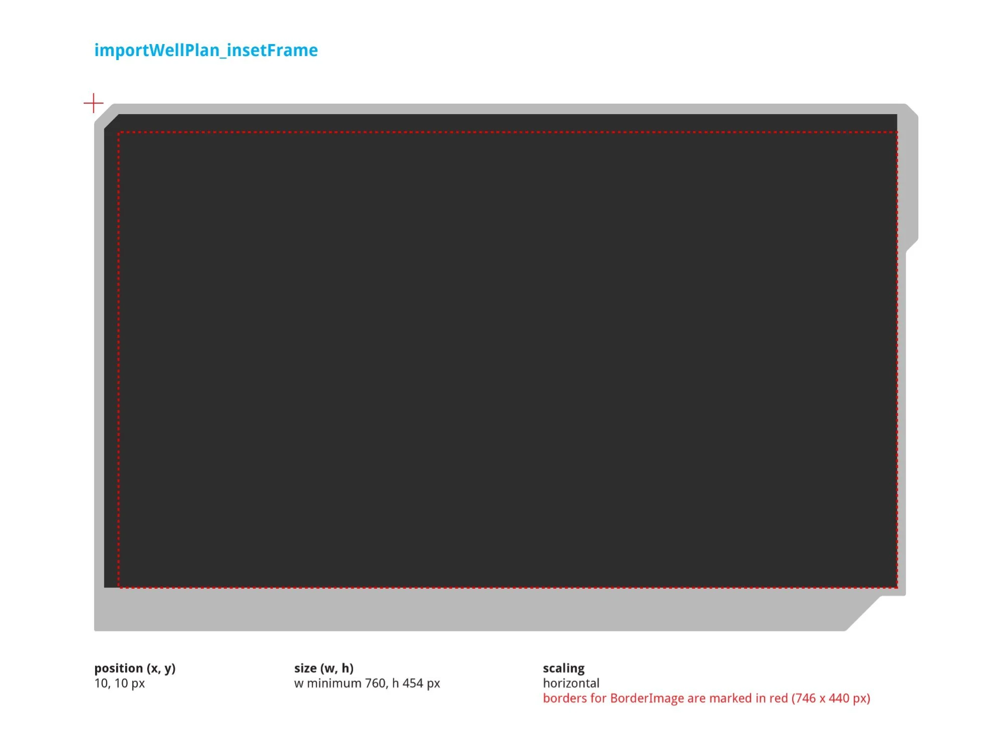
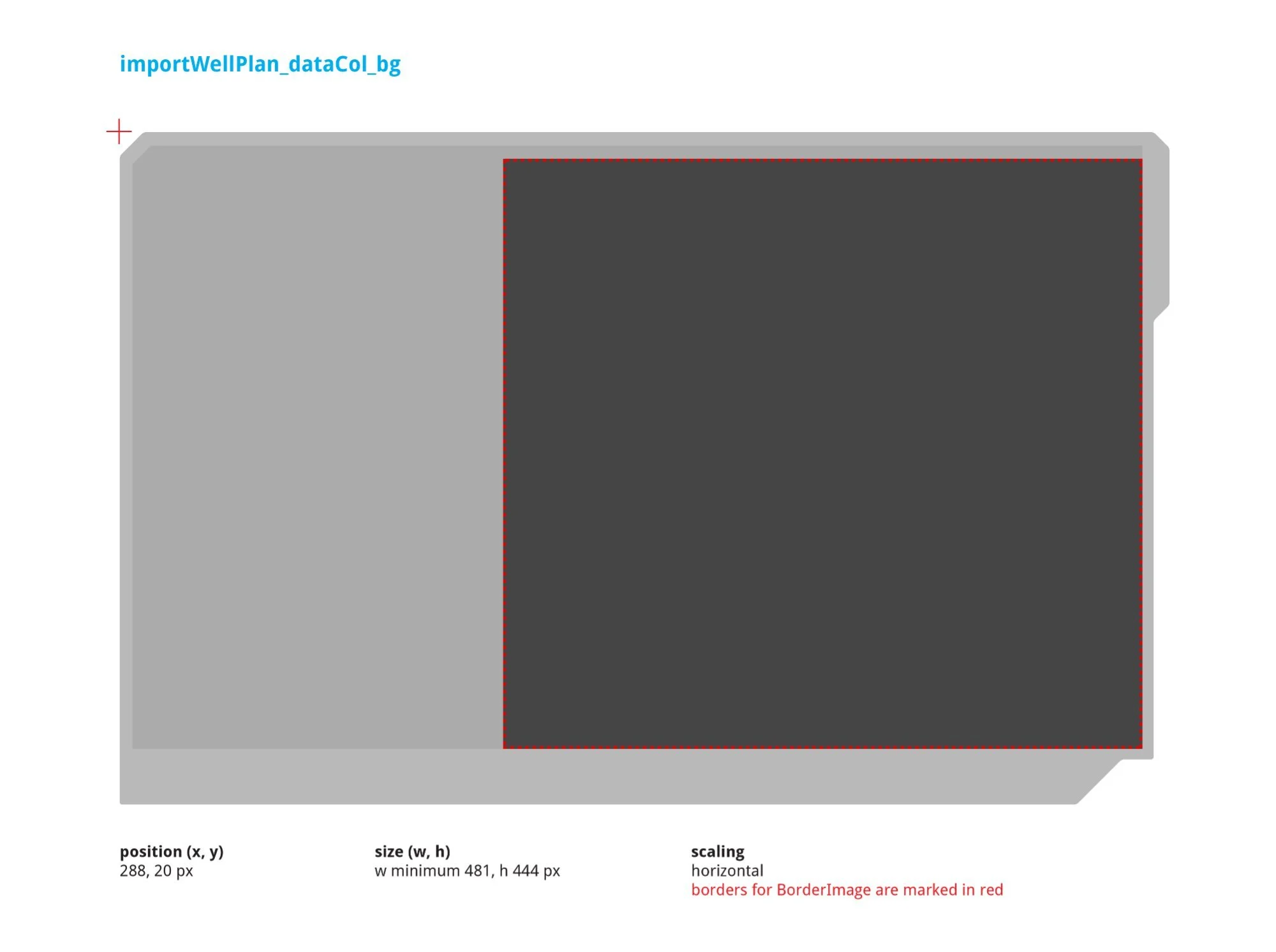
v2 guideline equivalents confirming structural consistency between versions. The insetFrame height increased from 438px to 454px between versions, reflecting a layout refinement. DataCol_bg updated from a single-row strip to a full-height panel (min w 481, h 444px at position 288, 20px).
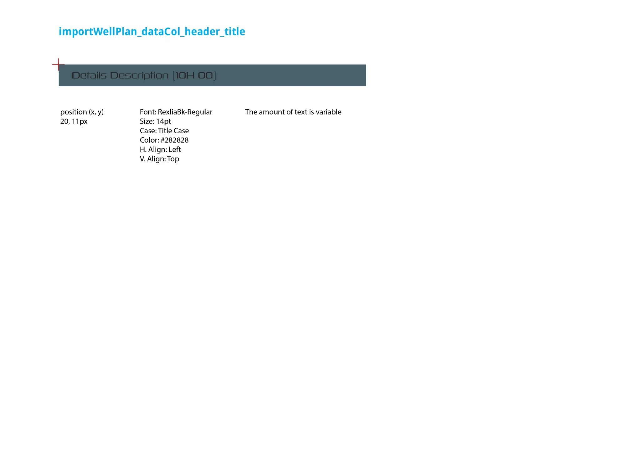
Left: dataCol_header SVG — the teal header strip at the top of the data column area, position (5, 5px), min w 470, h 33px. Right: dataCol_header_title — section title text element ("Details Description [10H 00]"), RexliaBk-Regular, 14pt, Title Case, color #282828, position (20, 11px). Amount of text is variable based on the selected well plan name.
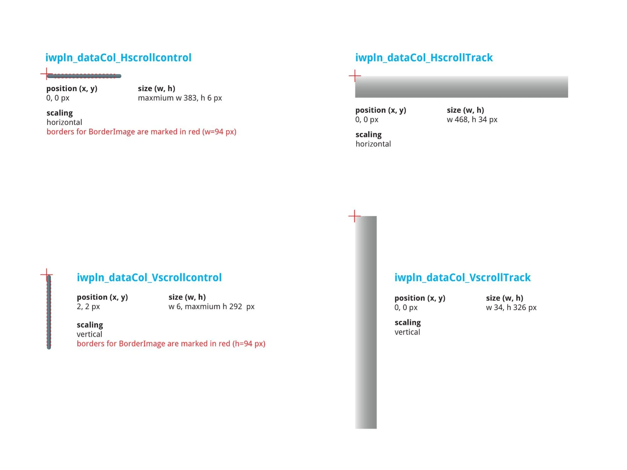
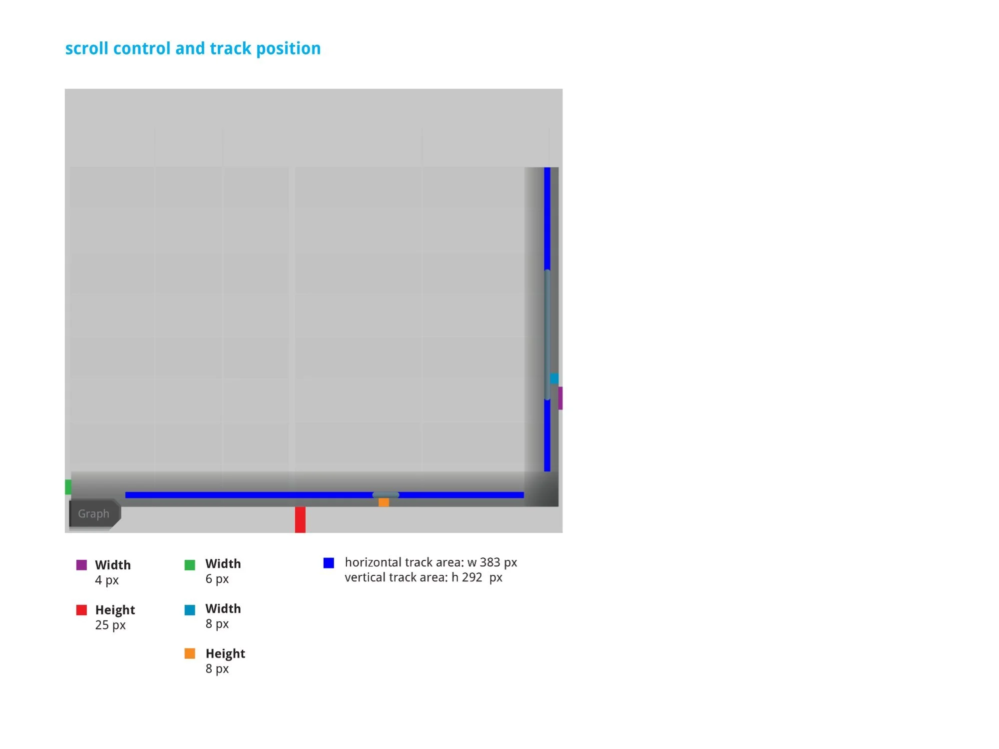
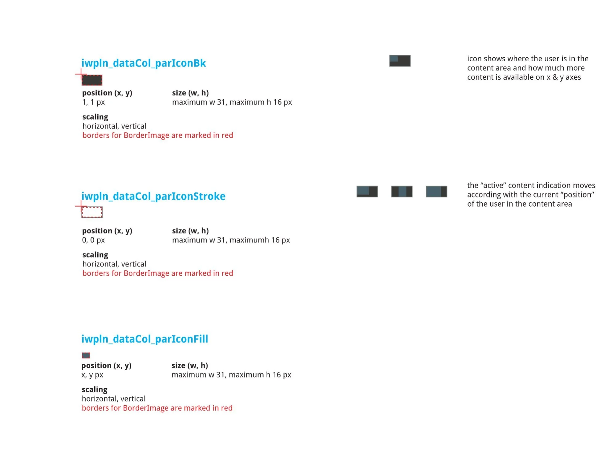
Left: H/V scroll control SVG specs — Hscrollcontrol max w383 × h6px, HscrollTrack w468 × h34px, Vscrollcontrol w6 × max h292px, VscrollTrack w34 × h326px. Center: Track position diagram with color-coded dimension callouts — horizontal track area 383px, vertical track area 292px. Right: parIcon three-layer position indicator (Bk, Stroke, Fill each at max 31 × 16px) — the active fill element moves dynamically to show viewport position on both axes.
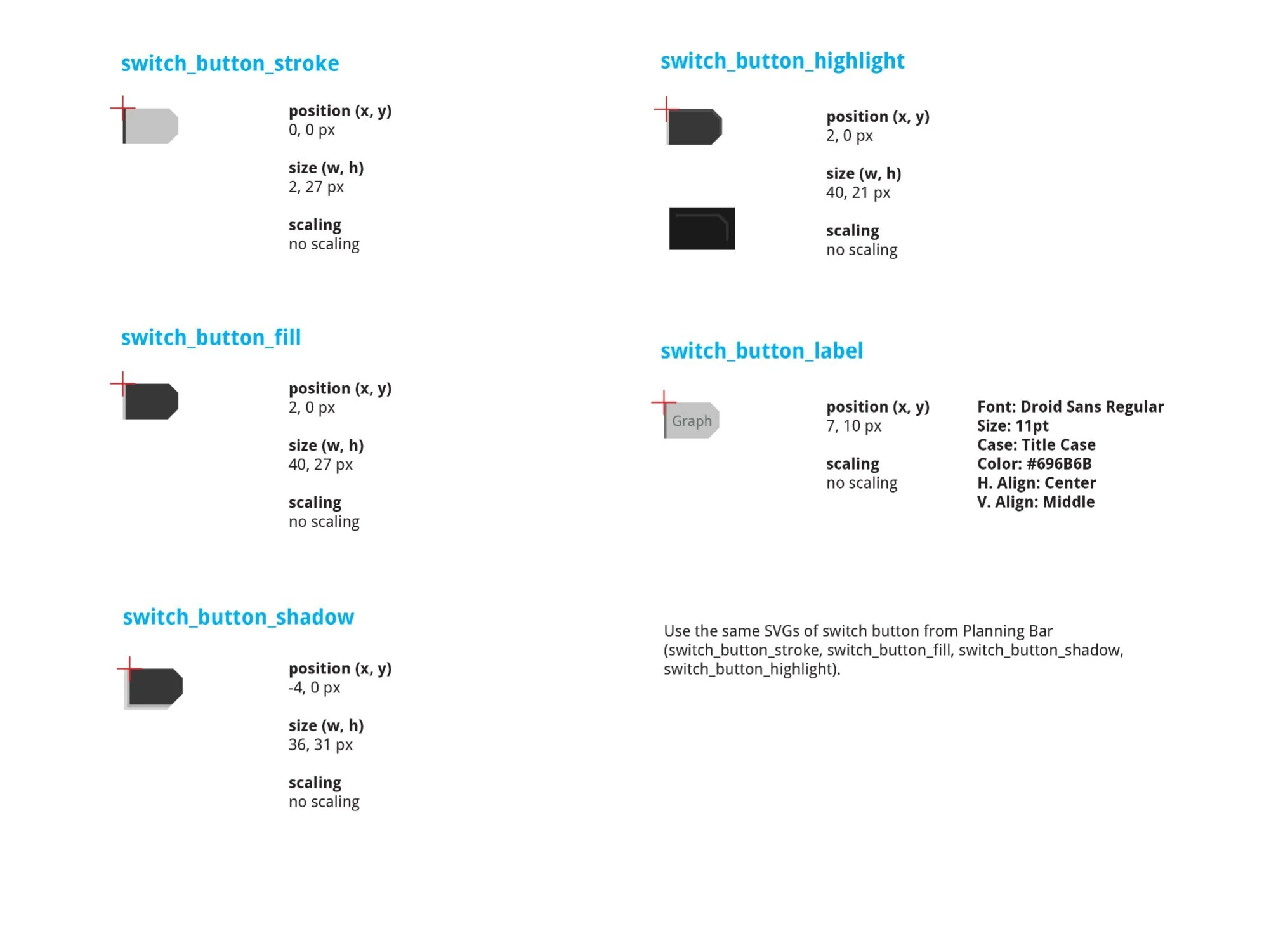
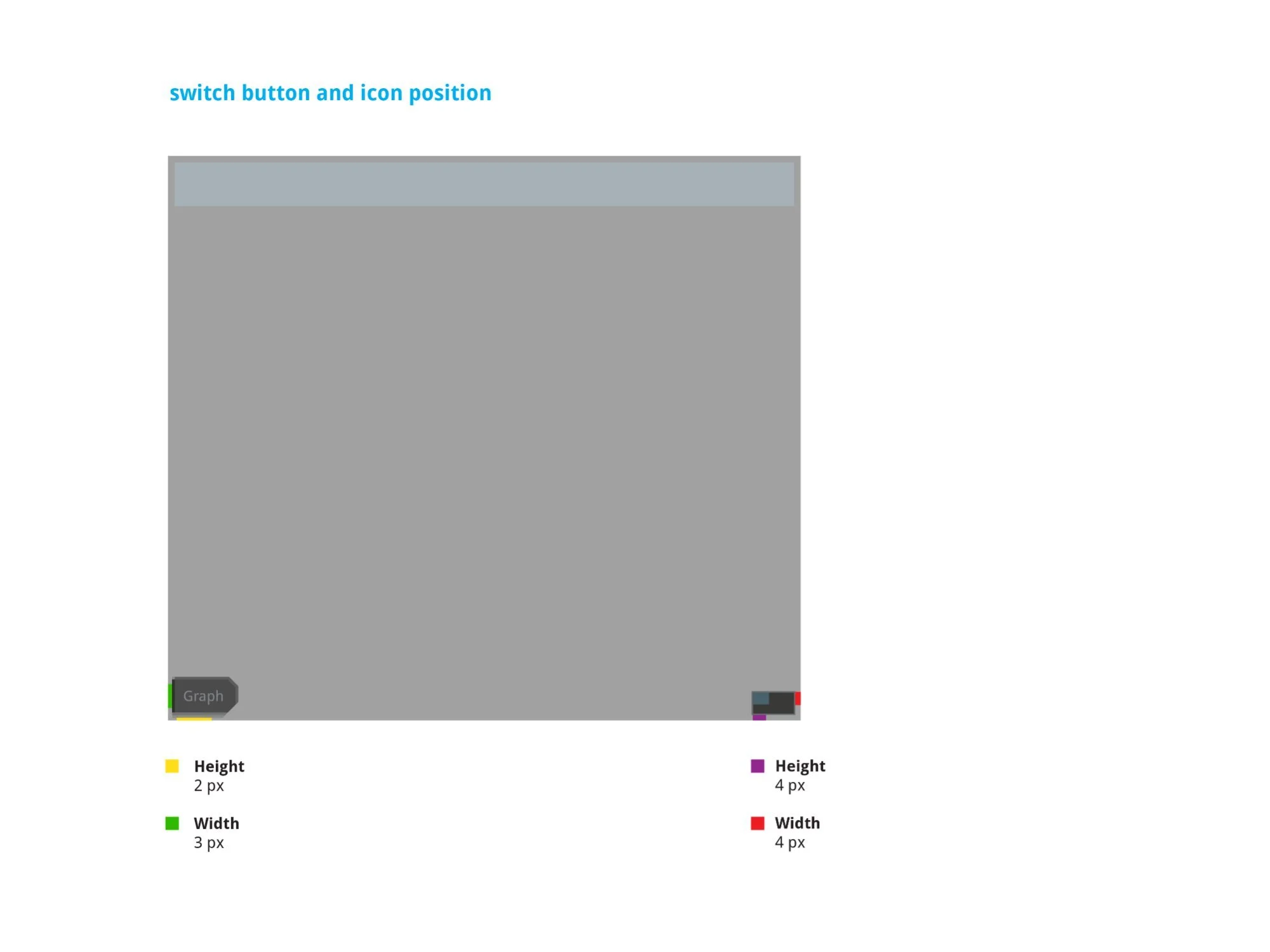
The "Graph" switch button at the bottom of the data column — uses Planning Bar SVGs (switch_button_stroke, fill, shadow, highlight). Stroke 2 × 27px, fill 40 × 27px, shadow 36 × 31px, highlight 40 × 21px. Label: Droid Sans Regular, 11pt, Title Case, #696B6B. Note: Graph view was marked "moved to Future Development" in v1.9 annotations — an accurate documentation of a descoped feature.
Both tracks required production-grade spec sheets beyond annotated Figma frames. The NOVOS development environment used a specific asset pipeline — SVG sprites with BorderImage scaling rules, pixel-exact position coordinates, and named component identifiers tied to the engineering codebase. Every component needed to follow this convention precisely.
The documentation covered: SVG asset names and source files, component dimensions at every scale point, font specifications including family, size, case, alignment, and color hex, scaling behavior (horizontal, vertical, or both), and BorderImage border definitions marked in red on each asset diagram.
This level of specificity meant developers could implement without a design review cycle — the spec sheet was the source of truth. Both tracks went through two rounds of guideline documents (v1.8 and v2) as the specs were refined through engineering review, ensuring that every dimension and asset reference was confirmed accurate before implementation.
On a system as operationally critical as NOVOS, ambiguity in the spec is a safety risk. A misimplemented alarm button that behaves differently in a warning state could contribute to exactly the kind of alarm fatigue the design was trying to solve. Complete, unambiguous documentation wasn't a formality — it was part of the safety discipline of the product.