KELSEY-SEYBOLD
THE PULSE
An end-to-end redesign of Kelsey-Seybold’s internal intranet — the daily digital workplace for 3,000+ nurses, administrators, technicians, and 480 physicians across 25 locations — from MoSCoW analysis through 9 content iterations to a final clickable prototype that put critical clinical tools above the fold for the first time.
3,000+ clinical staff.
One source of truth.
The Pulse is Kelsey-Seybold’s internal intranet — the daily digital workplace for over 3,000 nurses, administrators, and technicians, and 480 physicians across 25 clinic locations. Everything from HR forms to special events, payroll information, physician resources, and critical clinical web applications lives here. The organization needed a complete redesign: greater visual appeal, dramatically improved ease of use, and critical clinical tools moved above the fold where medical professionals can access them the moment they need them.
Senior UX Designer & Client Liaison.
I worked directly with the HR client to organize and prioritize the initial project scope and develop requirements. In addition to serving as the liaison between HR and the development team, I was lead designer alongside SharePoint architects and developers — concepting wireframes, designing mockups and clickable prototypes, and creating spec sheets for developer handoff of the site.
The Problem to Solve
- Outdated page formats that no longer matched the updated Kelsey-Seybold brand identity
- Excessive links creating cognitive overload for nurses, technicians, and administrative staff navigating the site mid-shift
- Critical clinical web applications displayed below the fold — medical professionals had to scroll to reach tools they needed immediately
- No clear visual hierarchy distinguishing urgent clinical resources from general HR and administrative content
- All solutions required IE9 browser compliance — the organization’s mandated default browser
- SharePoint architecture required all design decisions to be pre-validated with developers before the concept phase began
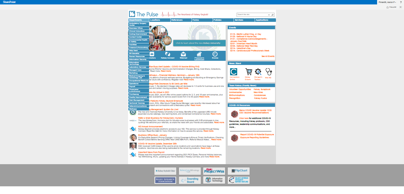
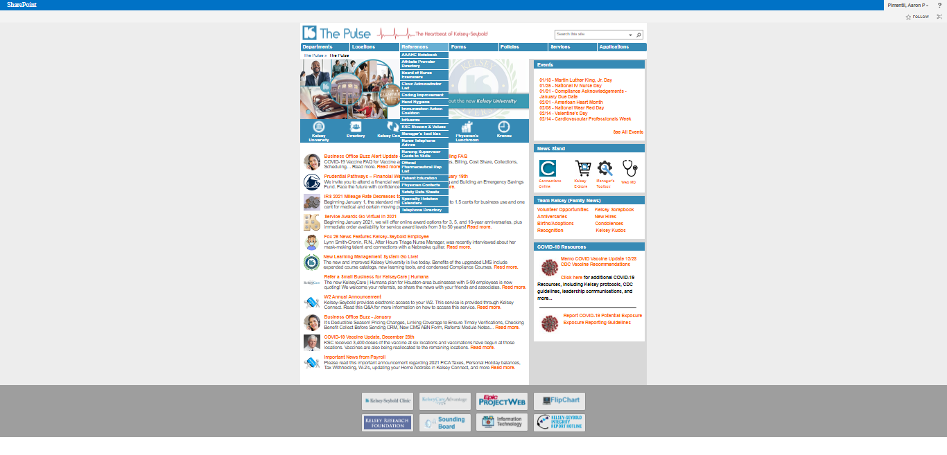
The site that needed
to change.
Before the redesign, The Pulse suffered from visual inconsistency, cluttered navigation, and a layout that buried the clinical tools nurses and physicians needed to access immediately. These screenshots document the state of the intranet at project kickoff.


From wish list to
working prototype.
MoSCoW Analysis
The kickoff meeting began with an initial wish list document from HR. This document was assessed using the MoSCoW Analysis method to determine which features would be built, in what priority order. Immediately following, the client requested low-fi concepts to see how the requirements would be interpreted visually. All SharePoint feasibility was pre-validated with the development team before design began.
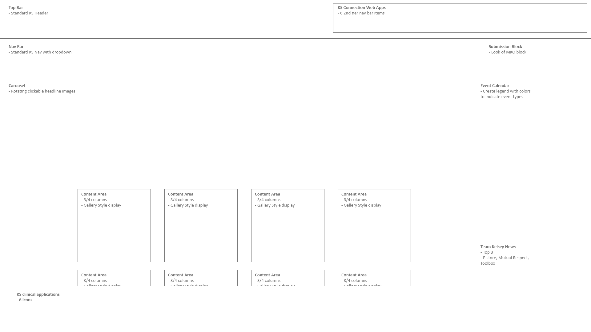
Research & Concept Exploration
I researched high-volume information sites and expanding market trends advantageous to the design. After the research phase, I developed several wireframe directions as potential solutions — pulled from a myriad of sources and discussed with the development team prior to design to ensure SharePoint would support the intended look, feel, and functionality.
9 Iterations & User Testing
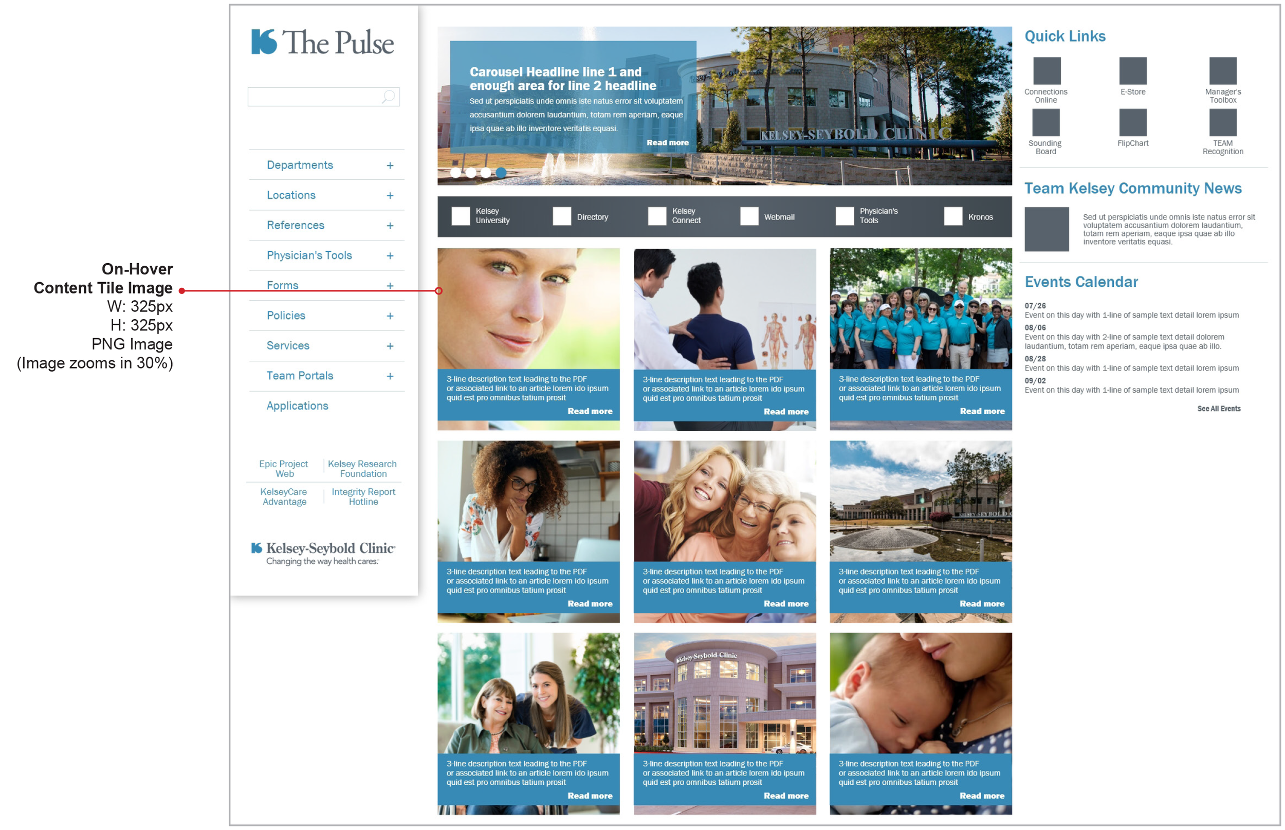
After nine content variations, dozens of email communications, 3 months of design refinement, and multiple rounds of user testing from the HR department, Option 4 was selected. The result gave Kelsey-Seybold’s clinical and administrative staff a clean, accessible interface — and more importantly, medical professionals now had immediate access to their clinical web applications directly in the navigation bar, above the fold, without any scrolling required.
High-Fidelity Prototype & Spec Sheets
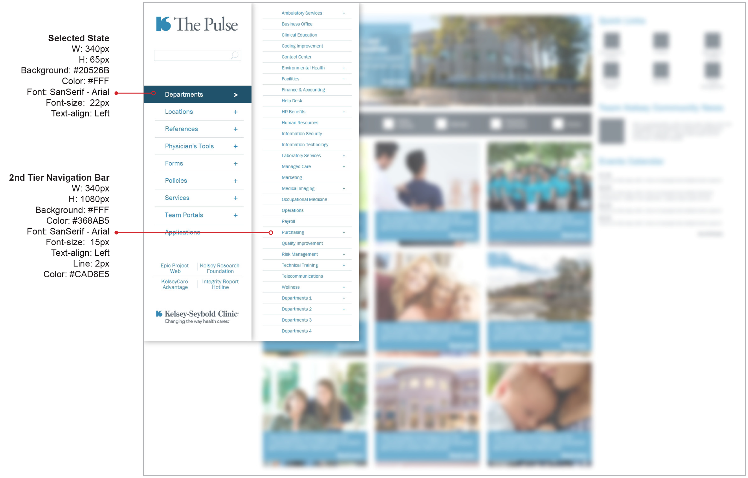
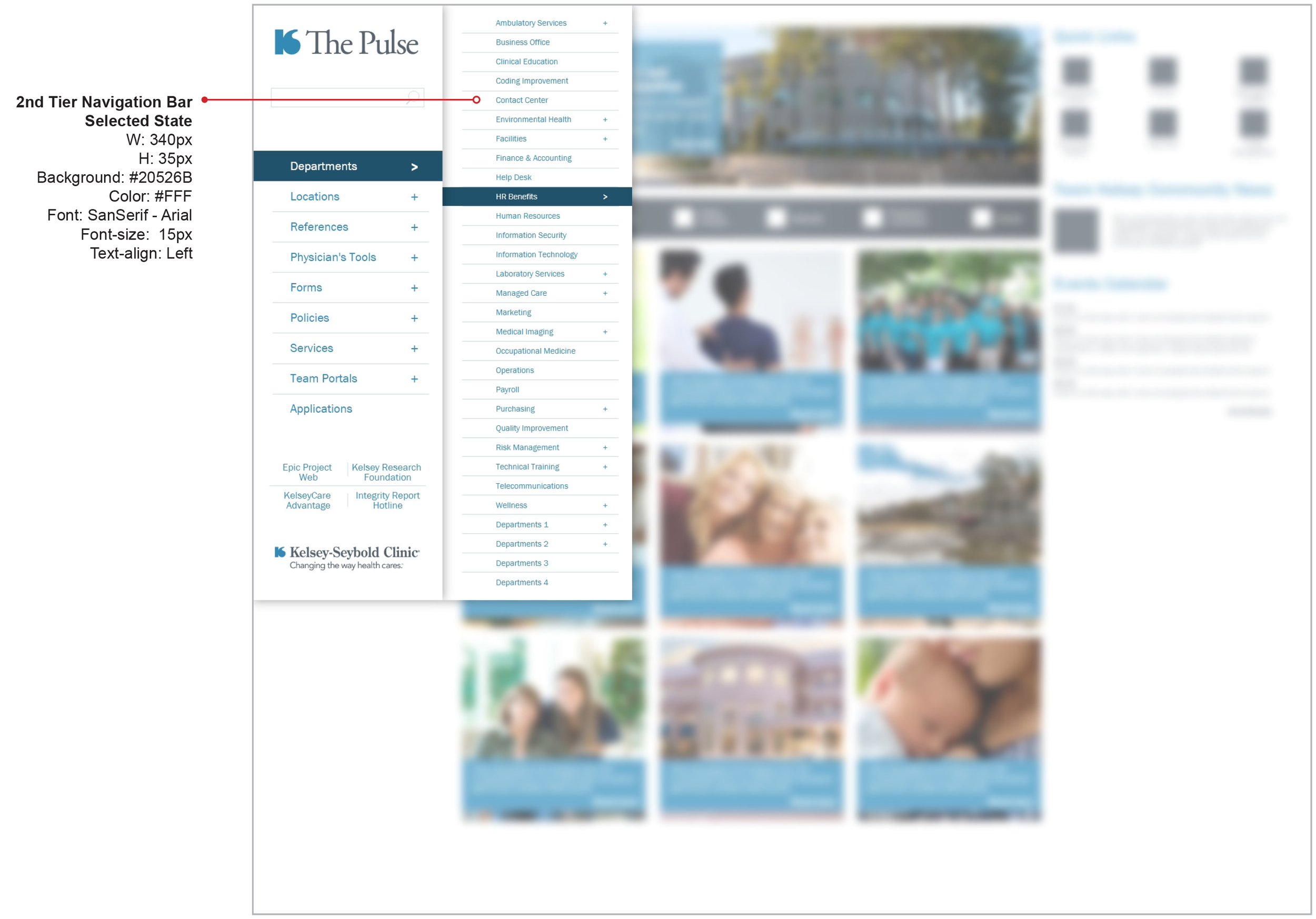
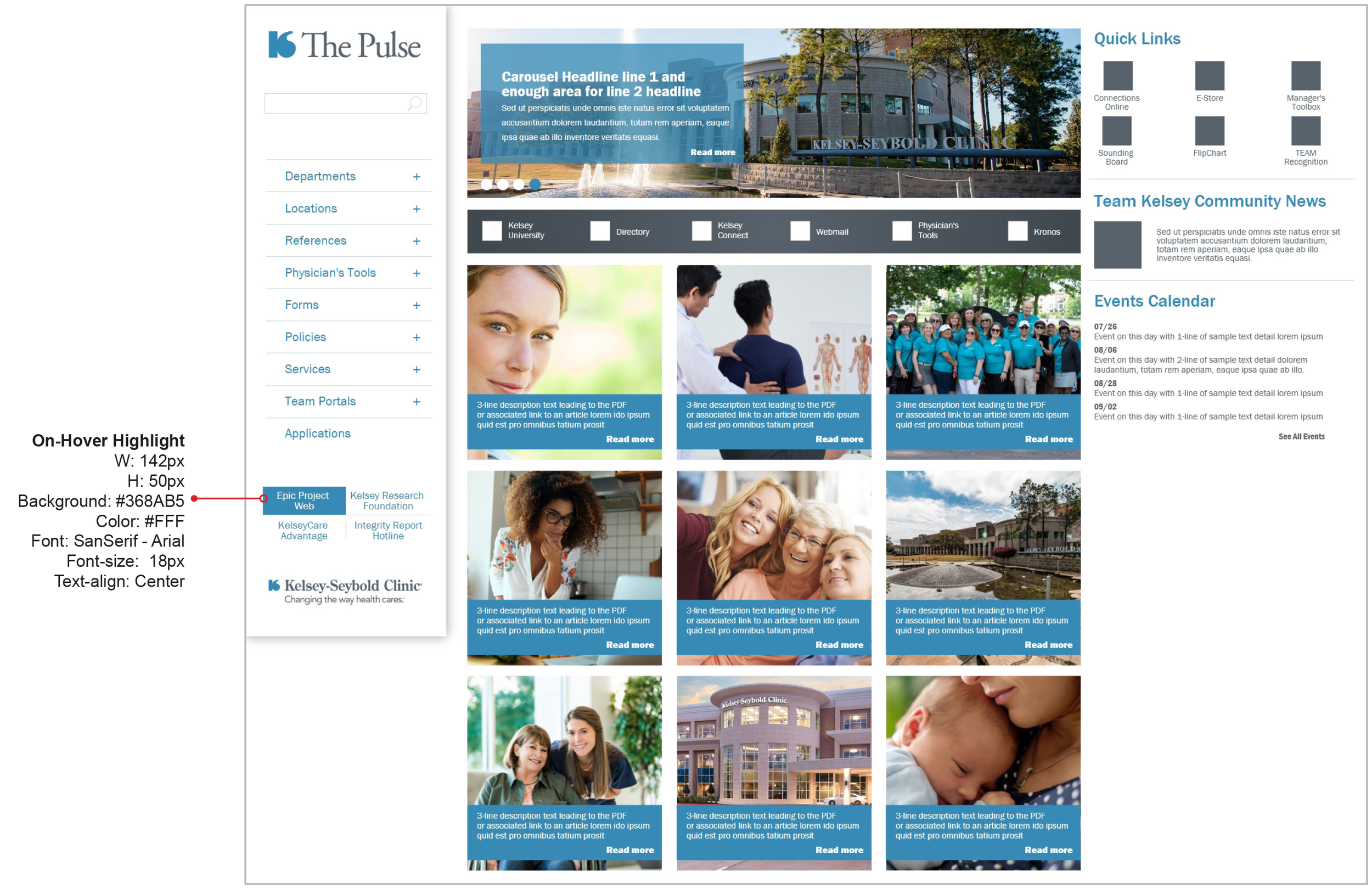
The final design was translated into a fully clickable Adobe XD prototype for stakeholder review and user validation. Complete spec sheet documentation was produced for developer handoff — covering layout, color, typography, component behavior, and interactive states across the full SharePoint implementation.
Four directions.
One chosen.
These first concepts were derived from researching existing dashboard trends, reviewing competitor websites for useful functionality, and maintaining Kelsey-Seybold brand standards. Each explored a different approach to information hierarchy and navigation architecture.


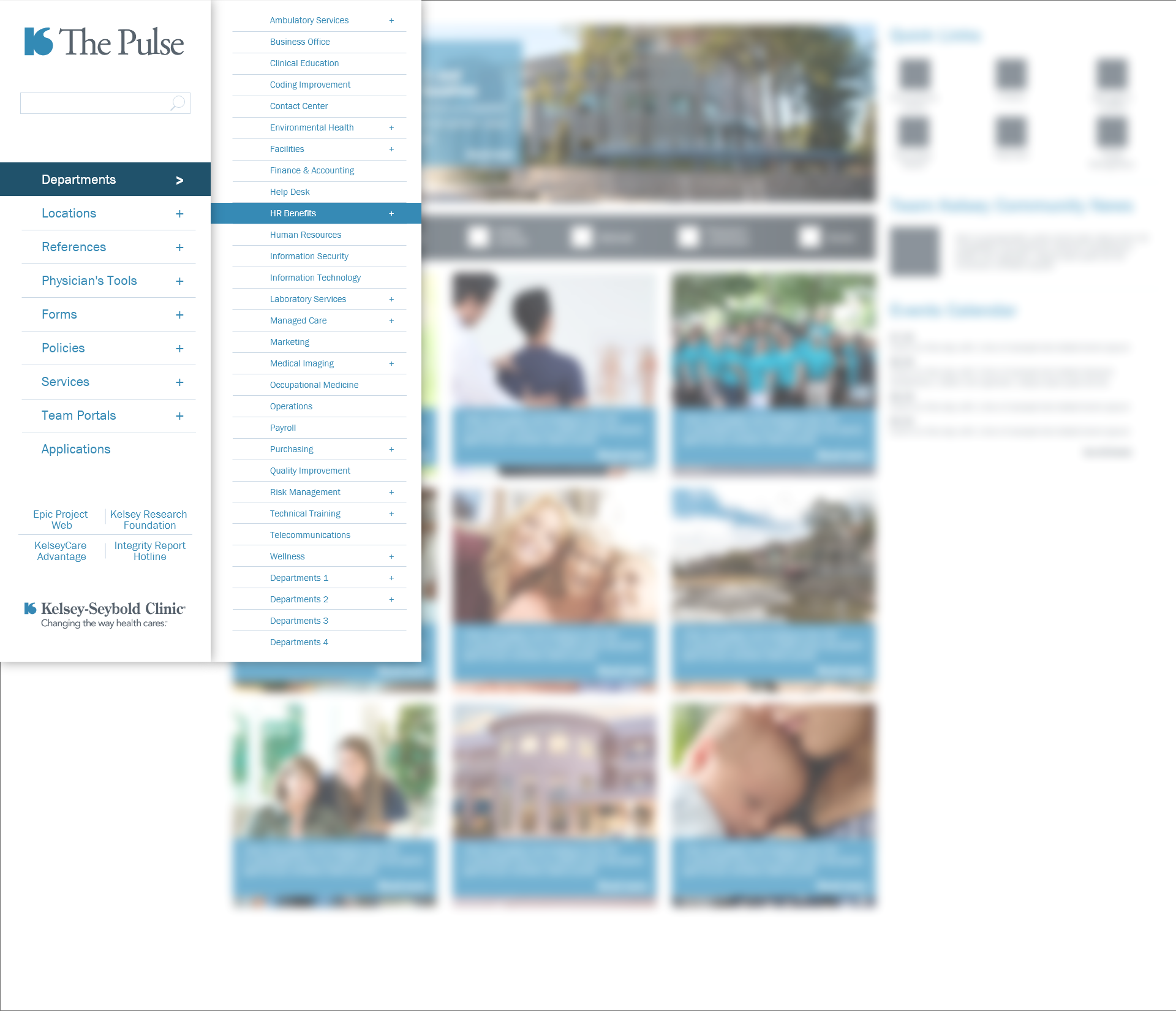
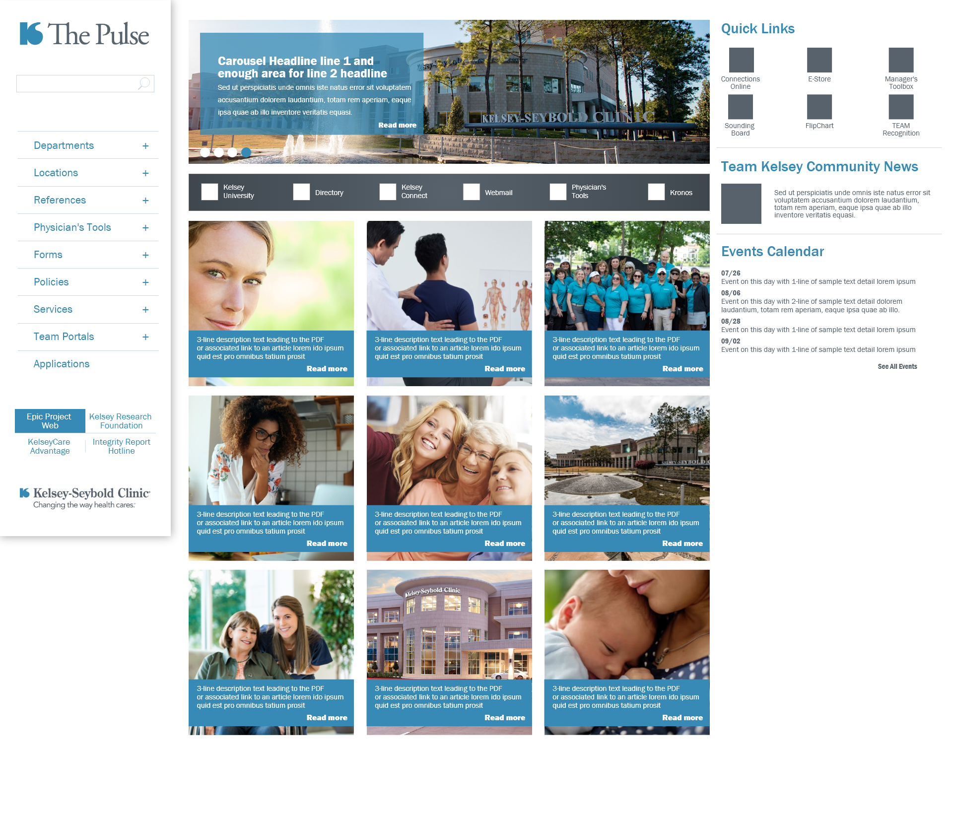
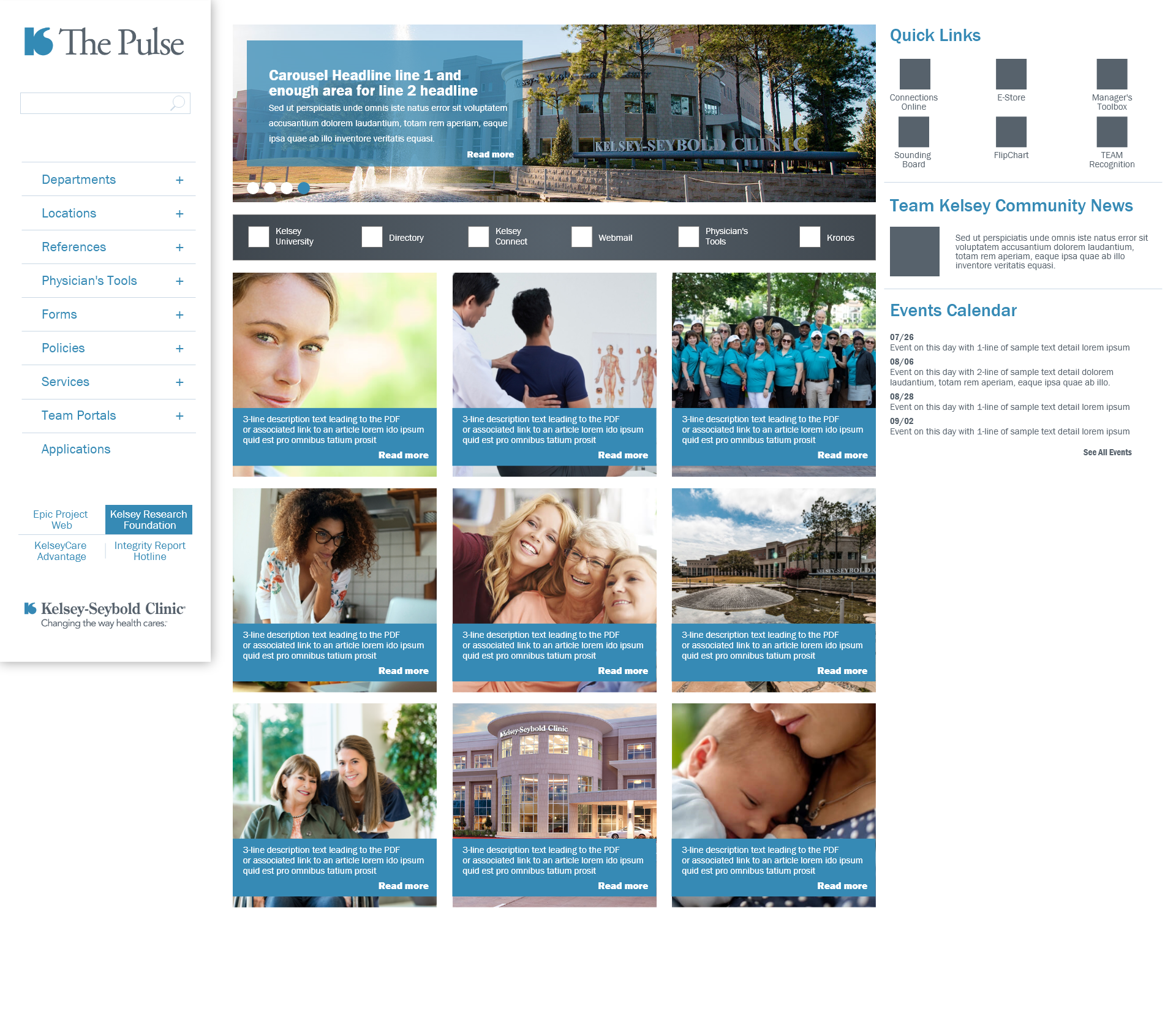
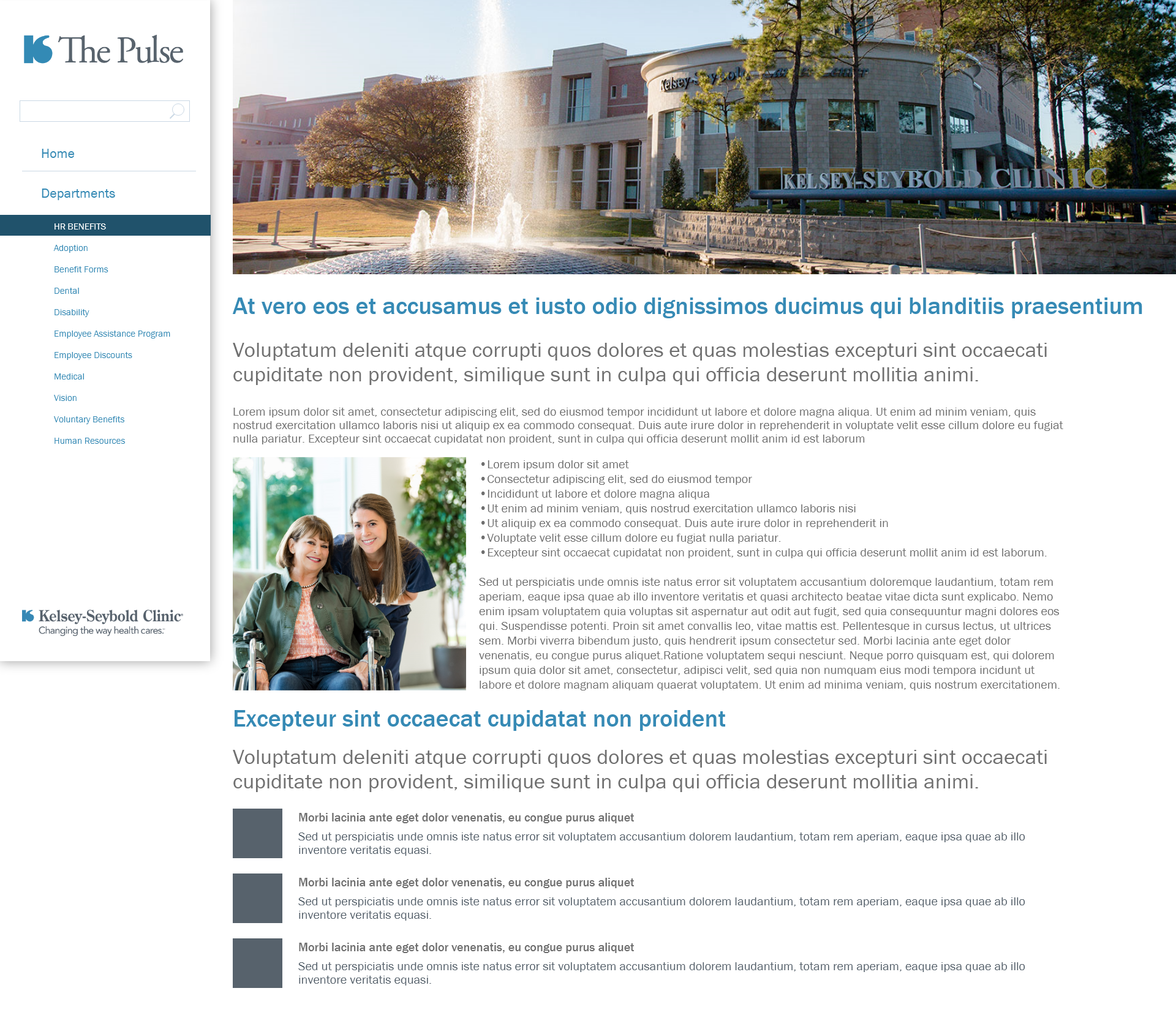
The selected design —
all states.
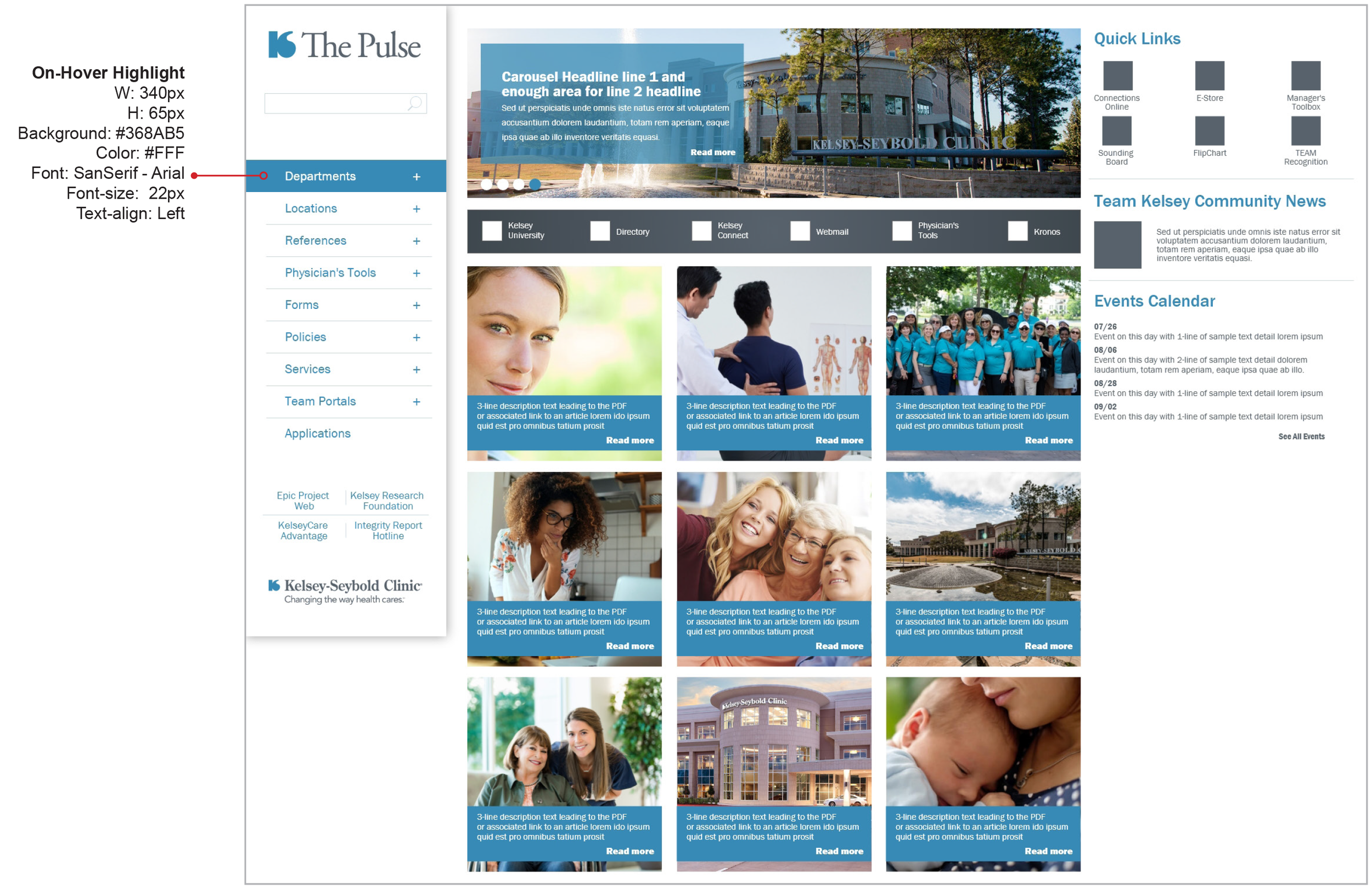
After 9 iterations and user testing rounds, the final design delivered a rotating carousel hero, side navigation with multi-tier hierarchy, custom QuickLink iconography designed specifically for this project, and medical web apps accessible above the fold. Below are the full hi-fidelity prototype screens.


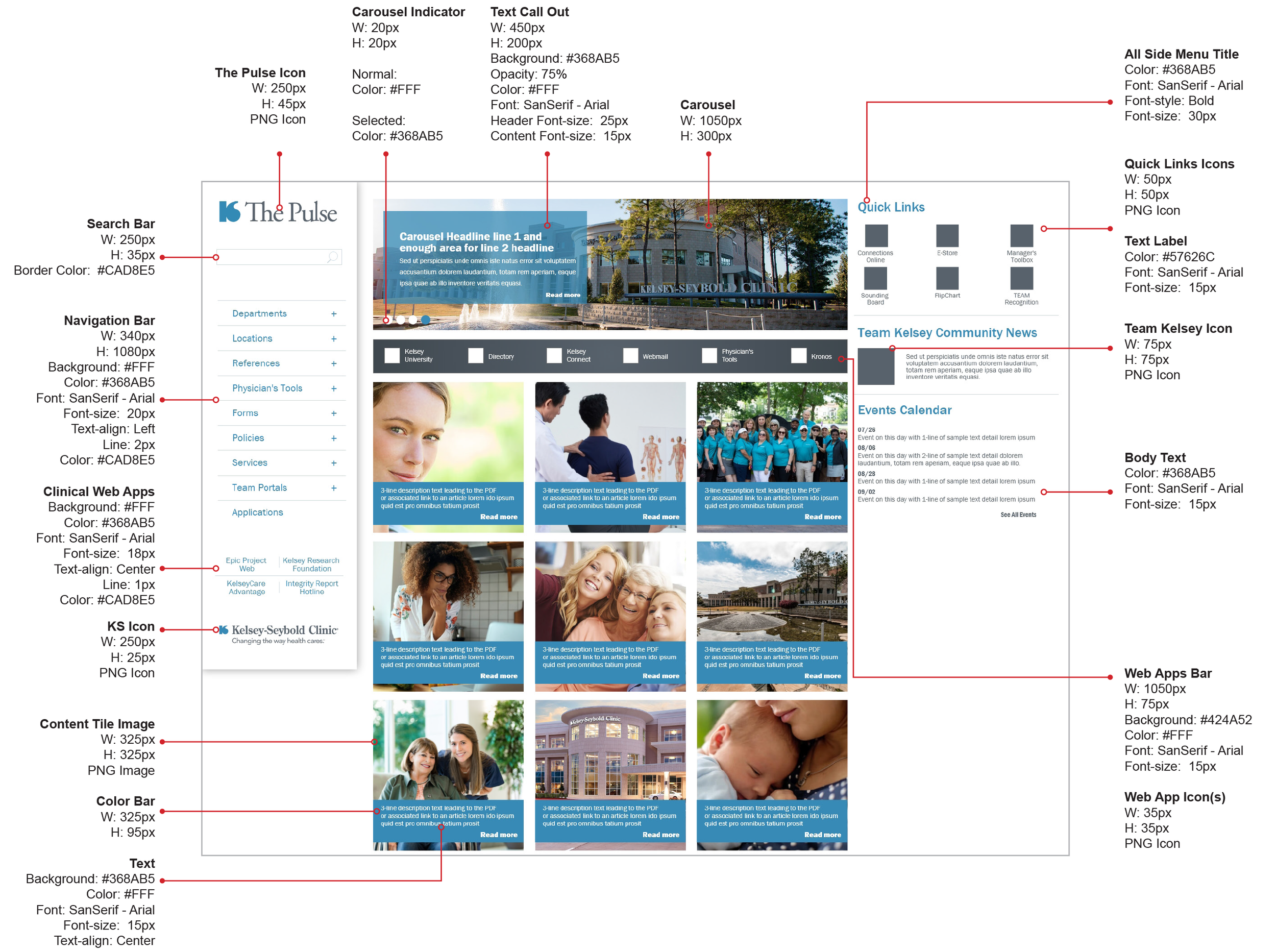
Spec sheets for
every component.
Complete specification documentation was produced for the development team — covering layout grids, color tokens, typography scales, component states, spacing rules, and interaction behaviors across the full SharePoint implementation.


A clinical intranet that finally works.
After 48 design iterations and 162 total screens built, the redesigned Pulse delivered 34% more accessible functionality than the previous version. Nurses, technicians, and physicians could access critical clinical web applications immediately in the navigation bar — above the fold, no scrolling required.
The project demonstrated that rigorous UX process — MoSCoW prioritization, iterative design, and user testing with the HR department — produces measurably better outcomes even within tightly constrained technical environments like IE9-limited SharePoint.
What Was Delivered
- Complete intranet redesign serving 3,000+ nurses, technicians, administrators, and 480 physicians across 25 locations
- MoSCoW-facilitated requirements workshop establishing prioritized feature scope with the HR stakeholder team
- 9 content iterations with multiple rounds of user testing and stakeholder review
- Rotating carousel hero, side navigation with multi-tier hierarchy supporting complex clinical resource structure
- Custom QuickLink iconography designed specifically for this project
- Critical clinical web applications elevated to the navigation bar — accessible above the fold for the first time
- 34% more functionality than the previous site, delivered within IE9 browser constraints
- Full clickable Adobe XD prototype and 8-page spec sheet documentation for SharePoint development handoff