Persona
Research &
Prioritization
Product leadership wanted a 2D and 3D wellbore viewer built next, as the headline differentiator for DBS and DBA. Instead of moving straight into screens, I ran twelve structured interviews across both product lines to test that assumption against what the people actually using the platform needed most.
Downhole Broadband Solutions (DBS) delivers real-time, high-resolution downhole data over wired drill pipe, the telemetry backbone that offshore operators and drillers rely on to see what's happening below surface as it happens. Drilling Beliefs and Analytics (DBA) sits on top of that data, the calculation and expression layer meant to turn raw telemetry into AI-backed insight the field can act on before a problem becomes a incident.
Both product lines rolled up into the Max platform roadmap I was leading UX for. Leadership's next big swing was a 2D and 3D wellbore viewer, a visual summary of trajectory, casing, and bit position they believed would be the differentiator. I'd already run a couple of early design passes against that brief when it became clear we were designing a screen nobody had validated wanted.
The request was clear and it wasn't unreasonable. A 2D/3D wellbore viewer is an easy thing to sell in a roadmap review. What wasn't clear was whether it was the thing that would actually move the needle for the range of people who touch DBS and DBA data every day, from an assistant driller on the rig floor to a control systems engineer deciding whether to trust an automated calculation.
Leadership wanted a 2D and 3D wellbore trajectory viewer built as the next differentiating feature, a visual summary of path, casing, bit position, and pressure in one place. It was framed as phase one of a longer automation roadmap.
Nobody had asked the people who'd actually use it. Two rounds of concepting in, I had no evidence the viewer would beat out the alarms, handoff standardization, or calculation transparency problems the field was almost certainly dealing with instead.
Rather than keep refining a screen against an untested assumption, I proposed we pause and go find out. Twelve interviews, screened deliberately across role, tenure, company, and how deeply each person actually used the tools day to day, would tell us whether the viewer was worth building next, or whether something else needed to come first.
The recommendation to pause and run interviews didn't come from a standing start. Several rounds of design already existed by the time it became clear the assumption needed testing, starting with the product owner's own sketch and running through multiple iterations on a wellbore and formations viewer.
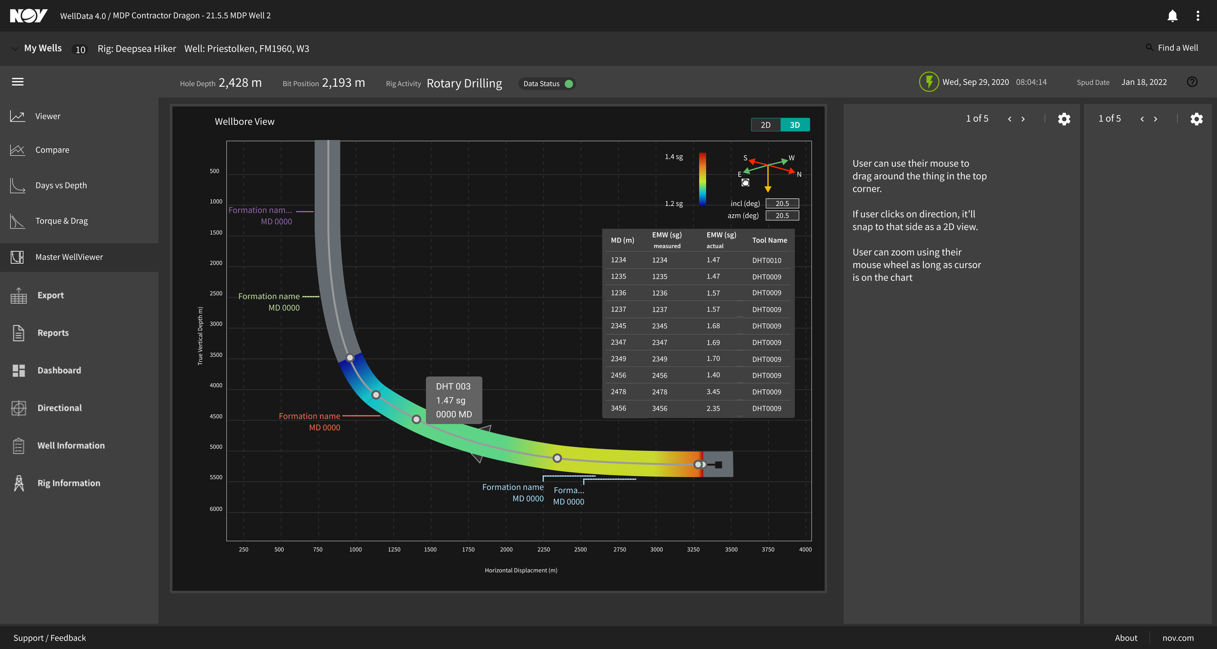
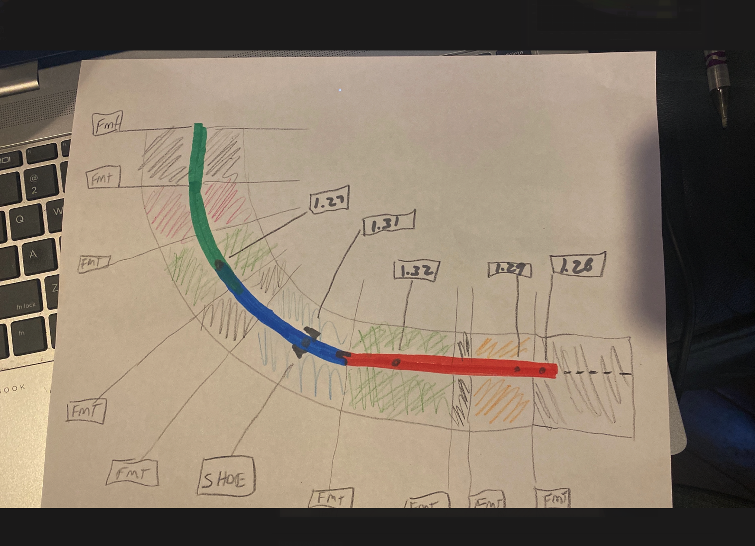
Drag to compare: the product owner's original sketch against the final formations and wellbore viewer it grew into.
The starting brief was a rough wellbore trajectory drawing annotated with casing, formation markers, and bit position. Everything in this section is what happened between that sketch and the screen on the right.

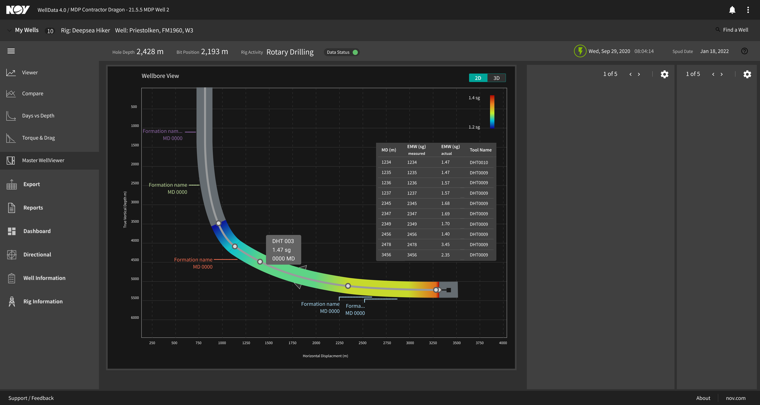

Left to right: an "inside the well" viewer concept looking down the wellbore with casing and formation context rendered in the platform's dark theme; a 2D wellplot in cross-section against depth; the same trajectory from a 3D top-down view, testing whether a plan-view angle read more clearly than the side profile.
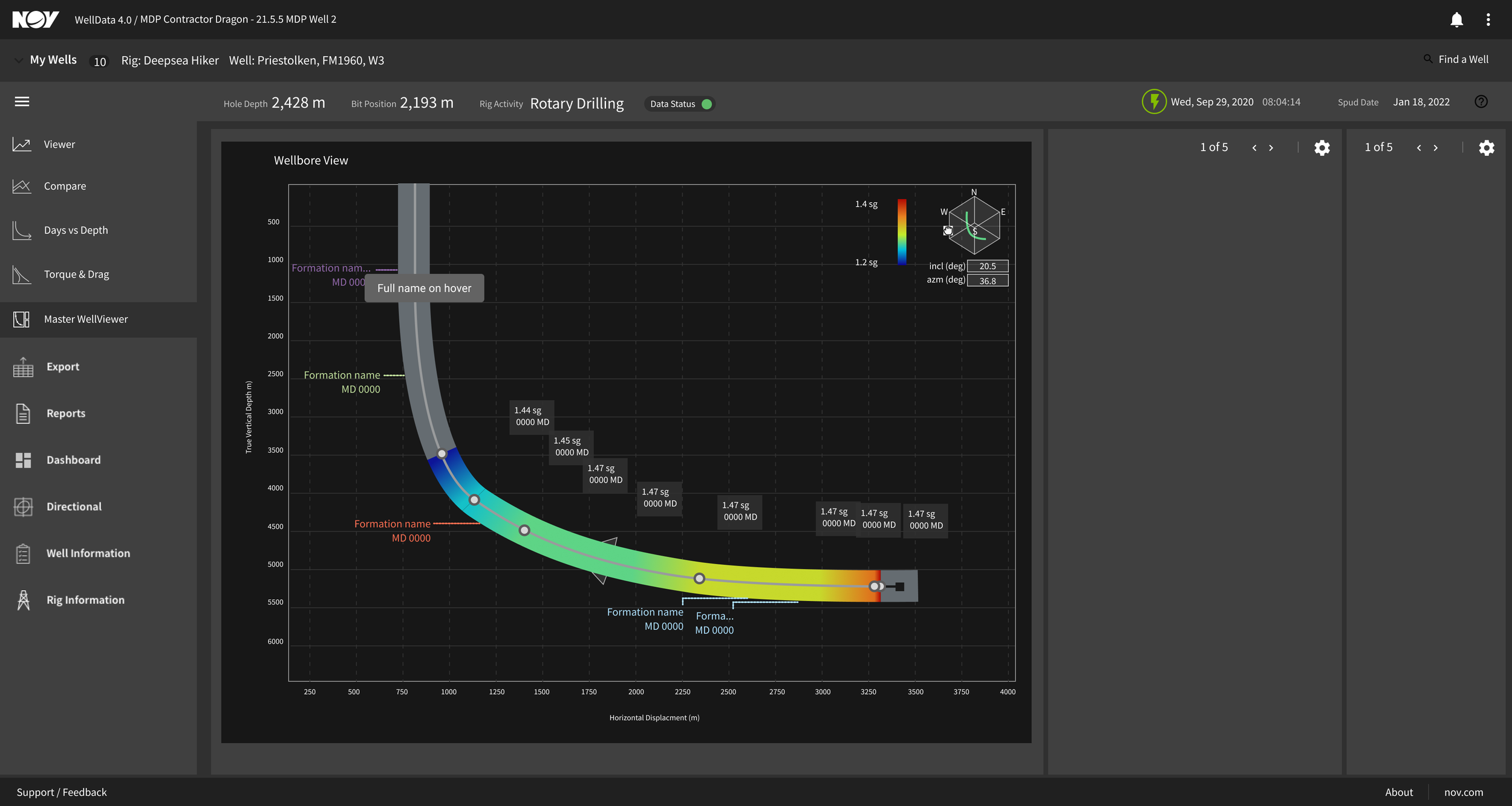
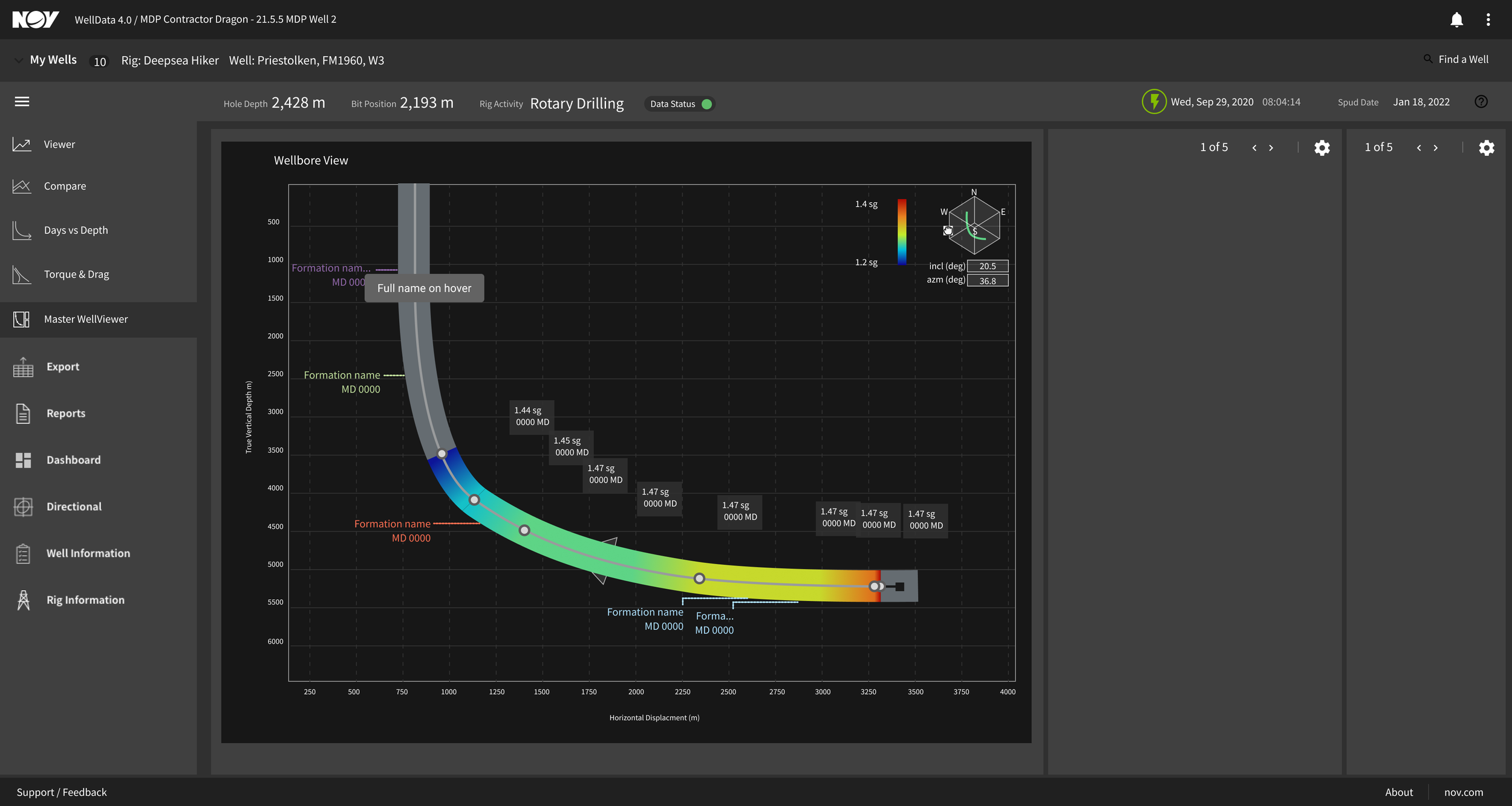
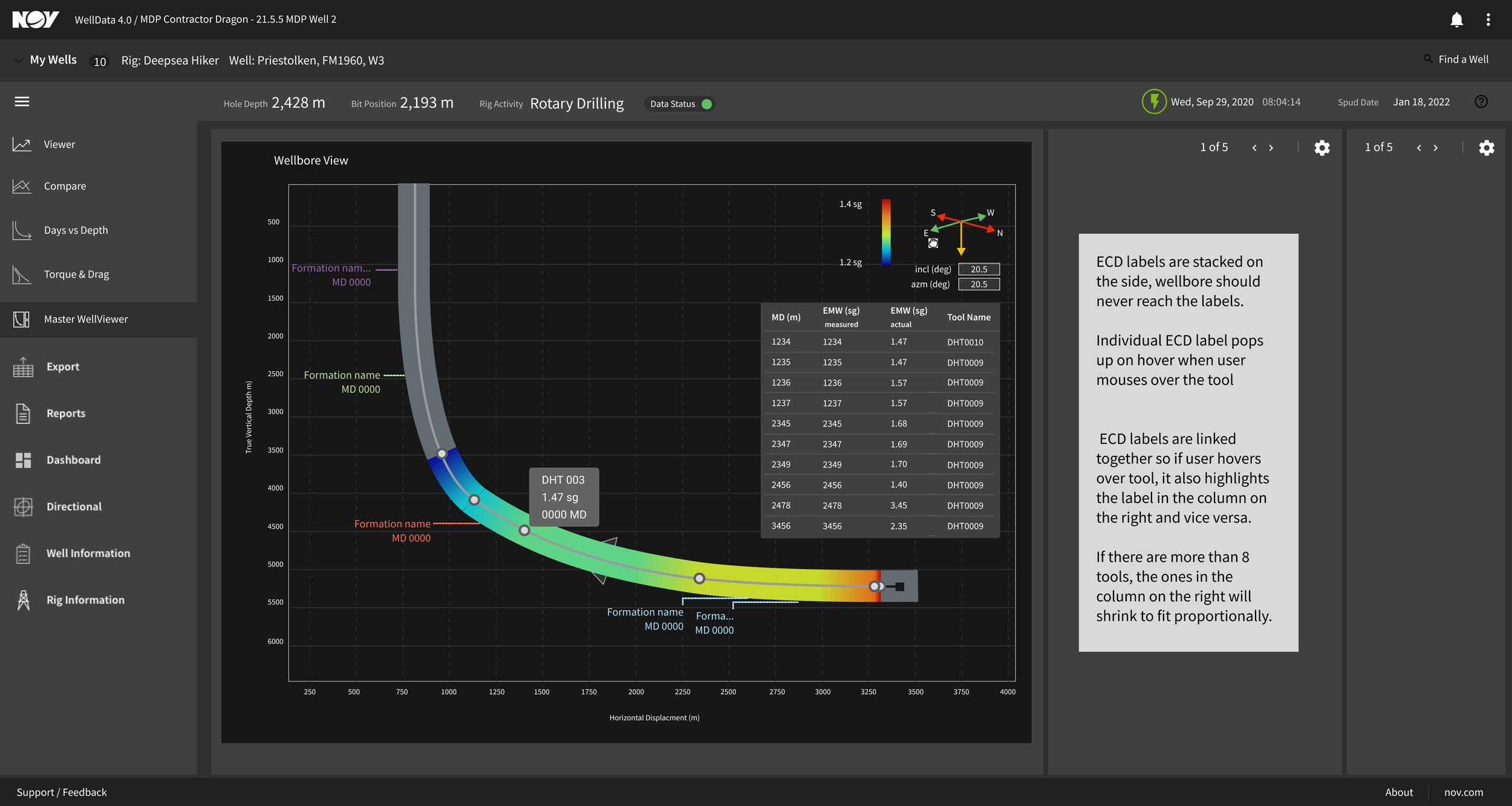
Three iteration passes on the same core wellbore-and-formations concept, refining layout, color coding, and panel structure round over round. This was the refinement cycle still running when the pivot to research got proposed.
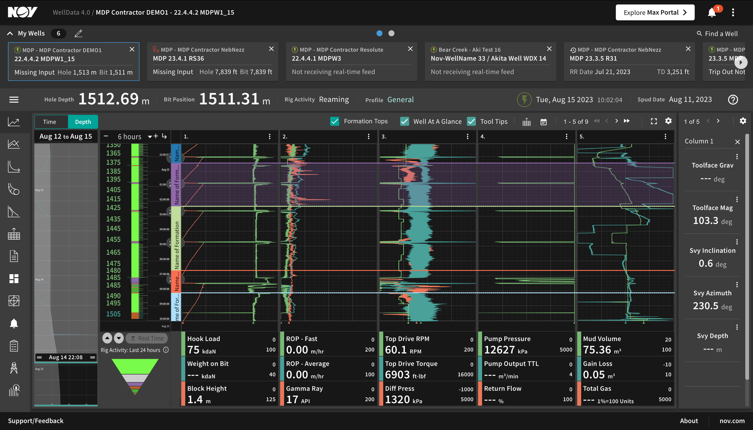
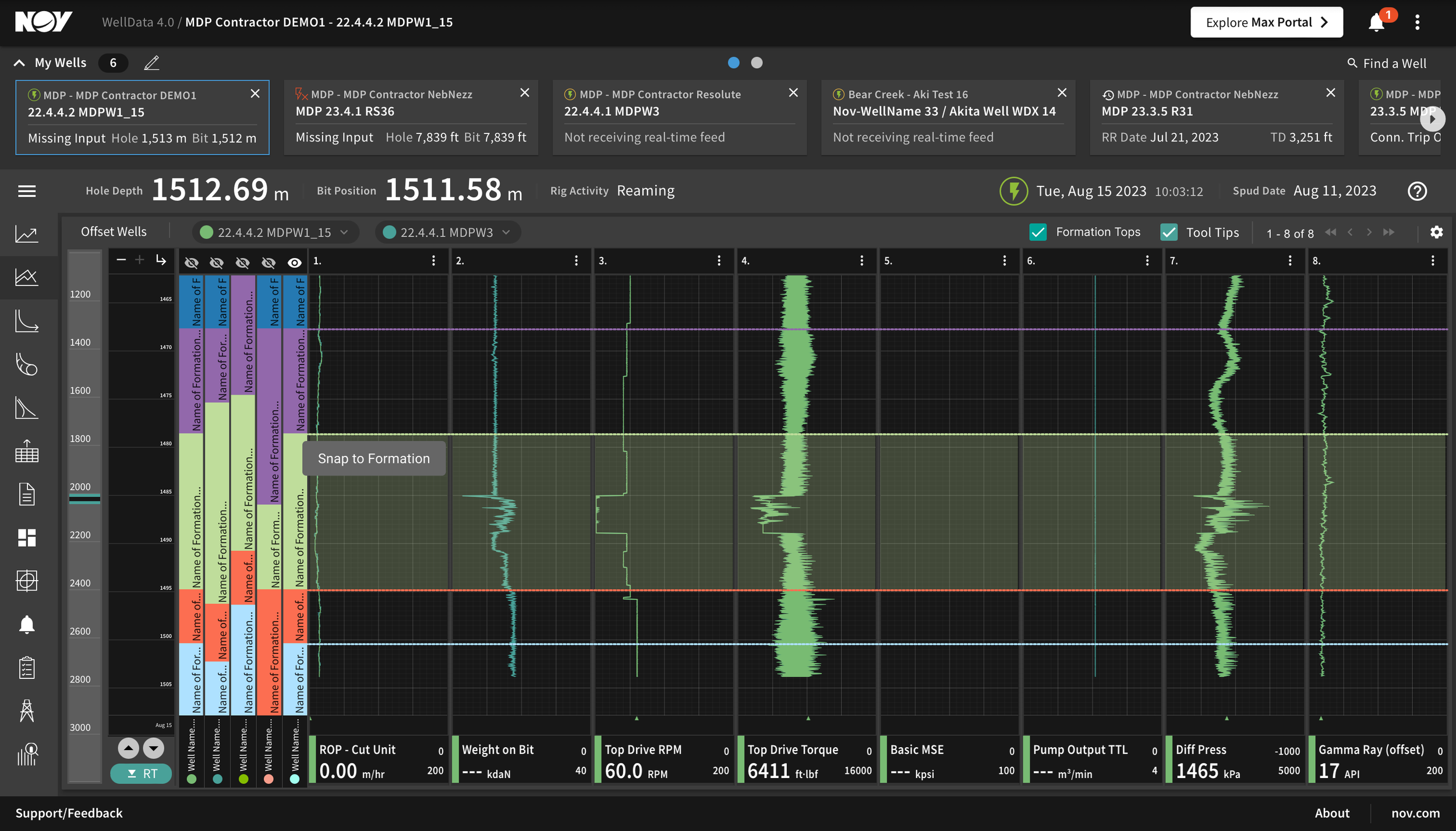

A formation-focused pass layering formation top data directly into the viewer; a well-comparison concept laying formation data from multiple wells side by side; and the formation tops table in its empty state, before any data has been entered.
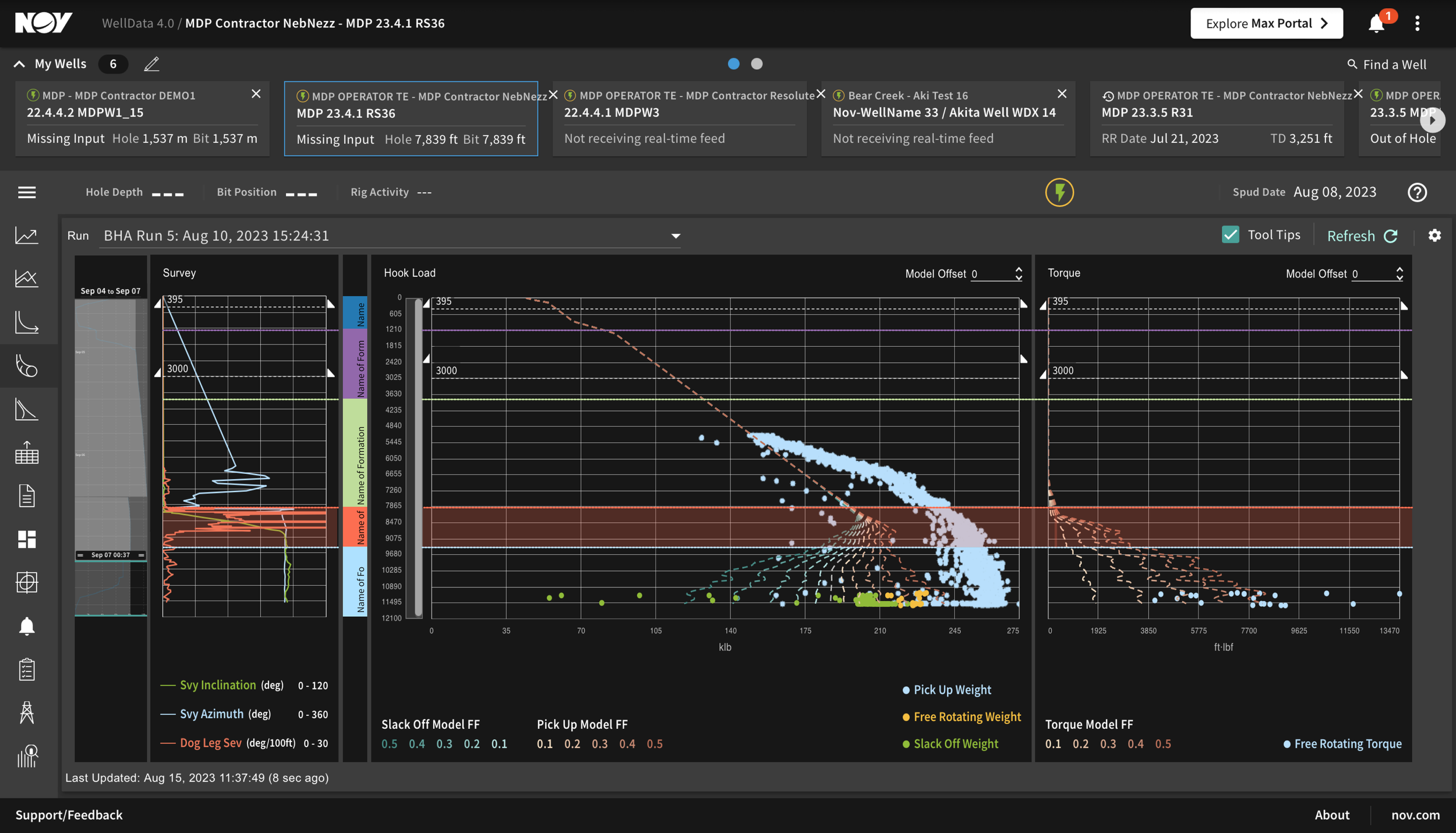

Torque and drag, an existing calculator, reimagined with formation context layered in, part of testing whether formation awareness belonged in one new viewer or spread across tools the field already used. Right: the main WellData dashboard in its current dark theme, the visual system every concept had to sit inside.

Annotated error and edge-case behavior for the viewer concepts: what should happen when data is missing, delayed, or out of range. Documentation work like this was already underway when the interviews were proposed.
This wasn't a case of skipping research from day one. Real design hours, iteration cycles, and edge-case documentation had already gone into the viewer concept. Recommending a pause at that point was a harder call than recommending one at the very start would have been, and it's exactly why the finding carried weight once the interviews came back.
I wrote a structured discussion guide before the first interview, built around nine blocks: role context, a vigilance question ("what worries you when you're not watching?"), analytics priorities, a task-based workflow walkthrough, a pain point probe with an immediate severity check, handoff and standardization, a direct reaction test against the proposed viewer concept, an open wish list, and a closing quote capture.
Every field mapped to a slot in the persona template: Bio, Insights, Goals & Needs, Tool Usage, and for the DBA calculation-point interviews, a Critical/Moderate pain point rating. That consistency meant twelve very different roles could still be compared side by side.
The sample was deliberately mixed rather than convenient. Nine interviews covered DBS telemetry and monitoring across four operator companies and tenure from one year to twenty. Three targeted DBA specifically, screened by where each participant's team actually performed calculations, at the edge, in the cloud, or in transit, since that governed a completely different set of trust and visibility problems.
Every pain point got rated against a five-point severity scale (Critical through Minor) and plotted against a Jobs-to-be-Done lens (Over-Served, Served Right, Under-Served), so prioritization traced back to the participant's own words, not to whoever argued loudest in the room afterward.
| Participant | Role | Organization | Tenure | Track |
|---|---|---|---|---|
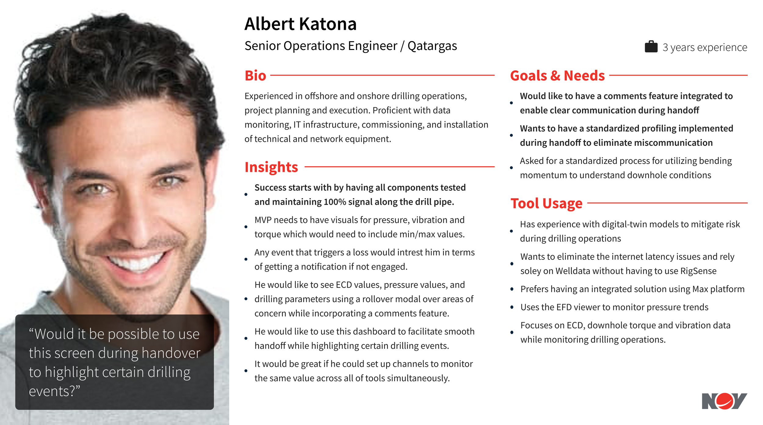
| Albert Katona | Senior Operations Engineer | Qatargas | 3 yrs | DBS |
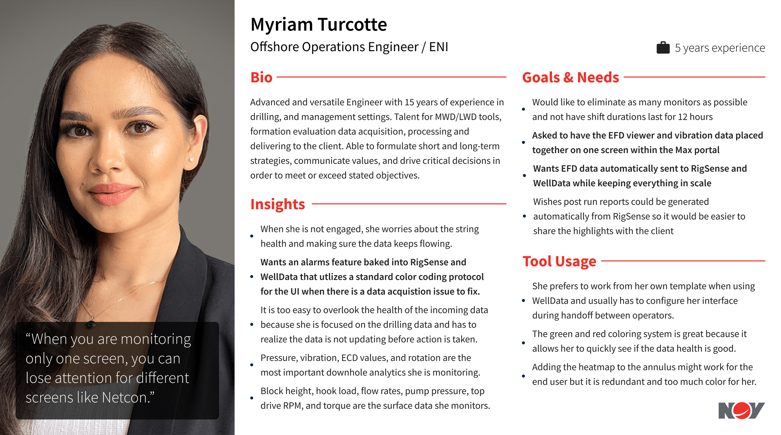
| Myriam Turcotte | Offshore Operations Engineer | ENI | 5 yrs | DBS |
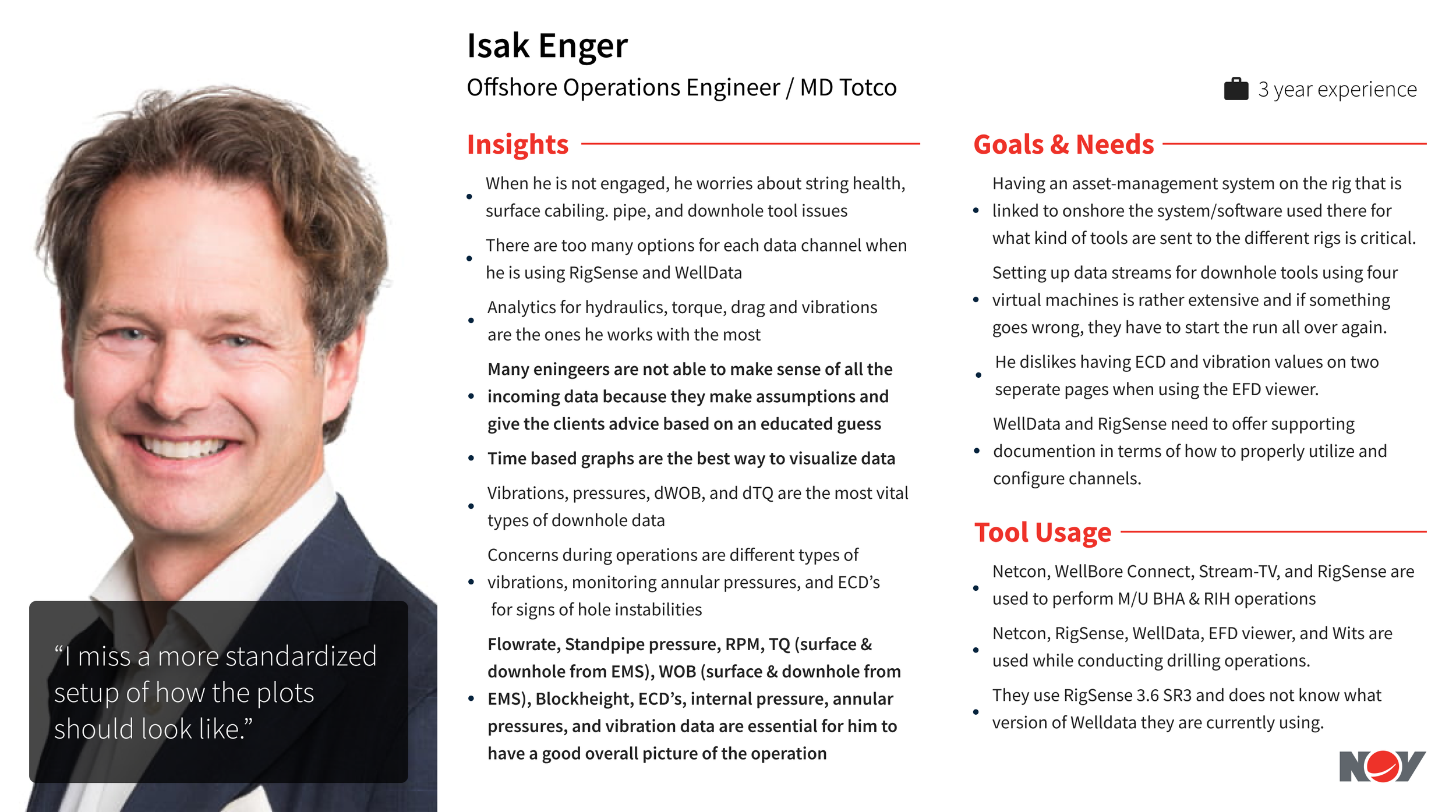
| Isak Enger | Offshore Operations Engineer | M/D Totco | 3 yrs | DBS |
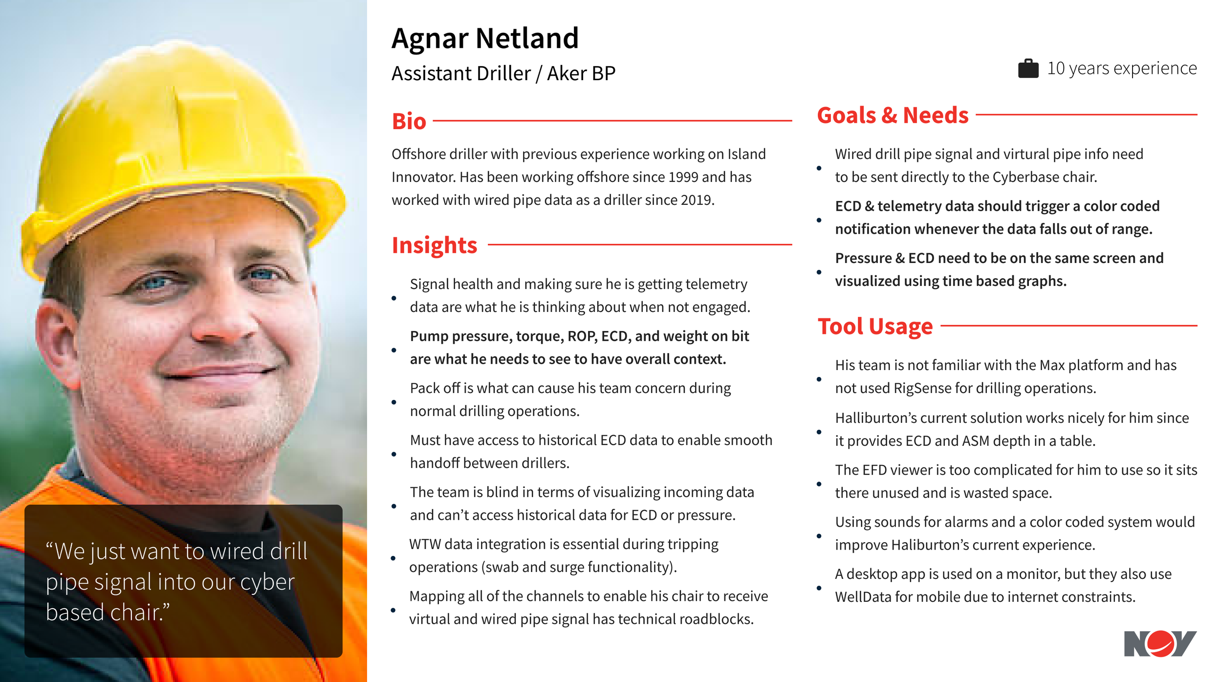
| Agnar Netland | Assistant Driller | Aker BP | 10 yrs | DBS |
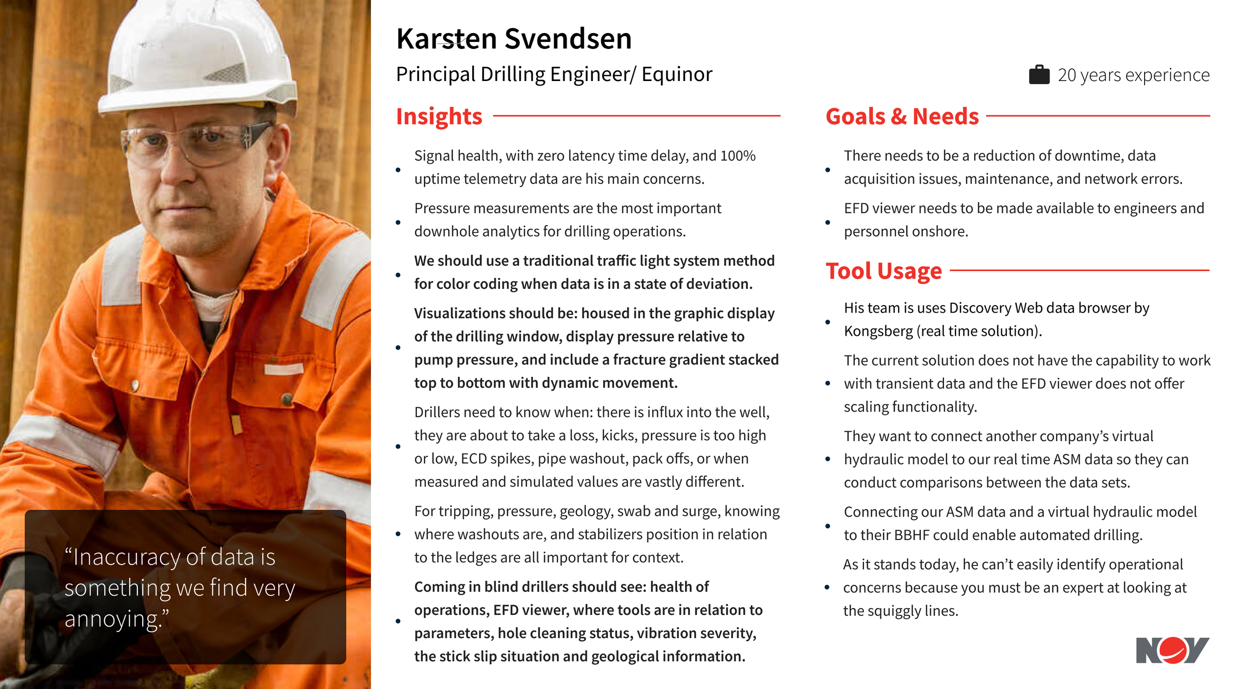
| Karsten Svendsen | Principal Drilling Engineer | Equinor | 20 yrs | DBS |
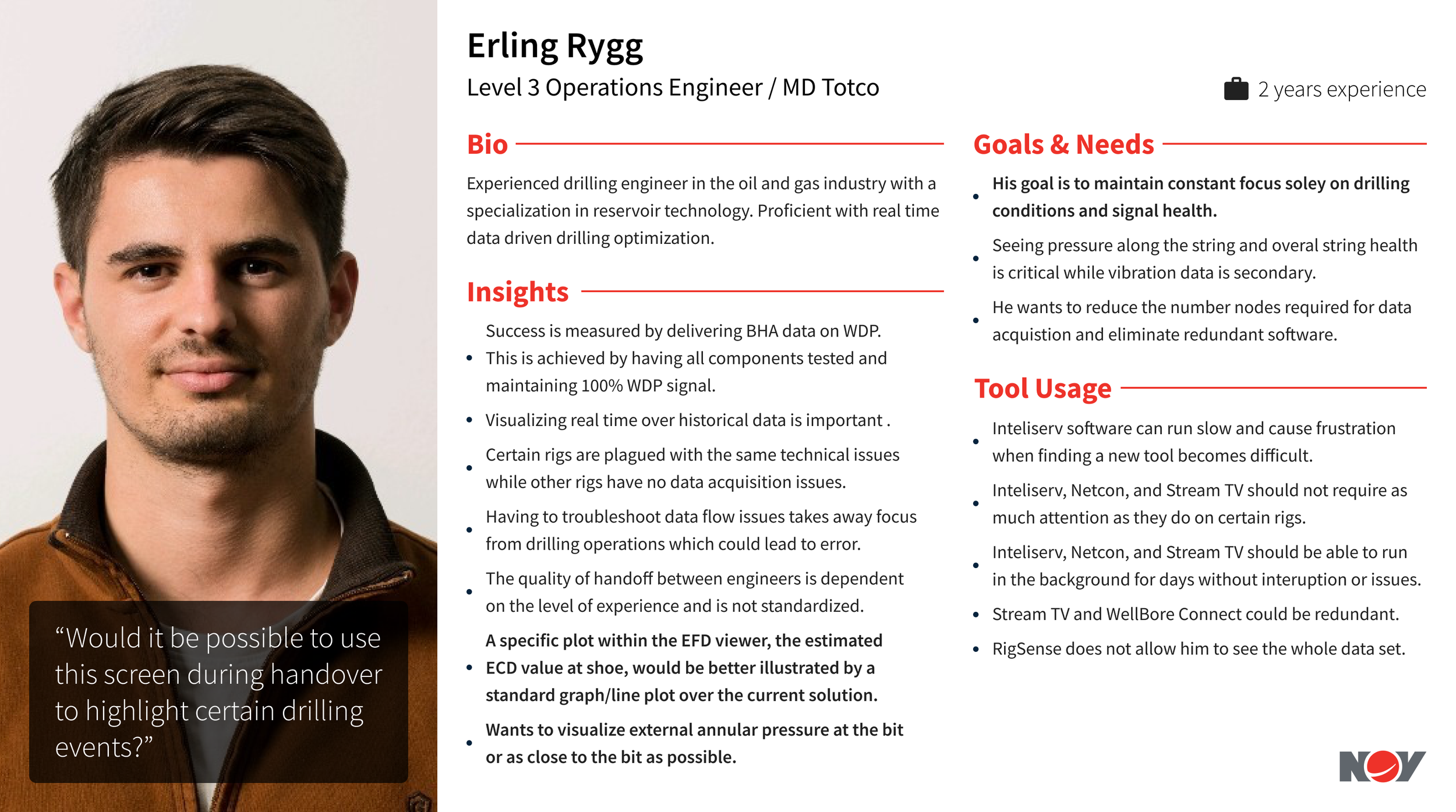
| Erling Rygg | Level 3 Operations Engineer | M/D Totco | 2 yrs | DBS |
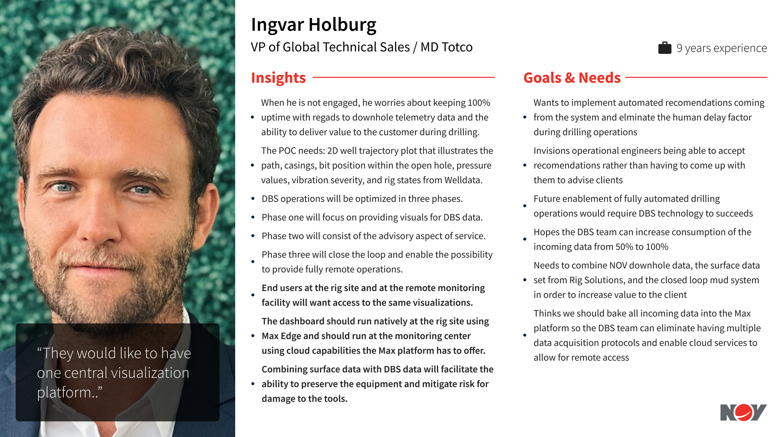
| Ingvar Holburg | VP, Global Technical Sales | M/D Totco | 9 yrs | DBS |
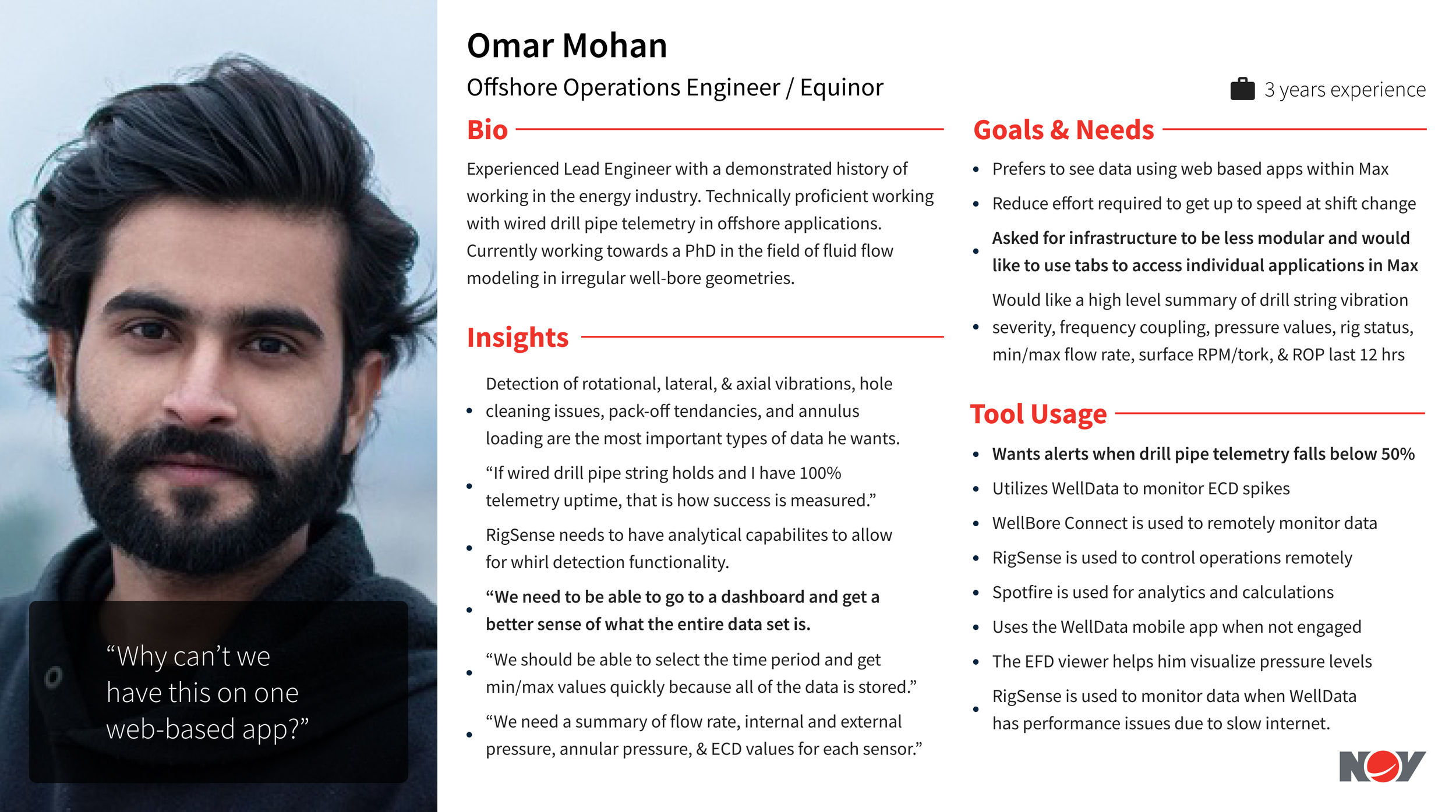
| Omar Mohan | Offshore Operations Engineer | Equinor | 3 yrs | DBS |
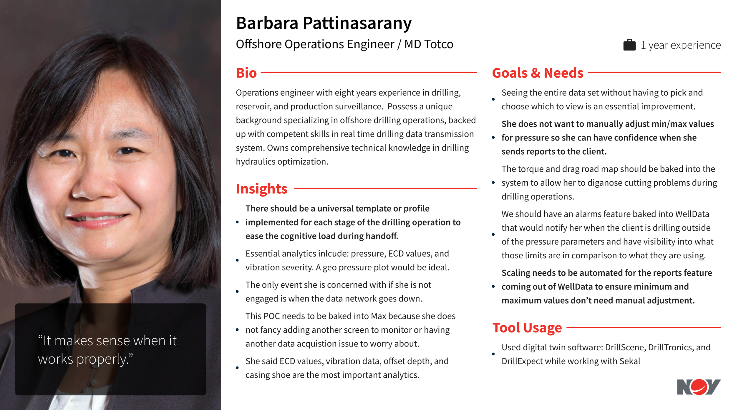
| Barbara Pattinasarany | Offshore Operations Engineer | M/D Totco | 1 yr | DBS |
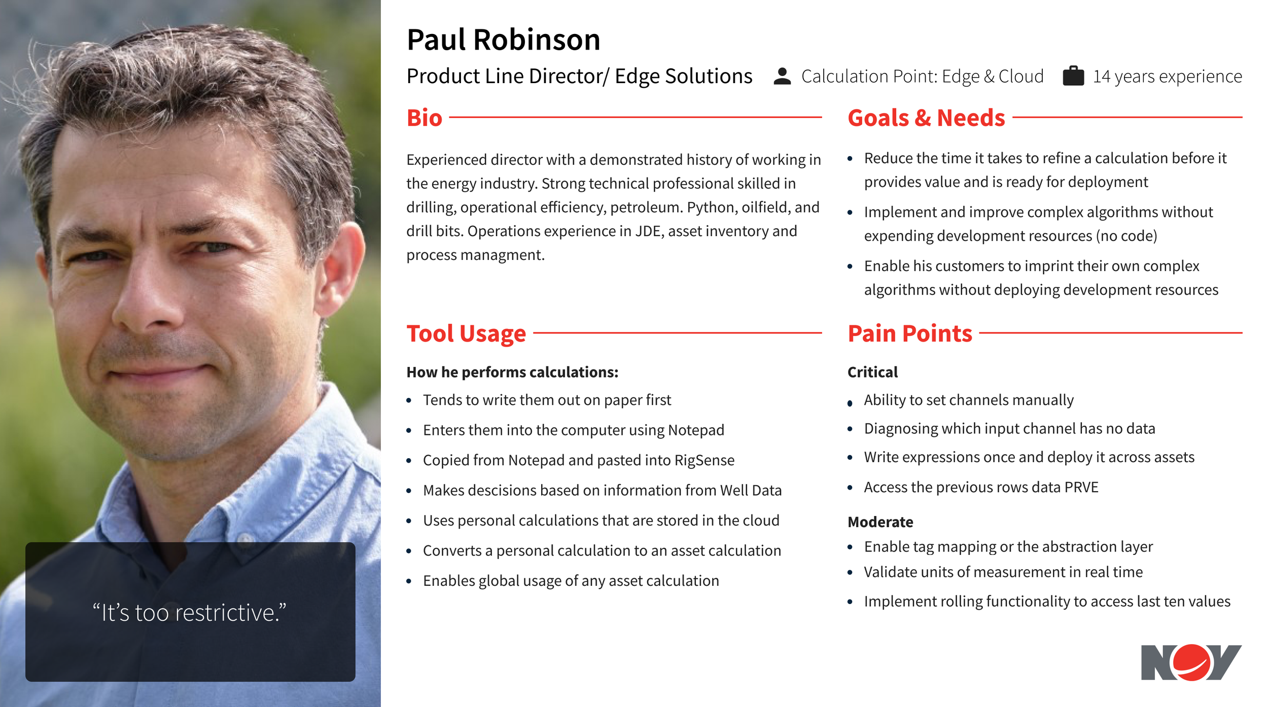
| Paul Robinson | Product Line Director, Edge Solutions | NOV, Internal | 14 yrs | DBA |
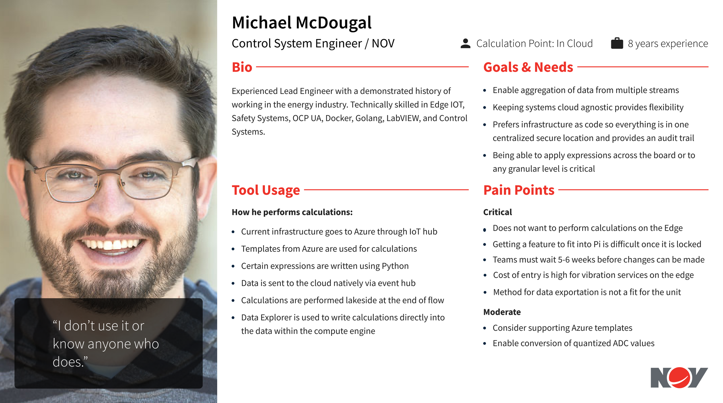
| Michael McDougal | Control Systems Engineer | NOV, Internal | 8 yrs | DBA |
| Thomas De Vries | Lead System Engineer | M/D Totco | 14 yrs | DBA |
Every pain point that came out of these interviews got scored against that same five-point severity scale and JTBD lens, documented in full in the companion discussion guide. One note surfaced during the workflow walkthrough is worth calling out on its own: the shift report chain, a driller fills out the IADC tour, the toolpusher reviews it, the company man reviews and submits it, then the drilling operator and contractor sign off within 24 hours, is the last layer of field communication and the mechanism that gets everyone paid. That single thread ran straight into the handoff findings below.
Across nine roles spanning an assistant driller to a VP of technical sales, the same handful of themes surfaced independently, in different words, from people who had never spoken to each other.
- Finding 01Handoff quality depends entirely on the individual, not the system. Nearly every DBS participant, from Albert Katona to Barbara Pattinasarany, independently asked for a standardized template or profile at shift change. Nobody had one.
- Finding 02Color coding is inconsistent across the tool ecosystem. Agnar Netland wanted wired pipe telemetry to trigger color-coded alerts with sound. Karsten Svendsen asked for a traditional traffic-light system. Barbara Pattinasarany wanted alarms baked into WellData for pressure deviation. Three people, three different asks, one underlying gap.
- Finding 03Tool fragmentation is a bigger daily cost than any single missing feature. Erling Rygg flagged that Stream TV and WellBore Connect were likely redundant. Omar Mohan asked, verbatim, why the team couldn't have this on one web-based app instead of a modular tool stack. Isak Enger said there were simply too many options for each data channel.
- Finding 04The EFD Viewer was widely disliked in its current form. Agnar Netland's team left it unused entirely, calling it too complicated. Isak Enger and Karsten Svendsen both wanted ECD and vibration consolidated onto one screen instead of split across separate pages.
- Finding 05The 2D/3D viewer itself came from exactly one interview. Ingvar Holburg, the VP who'd requested it, described it as phase one of a three-phase roadmap toward automated drilling. No operations engineer or driller raised trajectory visualization unprompted as a top priority. When probed directly, most said they'd use it occasionally, not instead of the alarm and handoff problems already on the table.
The DBA track was screened differently on purpose. Paul Robinson, Michael McDougal, and Thomas De Vries each represented a different point in the pipeline where a calculation could physically execute, at the edge, in the cloud, or in transit before the data ever reached Well Data. That structural difference turned out not to be where the real problem lived.
Paul Robinson (Edge & Cloud) walked through his actual workflow: paper, then Notepad, then copied into RigSense, then decisions made from WellData, personal calculations stored in the cloud, eventually converted to an asset calculation for global use. Seven manual steps to get one expression trusted enough to deploy. His words for the current system: "It's too restrictive."
Michael McDougal (In Cloud) was the most direct participant in the entire study. Asked about the compute-engine calculation feature, his answer was: "I don't use it or know anyone who does." That single line was worth more than a dozen polite non-answers would have been.
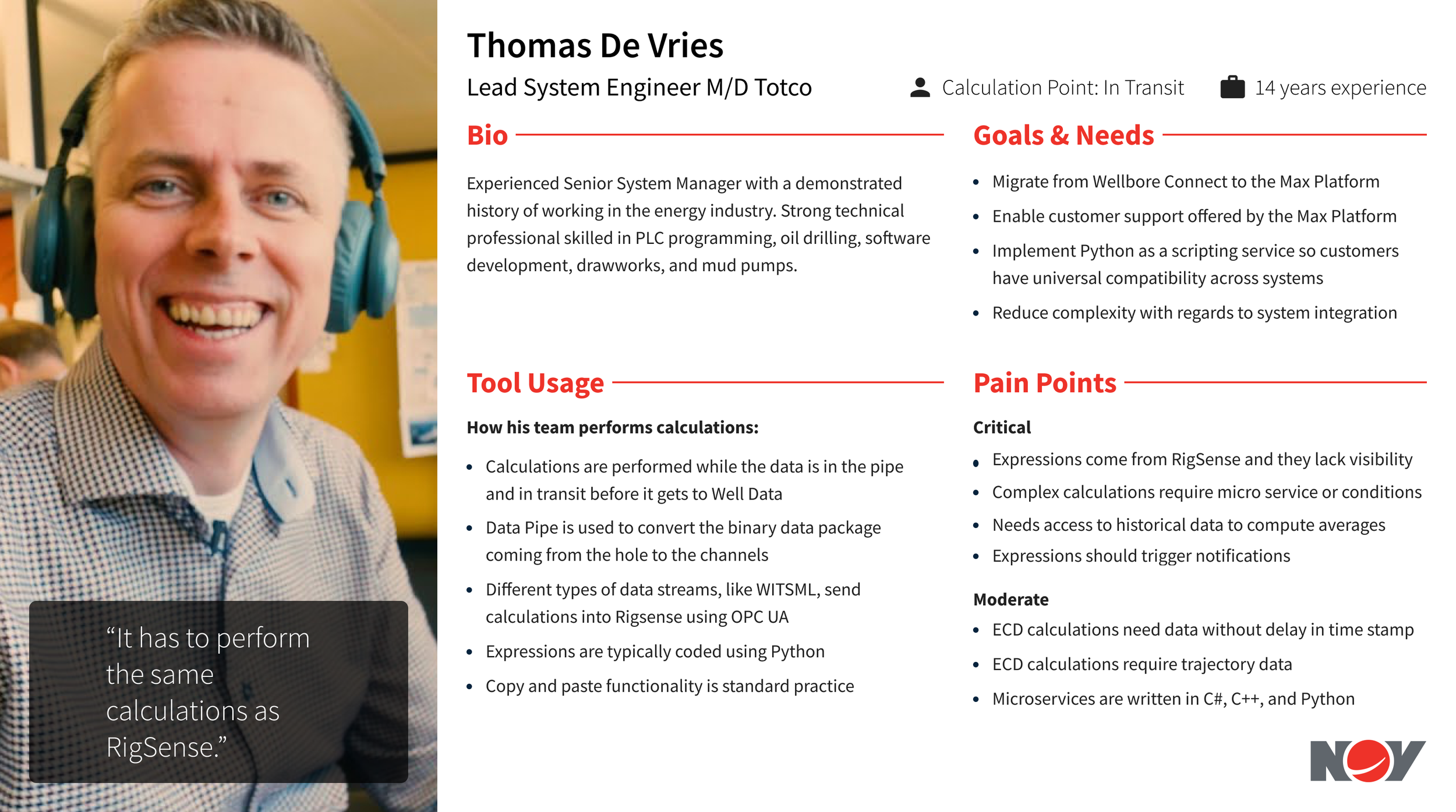
Thomas De Vries (In Transit) described a pipeline where expressions came from RigSense with no visibility into what they were actually doing, where complex calculations needed a microservice just to add a condition, and where his one hard requirement was blunt: "It has to perform the same calculations as RigSense." Not faster. Not smarter. The same.
All three DBA interviews converged on the same root cause regardless of where their calculations physically ran: the blocker was visibility and trust, not infrastructure location. Engineers didn't distrust the cloud, or the edge, or transit processing. They distrusted a calculation they couldn't see the working for.
Every interview was synthesized into a persona with the same structure, Bio, Insights, Goals & Needs, Tool Usage, and a closing quote, so a VP of technical sales and an assistant driller with ten years on the rig floor could be weighed on equal terms.
 Enlarge
 Enlarge
 Enlarge
 Enlarge
 Enlarge
 Enlarge
 Enlarge
 EnlargeEnlargeEnlarge
 EnlargeEnlarge
 EnlargeEnlargeEnlarge
 Enlarge
 Enlarge
The 2D/3D wellbore viewer wasn't a bad idea. Ingvar Holburg had already sketched a coherent three-phase path for it: visuals first, then advisory recommendations, then fully remote operations. What the research showed was that the phase-one visuals weren't what the majority of hands-on users would reach for first.
When rated against the Jobs-to-be-Done lens from the synthesis framework, the viewer landed as Served Right, not Under-Served. Meanwhile, handoff standardization, alarm consistency, tool fragmentation, and calculation transparency scored Critical or Serious across multiple independent interviews.
A feature leadership was confident in tested as adequately served, while a stack of lower-visibility, higher-severity problems kept surfacing on their own, unprompted, across roles, companies, and tenure levels. That's the kind of evidence that changes a roadmap conversation from opinion versus opinion into evidence versus assumption.
The team deferred the 2D/3D viewer to a later release and kept the MVP scoped to the needs the interviews had actually validated: standardized handoff templates, consistent alarm and color-coding conventions, and a path toward calculation transparency for the DBA team. Ingvar Holburg's own three-phase model stayed intact, it just moved to where the evidence said it belonged.
More durable than the scope change was what it did for how UX got treated on the team afterward. A research process that could show a product owner his own requested feature wasn't the field's top priority, and back it with twelve independent conversations rather than one designer's opinion, is what built the credibility to be brought into prioritization conversations early instead of handed a spec after the decision was already made.
- OutcomeReduced MVP scope based on validated user needs instead of the loudest internal voice.
- OutcomeImproved alignment between product leadership and the engineers and drillers actually using DBS and DBA day to day.
- OutcomeBuilt credibility for UX as a strategic partner with product owners and engineers, shifting discovery research from a step that happened after decisions to one that shaped them.